Read all about the most radical makeover I've done to date. Out of this nicotine-stained man-cave I created a classic yet contemporary and comfortable snug, as a gift for my client's husband.
Read moreDecorex 2016 here we come!
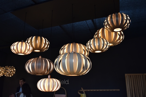
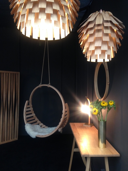
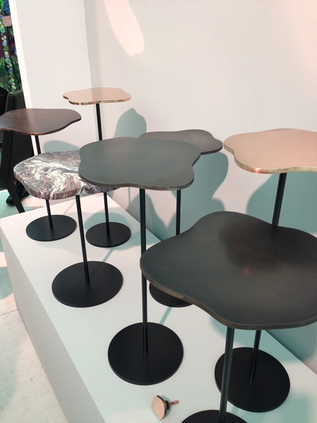
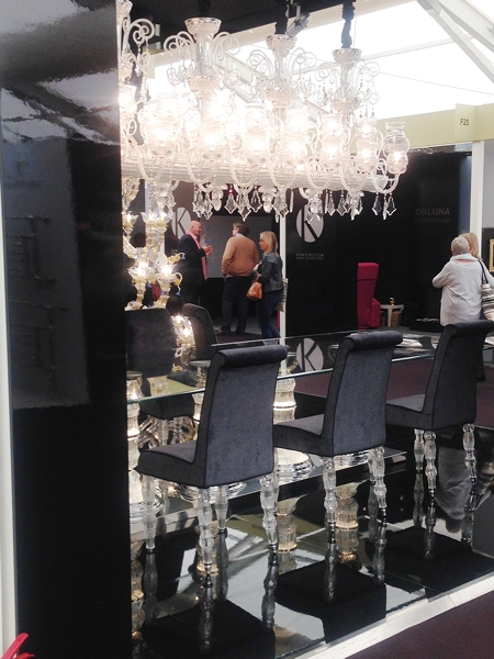
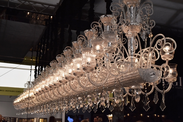
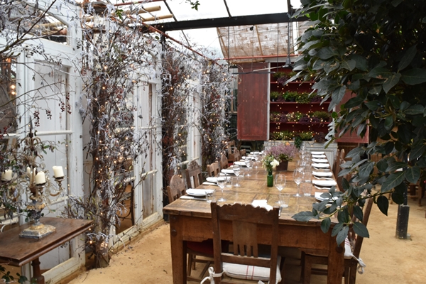
On Tuesday my friend Jane Fitch, also an interior designer, and I made our annual pilgrimage to Decorex at Syon Park. Decorex is internationally renowned for being THE event to discover the very best and most coveted products from 400 exhibitors. Decorex has been running for 39 years and this is the third year that I have been.
We were not blown away by much this year as it was very much the same exhibitors as last year. However some new blood gave a much needed injection of interest. I've included below a few newcomers as well as some highlights.
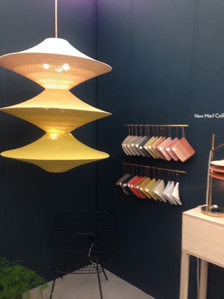
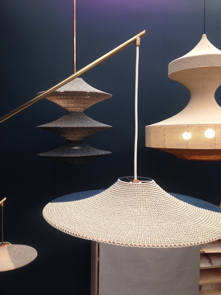
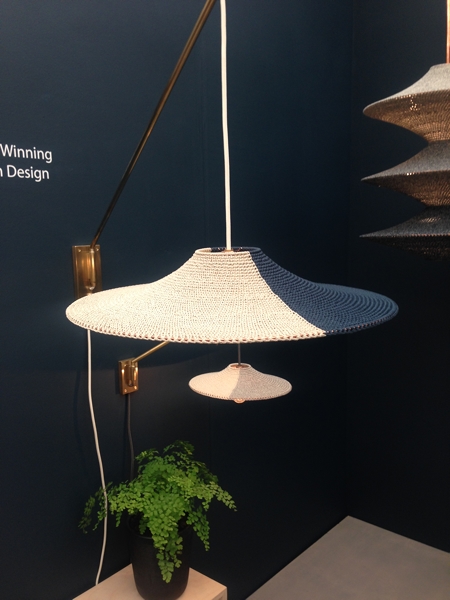
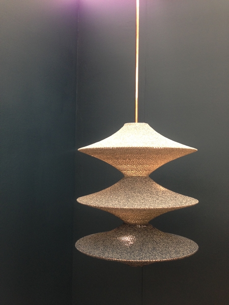
Naomi Paul beautiful crocheted lampshades were a feature in the VIP lounge as well as on their stand. Their ethos is to create beautiful functional textile objects by highly skilled craftsmanship and they certainly have achieve this. The lampshades are simple, stylish and elegant.
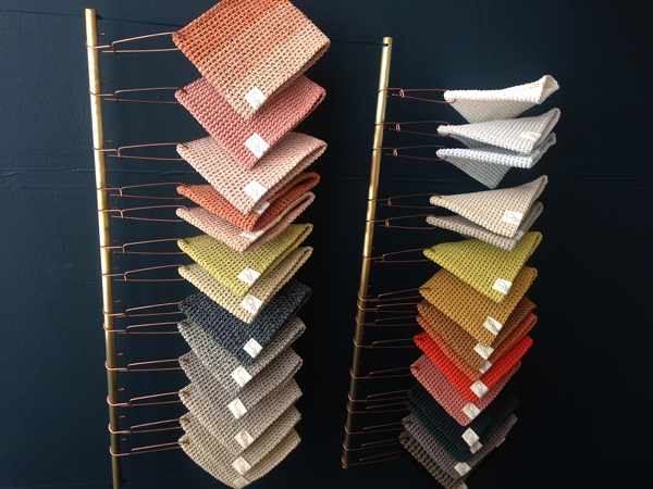
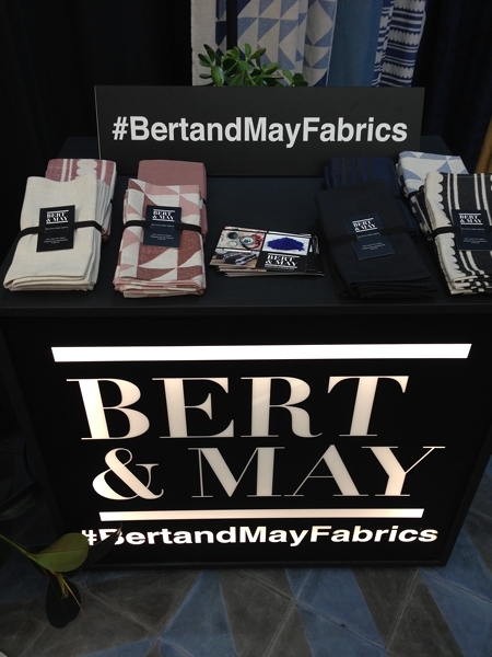
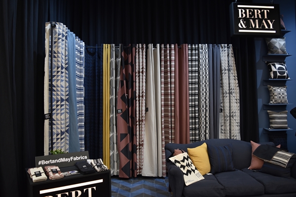
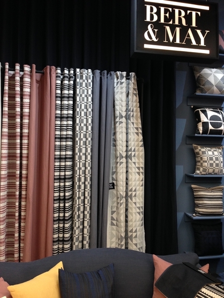
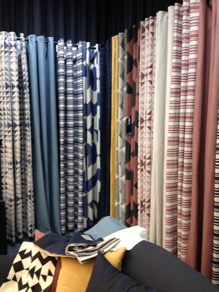
Bert and May are another newcomer to Decorex. They are committed to raw materials, natural pigments and fine craftsmanship which they certainly have achieved in their products. They launched a fabric range at Decorex which were beautiful subtle colours and bold geometric designs.
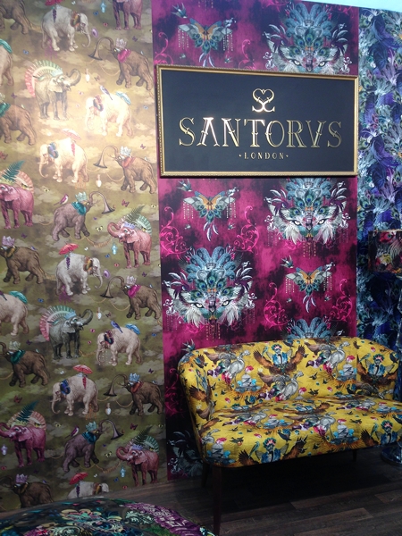
Santorus is another exciting newcomer. Brother and sister, Fabian and Tara have a rich cultural heritage of Indian and Italian parents and their products certainly reflect this. I adore the patterns and colours of their fabrics and wallpapers.
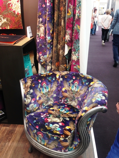
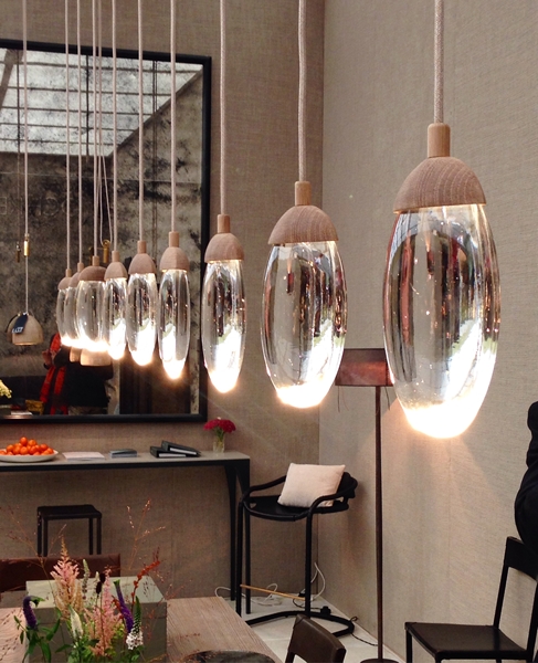
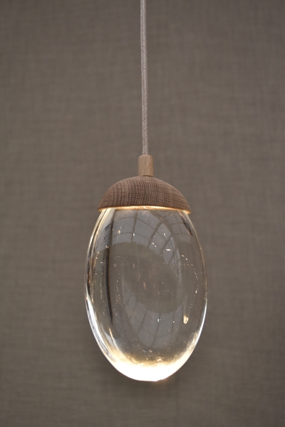
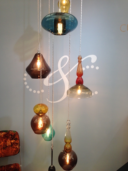
Tom Raffield is a relative newcomer to Decorex. Their beautiful wooden lighting and furniture are made in a woodland workshop in Cornwall where the company is based.
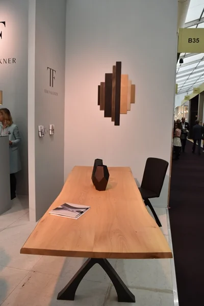
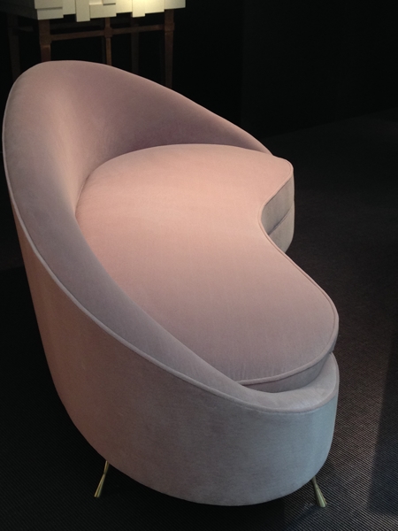
Tom Faulkner is not a newcomer to Decorex but I am always interested in visiting their stand and seeing their exquisite handmade furniture.
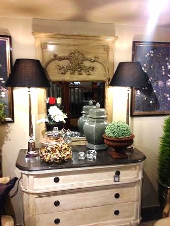
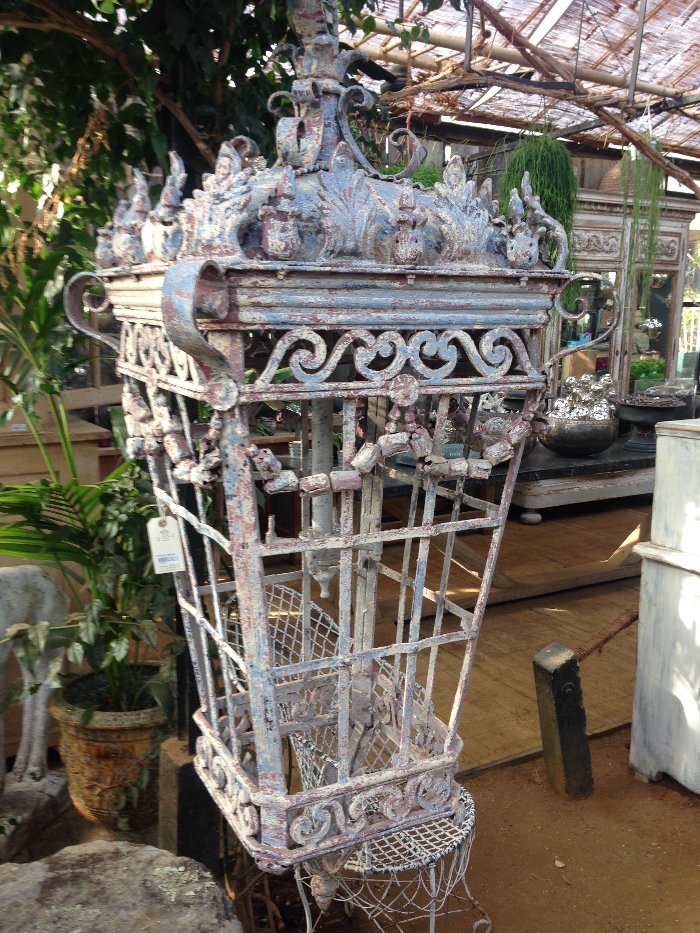
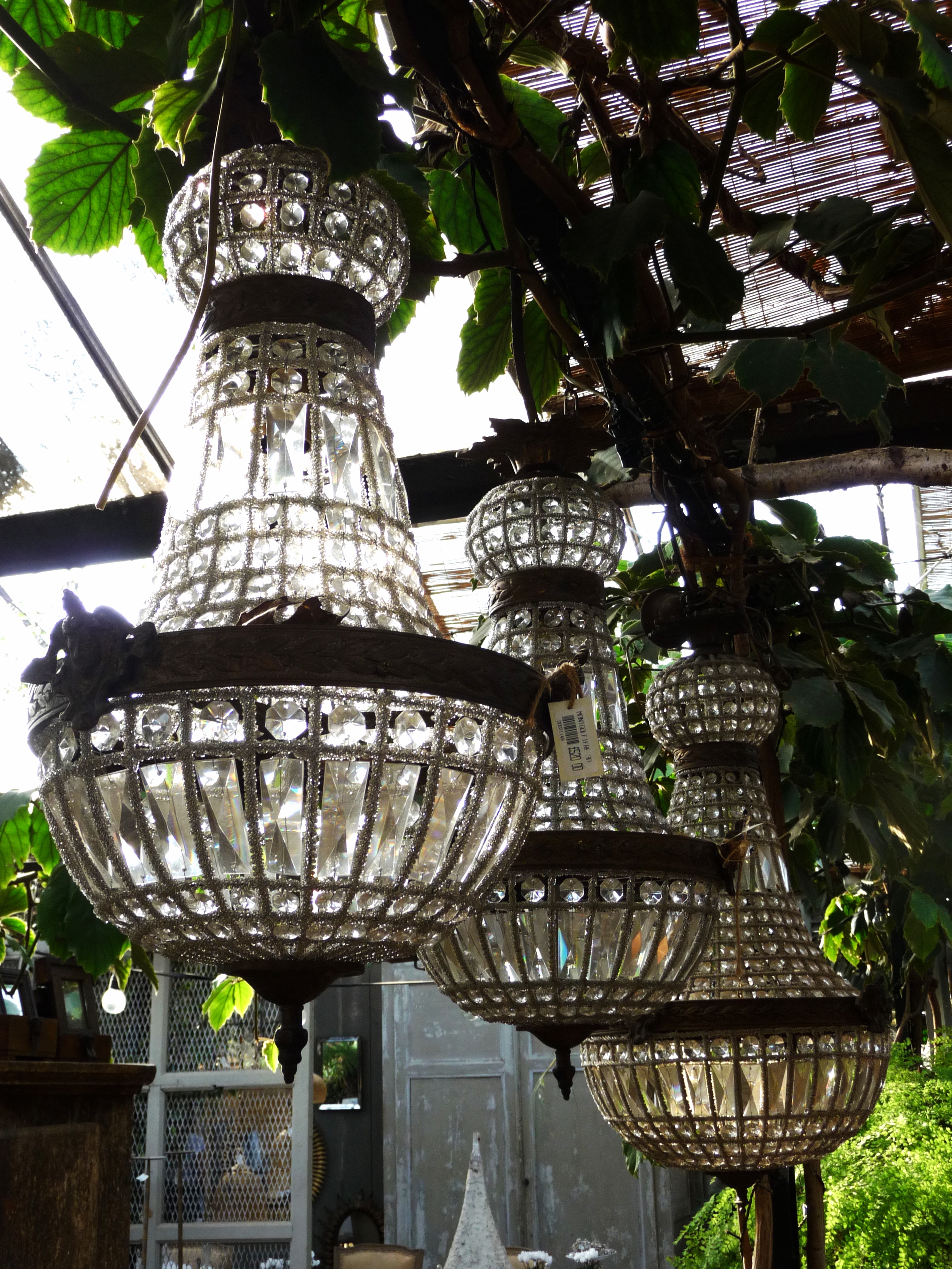
No visit to Decorex would be complete without a vist to the Ochre stand. I am always in awe of their celestial pebble light!
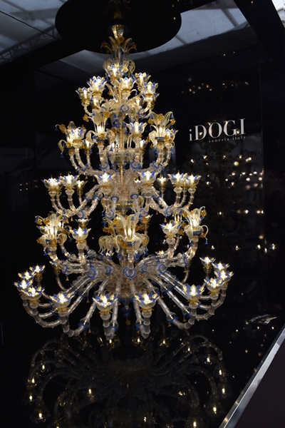
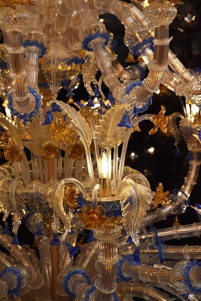
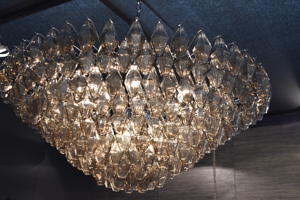
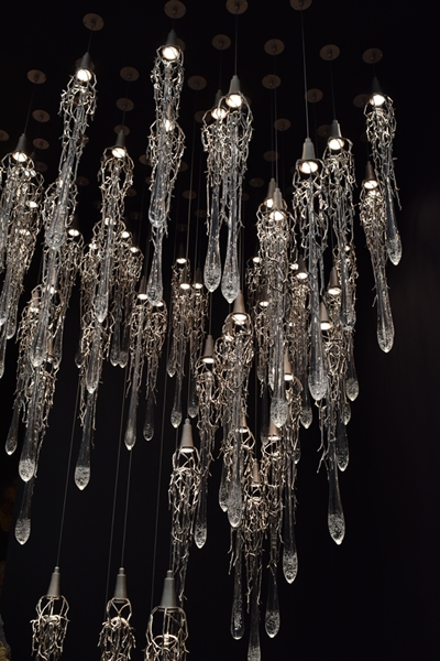
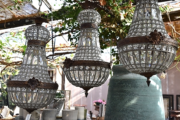
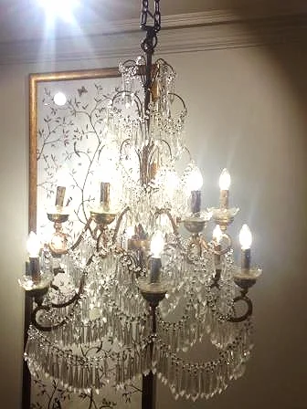
There is always the obligatory over-the-top glitz and these Murano chandeliers by iDogi were no exception!
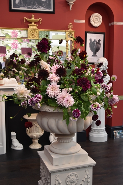
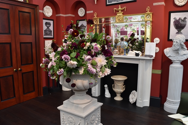
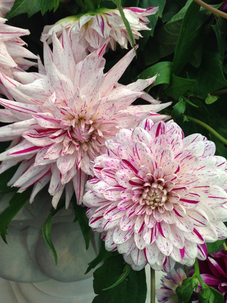
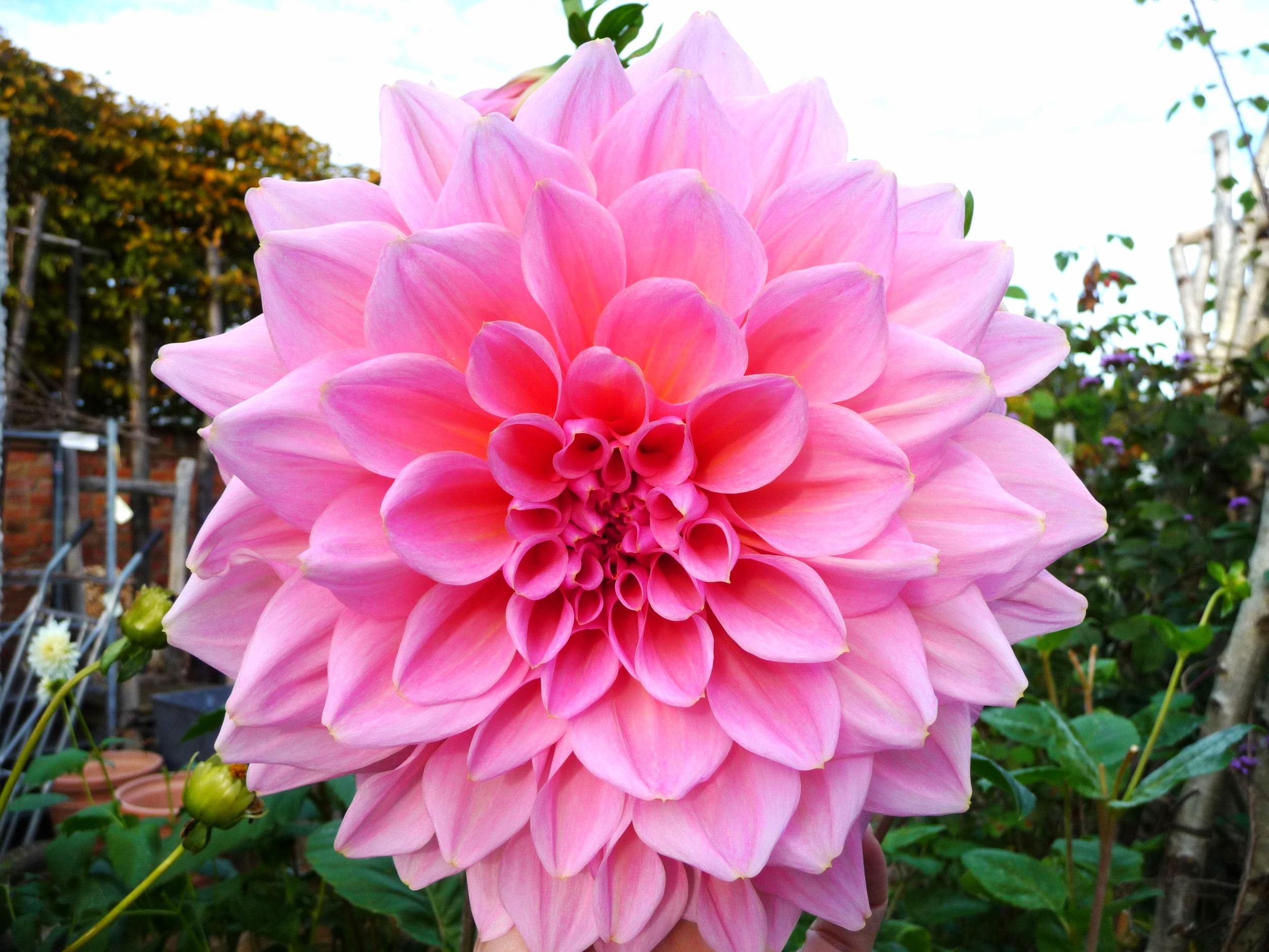
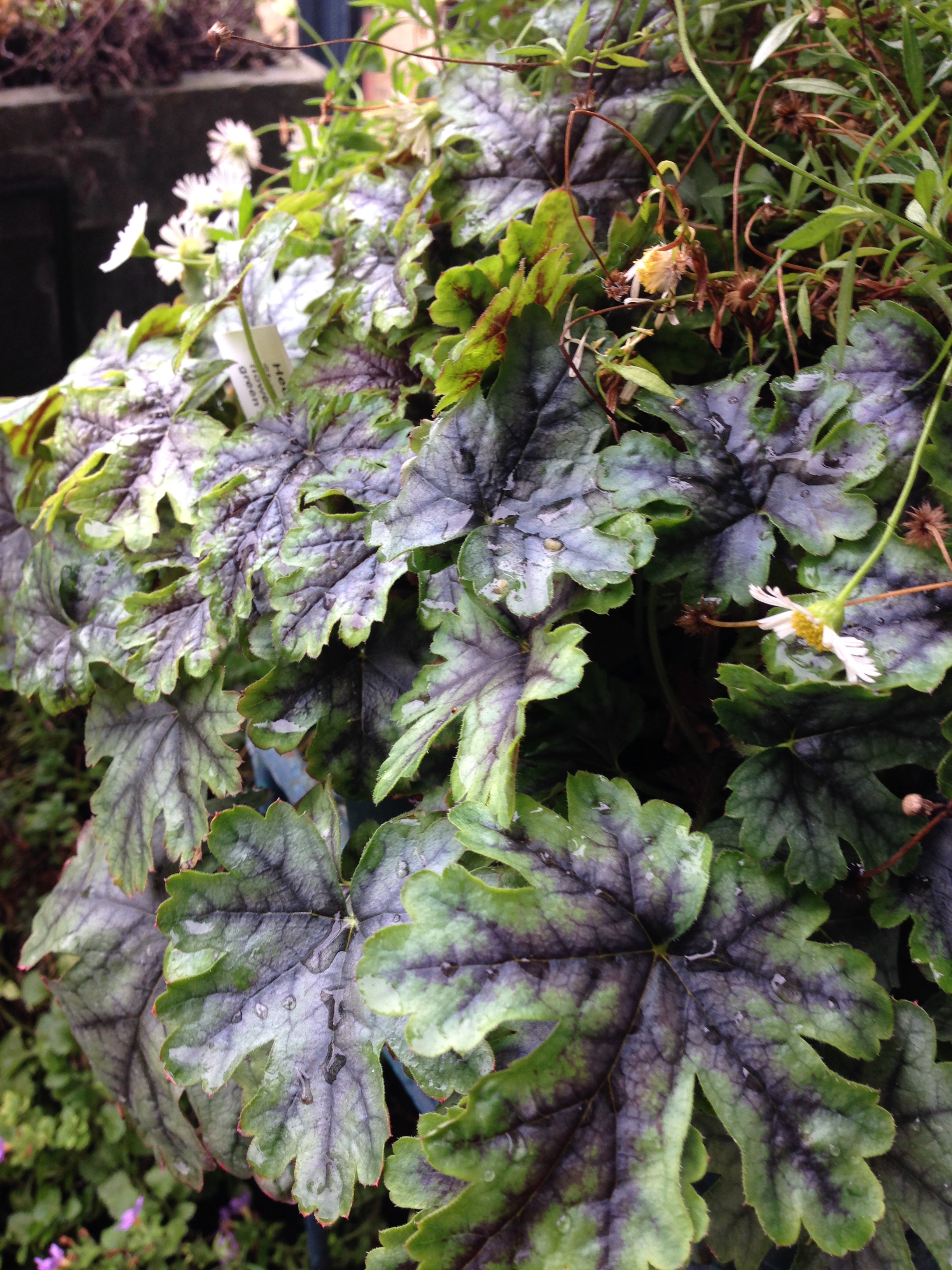
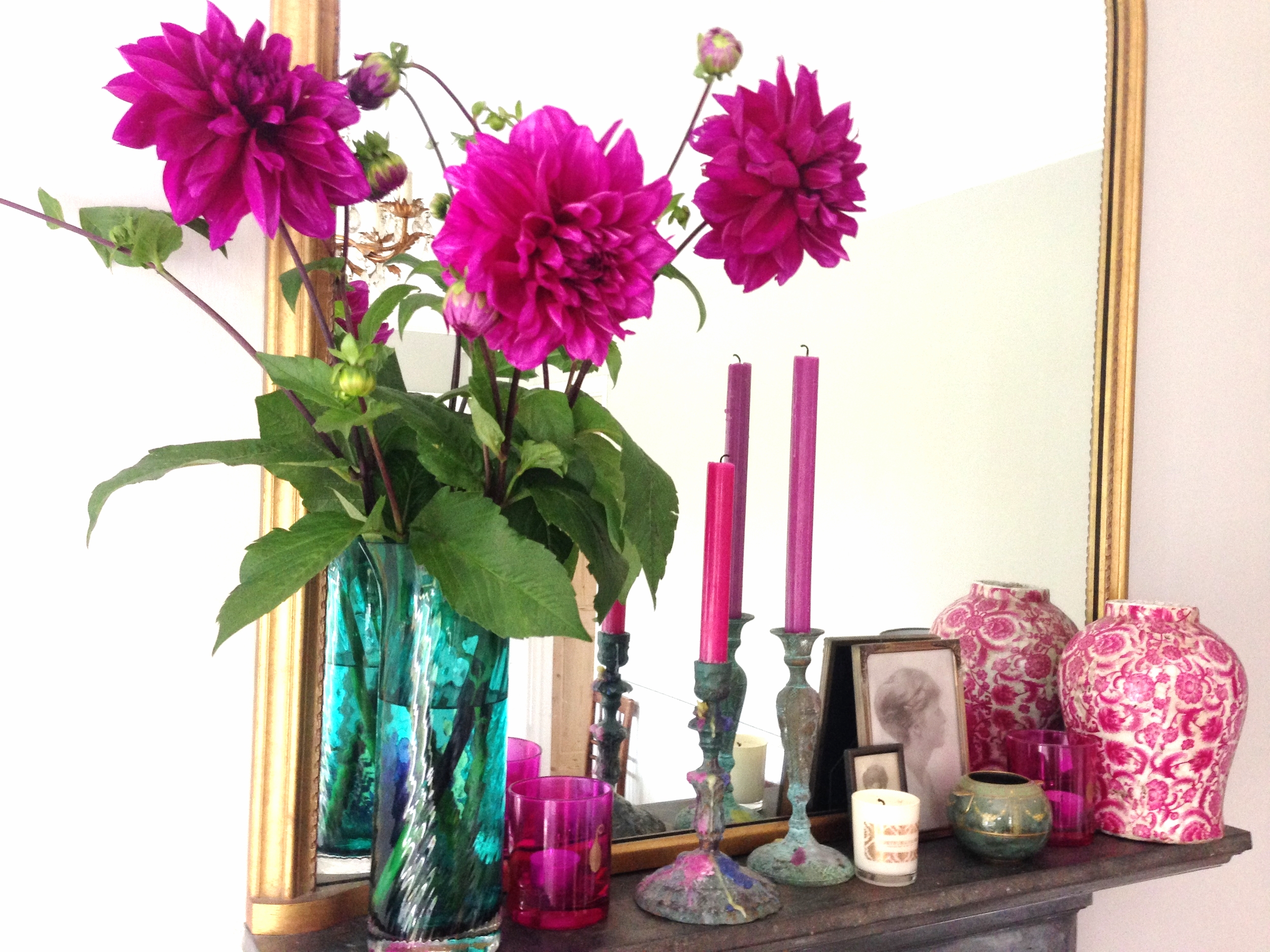
I always look forward to the floral displays on the exhibition stands but they were few and far between this year and very disappointing. The one that stood out for me was on the Sir John Soane Museum stand which was designed by Ben Pentreath and the magnificent display of dahlias was grown and designed by Ben's partner Charlie McCormick. This stand stood out from all the others for its design and colour.
To finish this whistlestop tour, here are a few more shots that I took.
I hope you enjoyed seeing a few of the highlights of Decorex. It was a long day as there were over 400 stands to see. A few glasses of bubbly in the VIP lounge with canapes helped to keep up our energy levels!
Did you go to Decorex this year? What did you think of it and what were your favourites? I would love to hear so do drop me a note.
You may also like to read
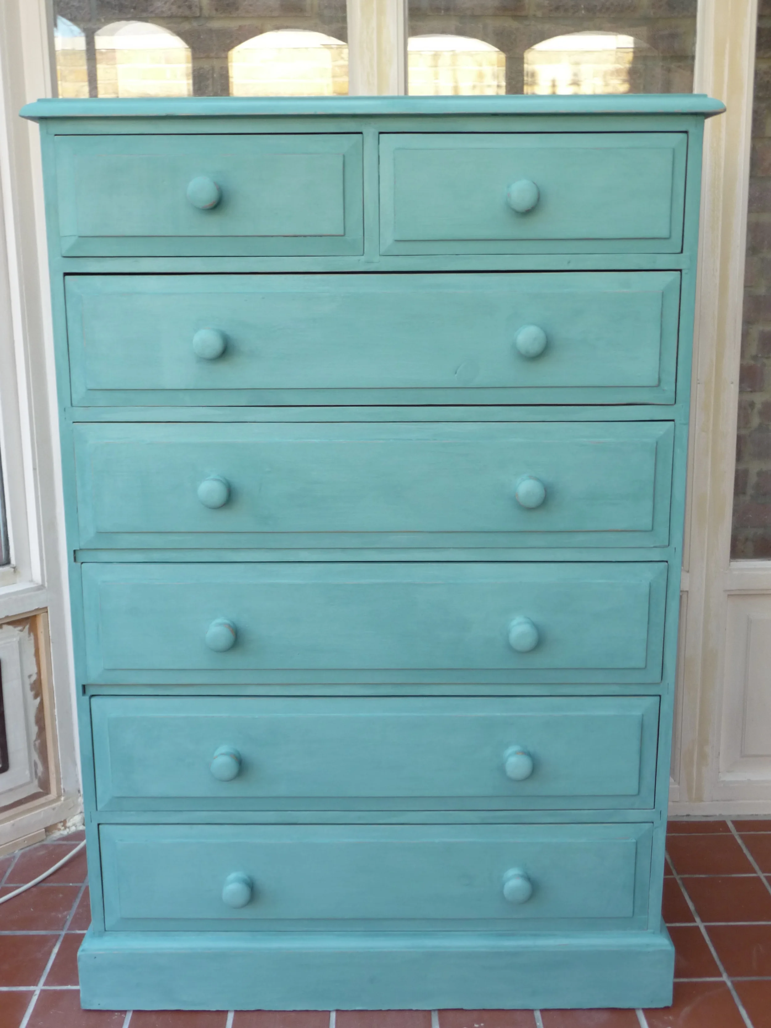
Give a piece of furniture a new lease of life
I'm a great one for up-cycling furniture with a lick of paint rather than get rid of it. I usually paint with Annie Sloan chalk paint as it's so easy to use - no prep required and you can paint it on any surface including on fabric! However this time I wanted a specific colour which doesn't come in the Annie Sloan range so I opted for Farrow & Ball which had the exact colour.
I'm a huge fan of Farrow & Ball paint and I have used it throughout my home. Most, if not all, my clients have F&B throughout their homes. I particularly like the way F&B split their neutrals into six groups which makes it so much easier for people when trying to choose a neutral colour(s). In fact I use the six neutral groups as the basis for my colour talks.
Read morePerfect design inspiration - the Bloomsbury Group

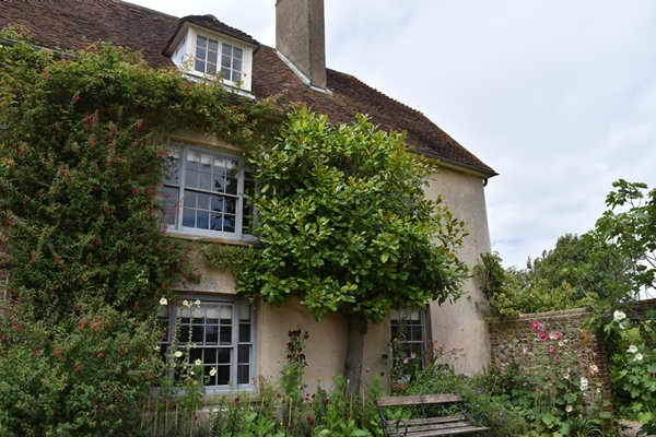
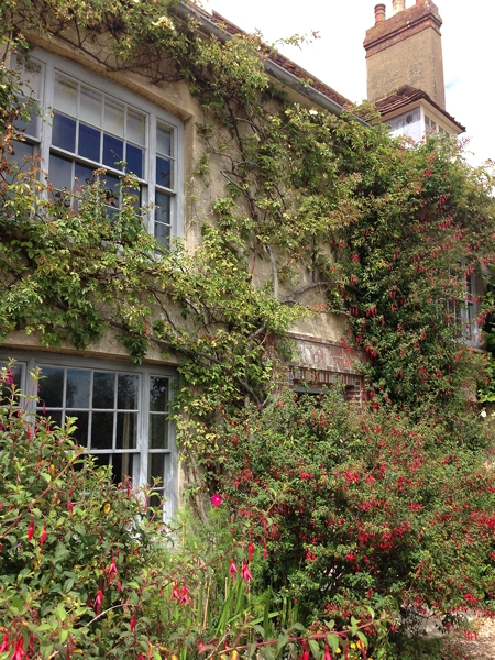
For those of you who don't know Charleston House, it is the home of the Bloomsbury Group and became a country outpost for a group of artists, writers and intellectuals. It started in 1916 when the painter Vanessa Bell, her husband Clive and their two sons Julian and Quentin moved there from London on the recommendation of her sister, the writer Virginia Woolf. With them were another painter Duncan Grant and his friend David Garnett. They rented the late 16th century farmhouse and despite the house having no hot water or heating, guests increased the household. It became a rather unconventional household of friendships and relationships - they didn't separate or divorce, they just reorganised!!!
Read moreHeadboard or Artwork in a Bedroom?
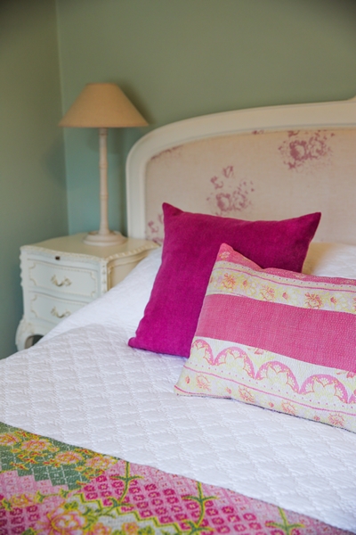
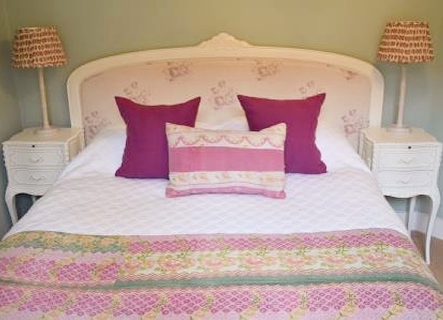
Do you have a headboard on your bed? Many of us don't. So what alternatives are there? Mirrors, artwork, wall hangings.......... ?
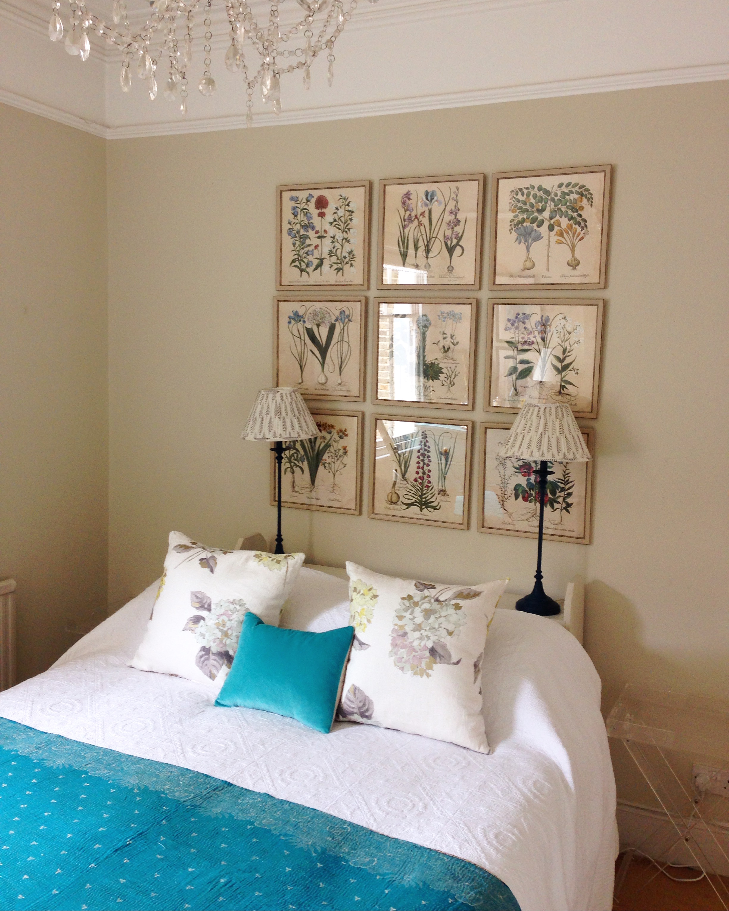
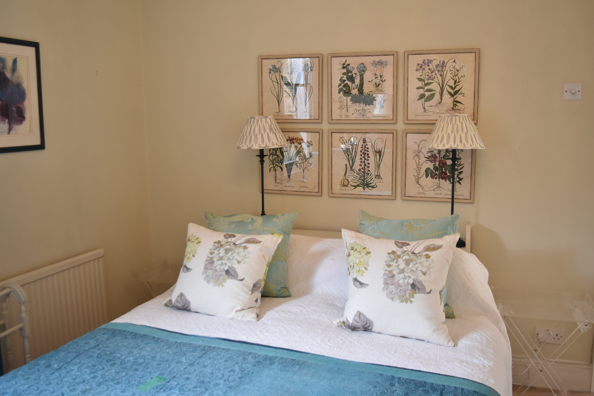
In one of my bedrooms the bed has no headboard so I have added a very narrow bookcase on which are two lamps. However the wall above that was completely empty and crying out for a wow factor alternative to a headboard.

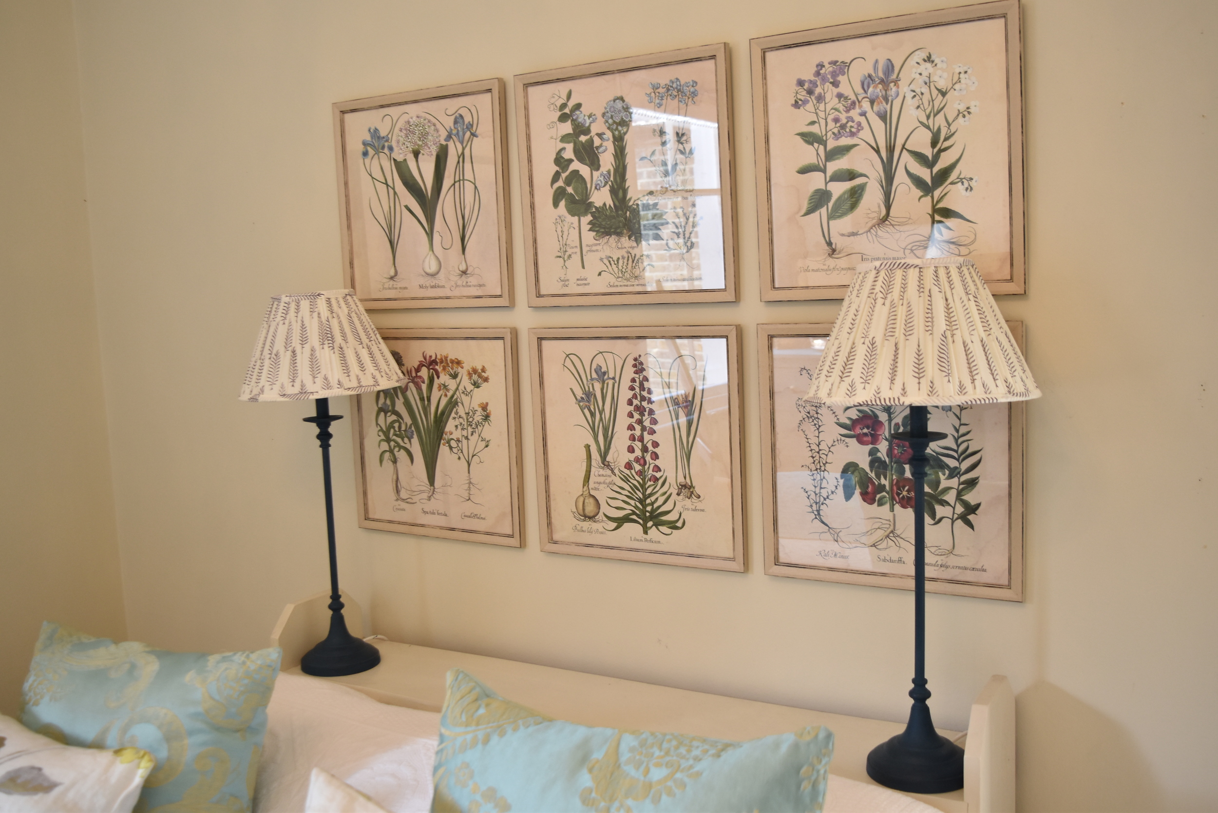
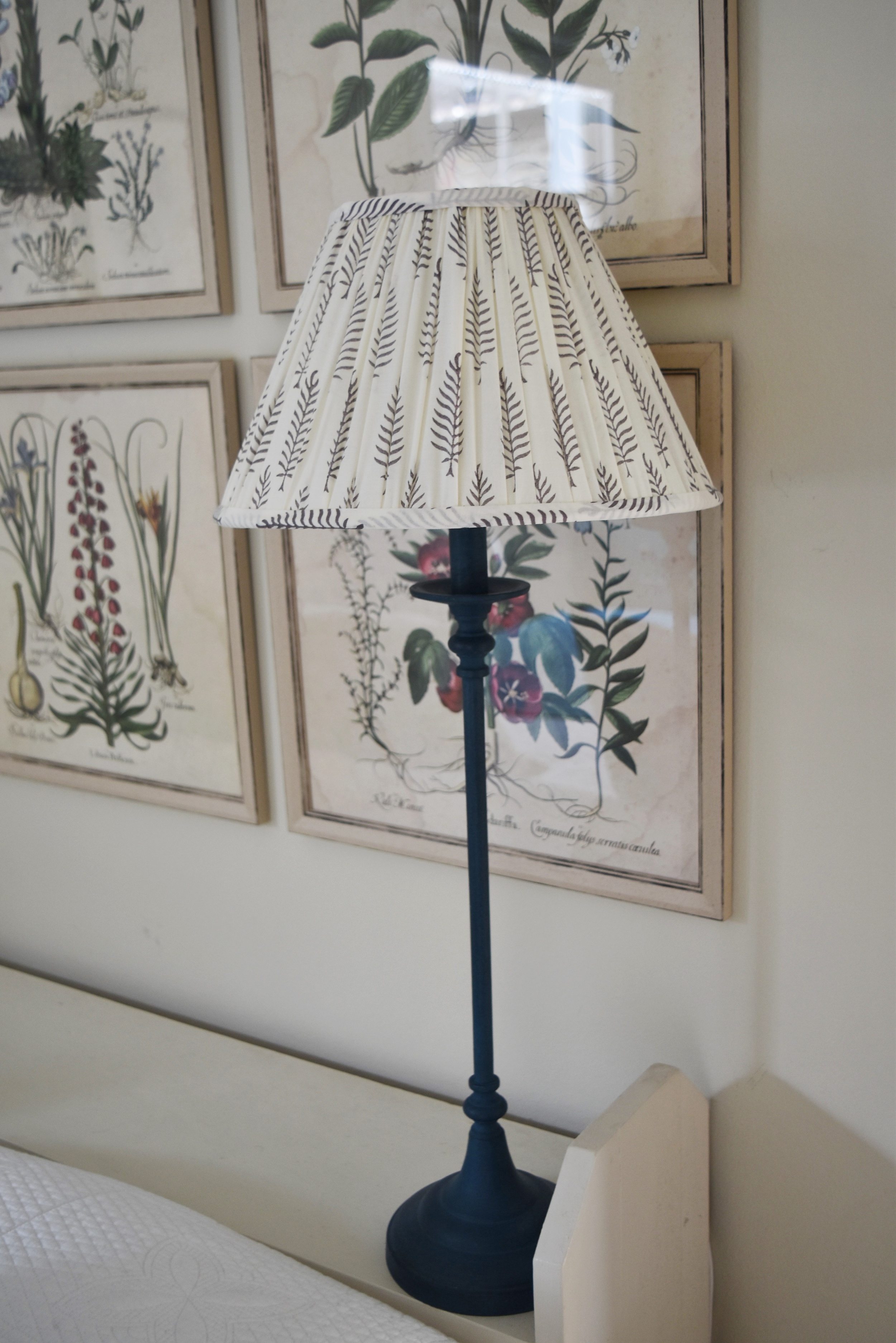
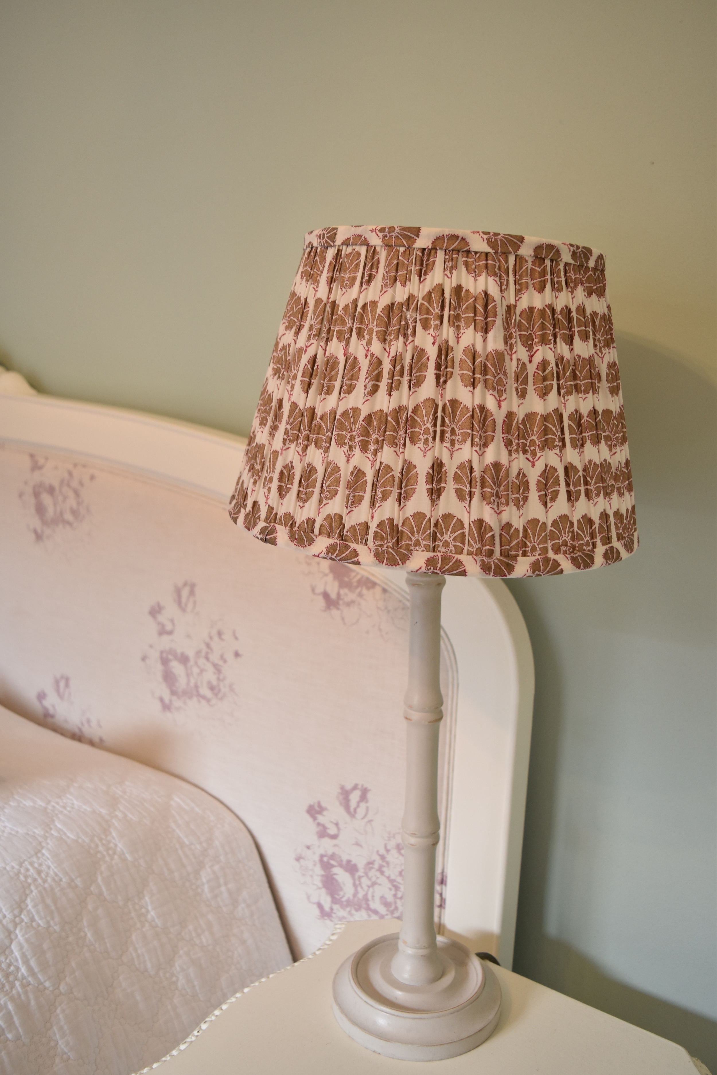
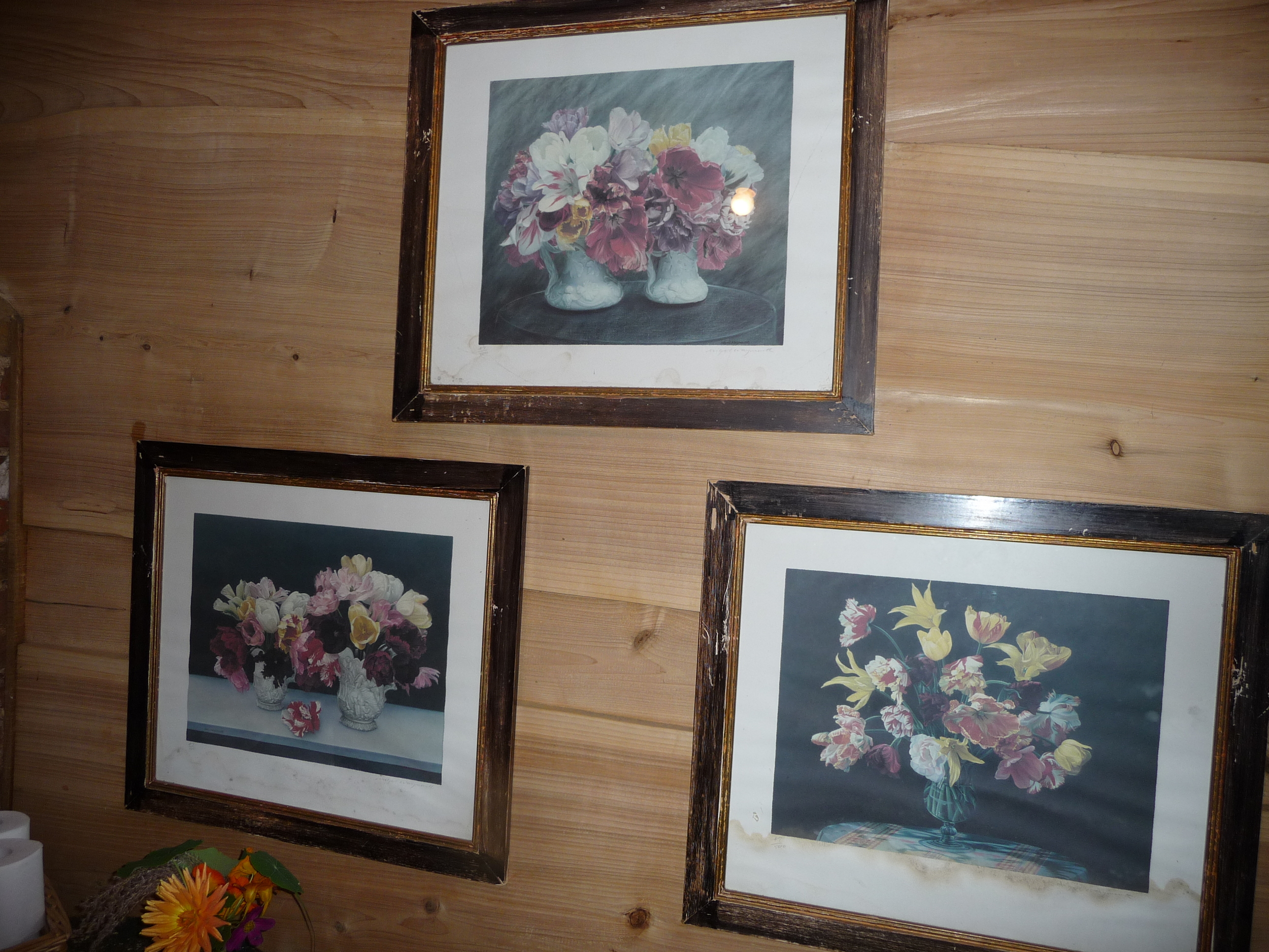
I recently purchased a boxed set by Natural Curiosities of 14 x 14 inch square prints called 'Images for the Inquisitive - Volume 12 - Hortus Eystettensis'. They bear the authentic Latin name of an important 1613 collection of engravings of every species in the palace garden of Prince Bishop of Eichstätt in Bavaria). The box had been sitting in a cupboard and this was the perfect opportunity to have some of them framed and placed as art decor behind the bed. I used my wonderful picture framers, Read and Booth, in Wandsworth Bridge Road, London SW6, who helped me select nine of the prints and a suitable frame (with no mount). I planned to hang them 3 x 3 to add a real sense of drama to the room. The ceilings are very high in the room so there was plenty of space below the picture rail. I also painted the lamp bases in Annie Sloan's 'Aubusson Blue' and bought a pair with a lovely botanical fern pattern pleated shades by Pooky Lighting.
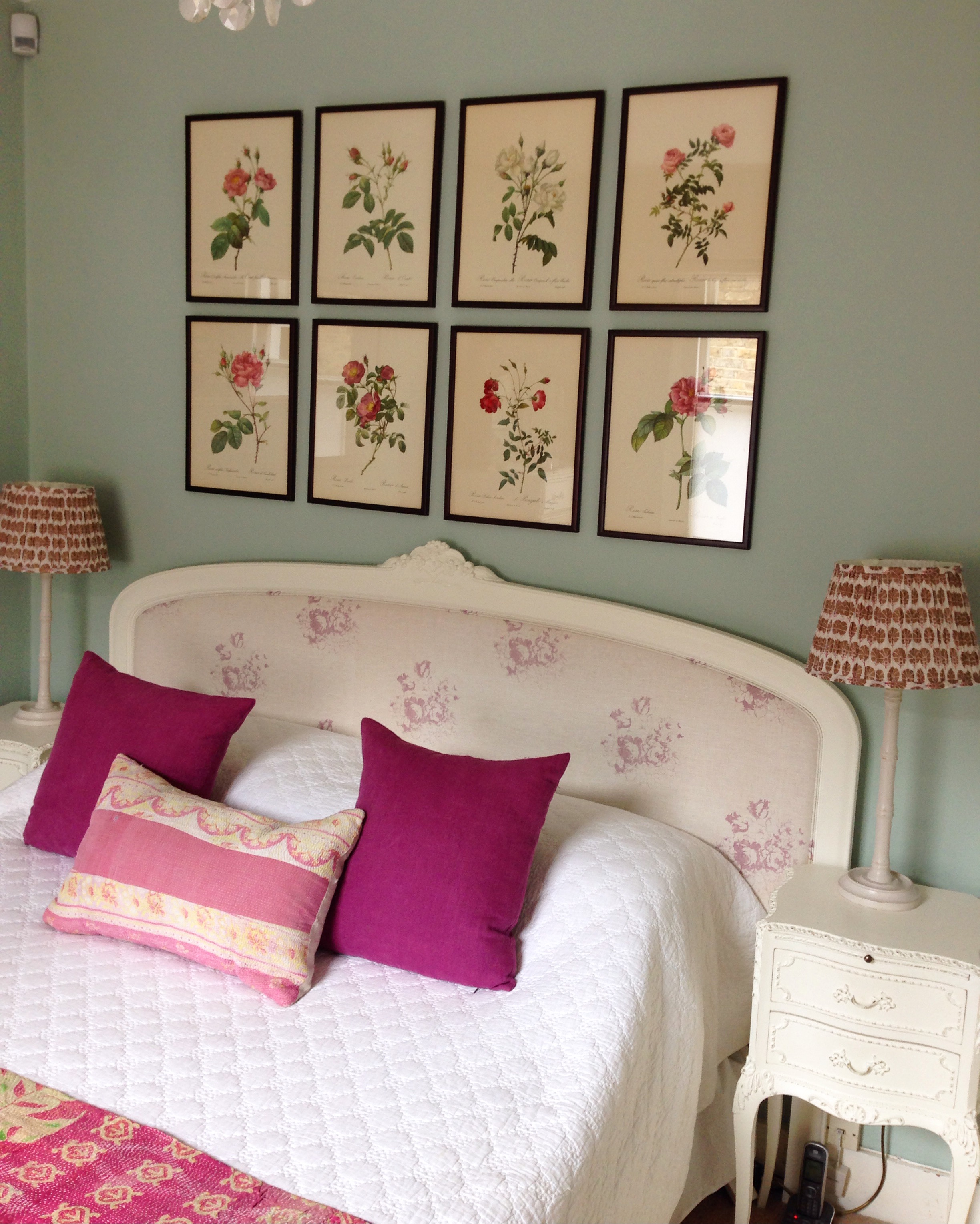
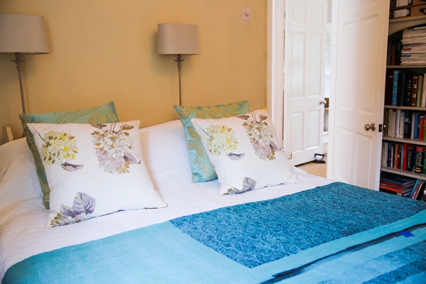
In the other bedroom there is a headboard but the wall above the headboard needed something on it to complement the headboard and add a wow factor.
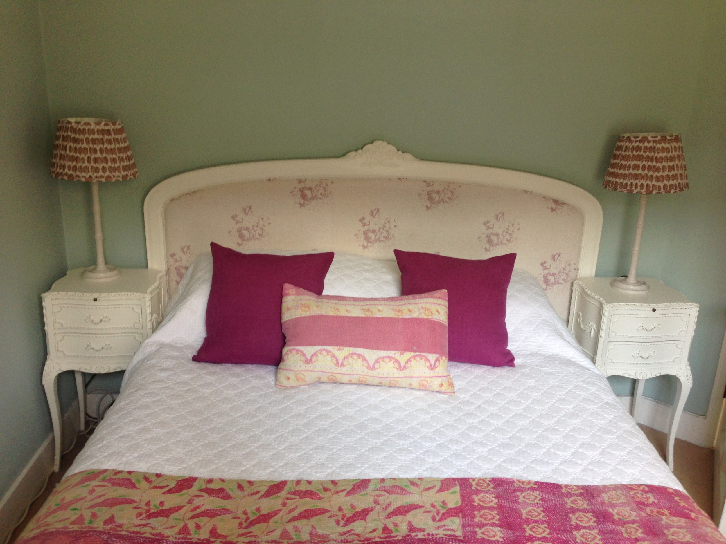
I had forgotten all about a very old book of Pierre-Joseph Redouté rose prints that was my grandmother's. Belgian born Redouté achieved success as a painter working for the French royal court as a tutor to Marie Antoinette and later from 1798 was appointed to paint the flowers of Malmaison by Josephine Bonaparte. His famous published works include 'Les Liliacées' and 'Les Roses'. This version of 'Les Roses' was published in 1954 and I had rescued it from my grandmother's house in New Zealand when she passed away over 40 years ago!! I had a light bulb moment and decided to create a group of framed rose prints above the bed as the colours would beautifully complement the headboard and the colours of the cushions and Kantha throw. Also, the wall colour, Farrow & Ball 'Teresa's Green' would provide the perfect colour to enhance their beauty. Once again my lovely framers, David and James from Read and Booth helped me select the eight prints from the book and a suitable frame. The frame is a reddish-brown wood which really works well with the background colour of the prints and the red/pink colours of the roses.
I hope I have inspired you to use art in a bedroom in place of a headboard or even to enhance a headboard. I would love to see what you have done with the wall above your bed(s) so do send me pics.
You may also like to read
Featured


Back to Petersham for inspiration and sourcing
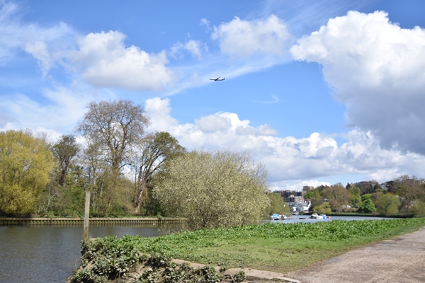
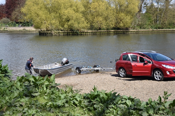
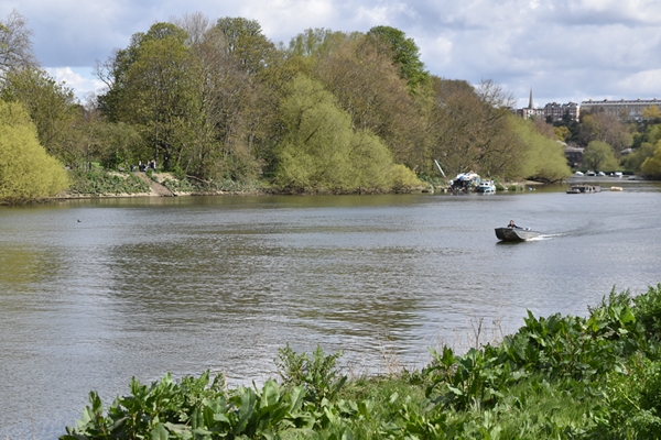
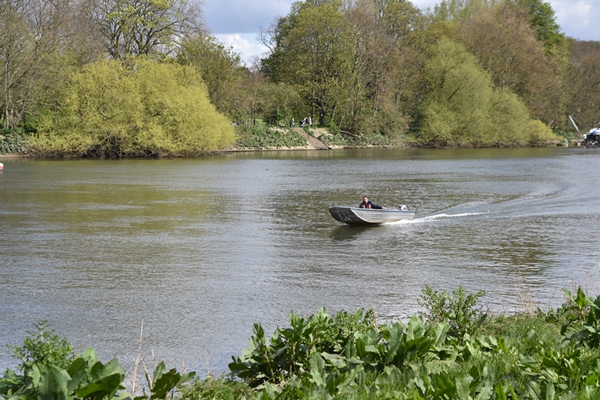
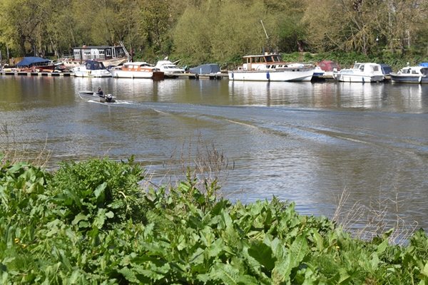
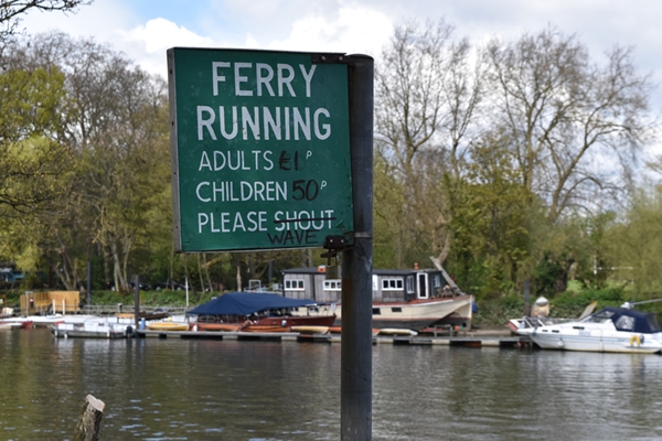
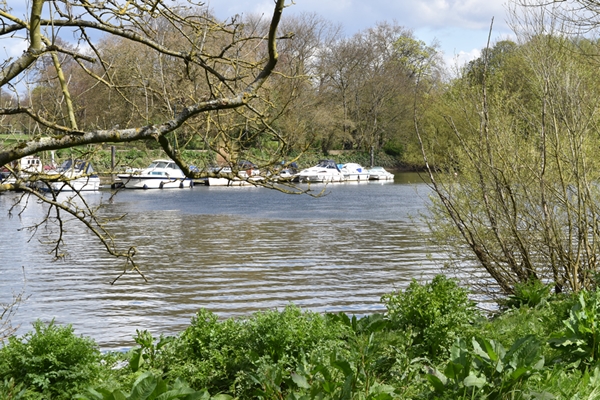
Hi everyone. I went back to Petersham Nurseries this week armed with my Nikon D5500 camera. It was a sunny but cold day and I decided to take a walk along the Thames before lunch (Petersham Nurseries is a stone's throw from the river). There was even someone launching a boat and taking a jaunt up the river, despite the cold.
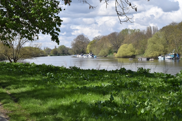

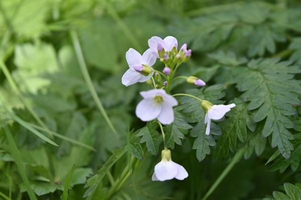
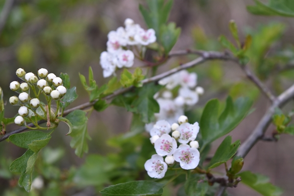
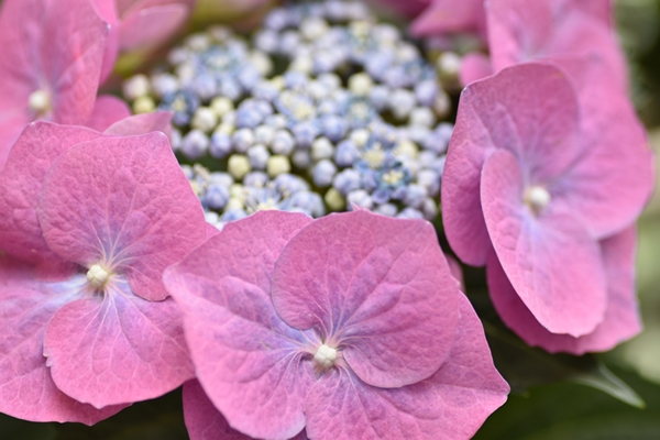
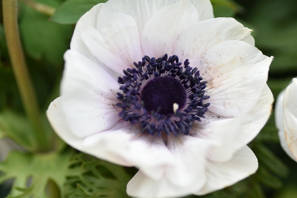
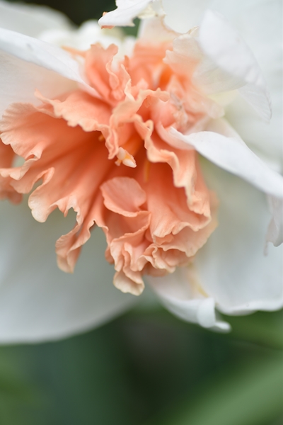
Along the river bank I found some pretty delicate wild flowers

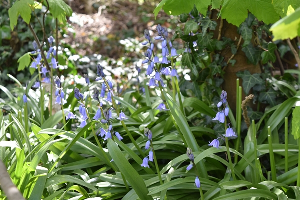

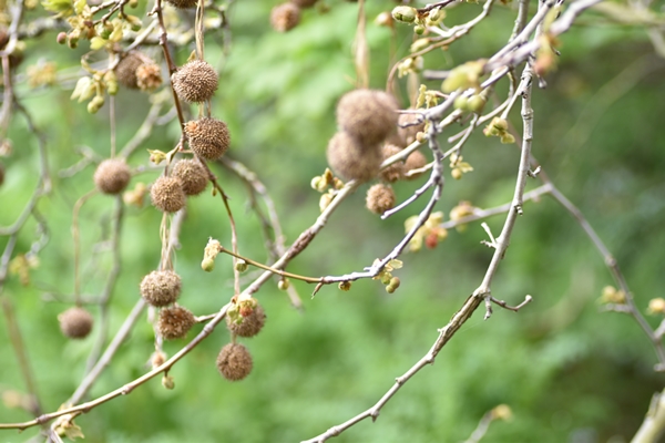
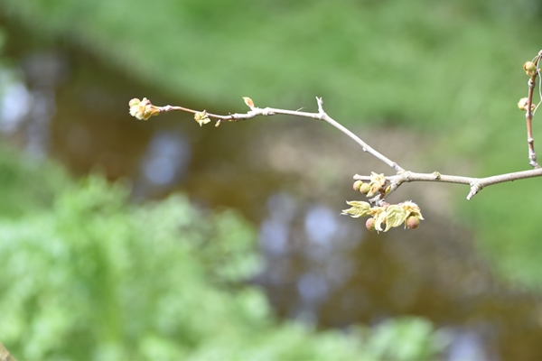
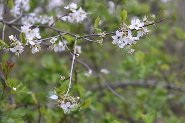
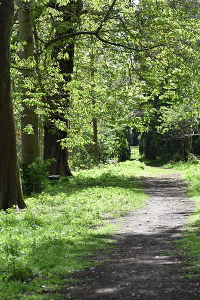
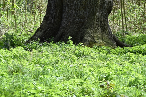
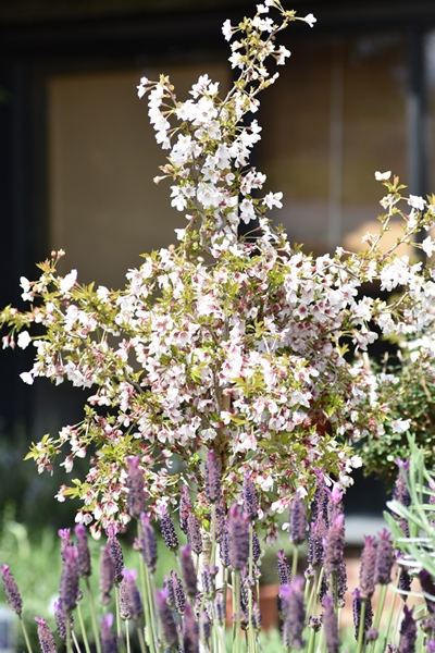
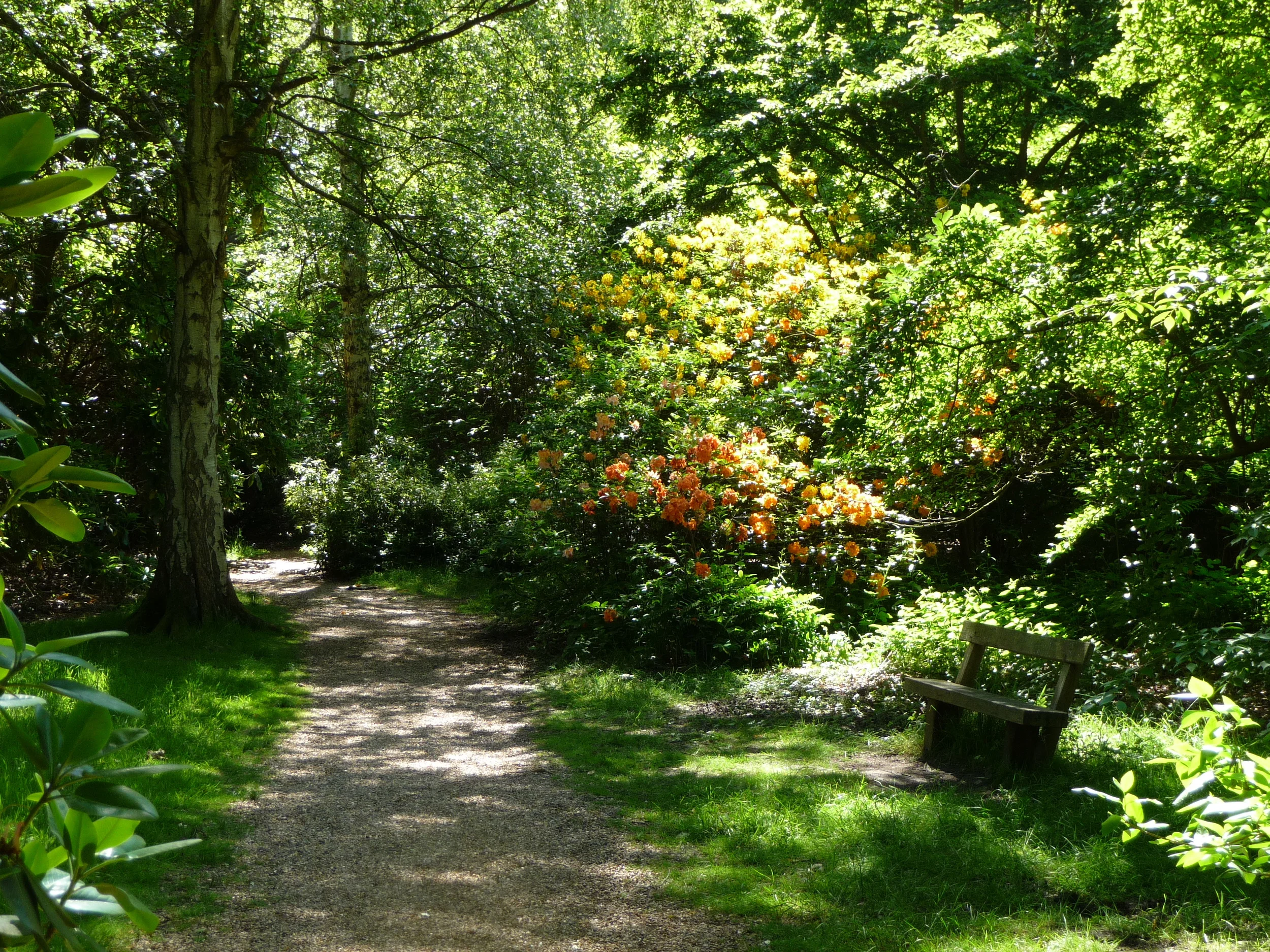
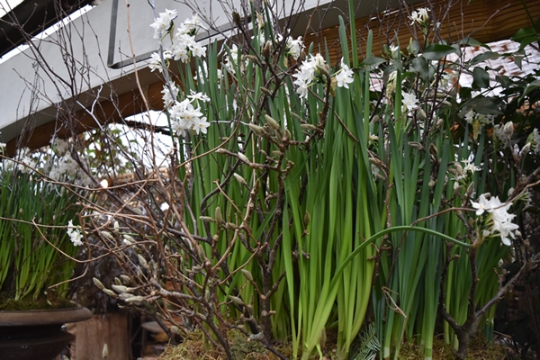
I branched off the towpath along the river into the woodlands of Petersham Lodge. Signs of spring were everywhere:


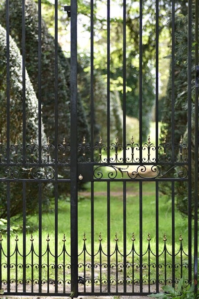
The woods led to a pretty iron gate that separates the gardens of Petersham Lodge (which are private) from the woodlands.


The Belted Galloways are back in the Petersham Meadows by Petersham. Dogs are banned during the grazing season, April to October.

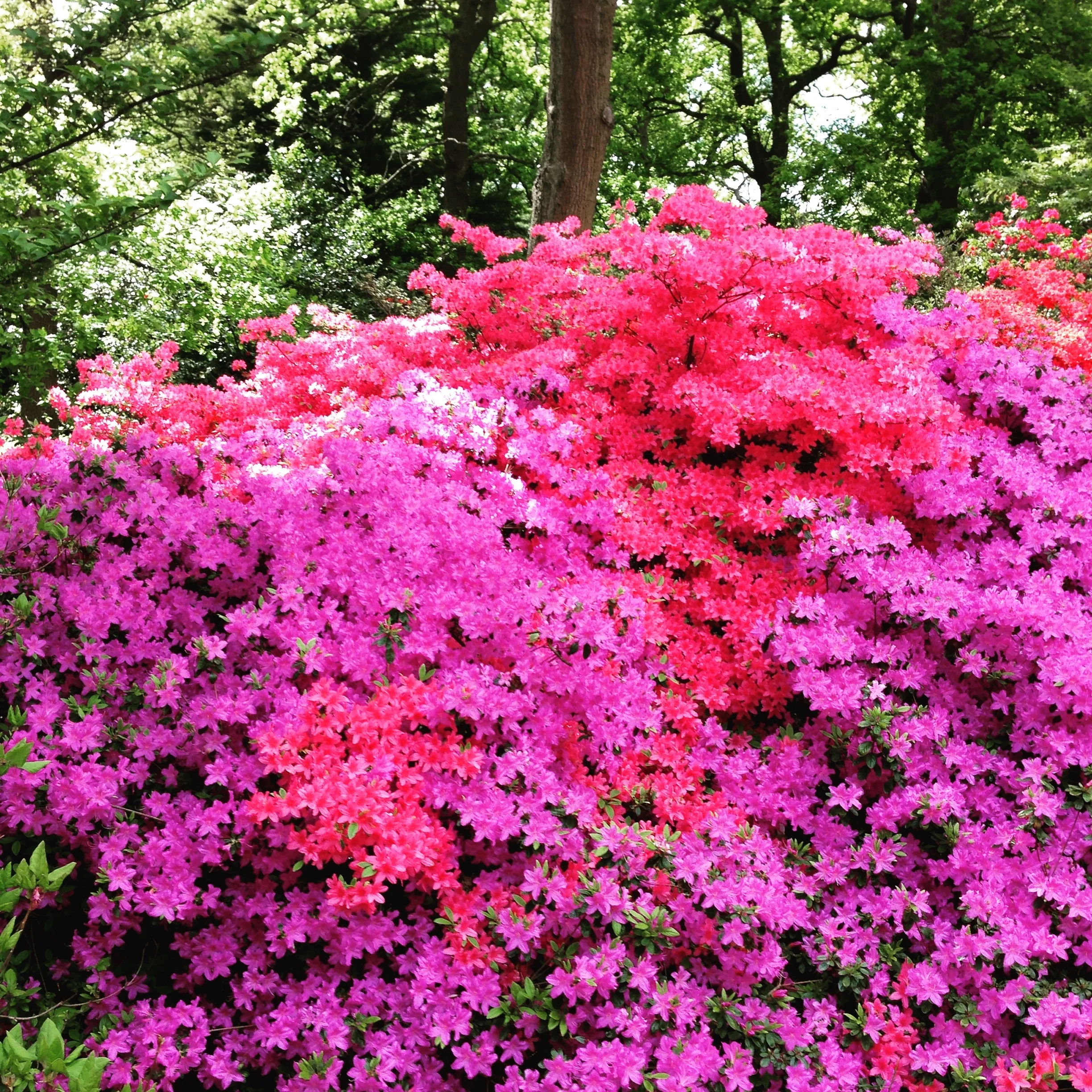
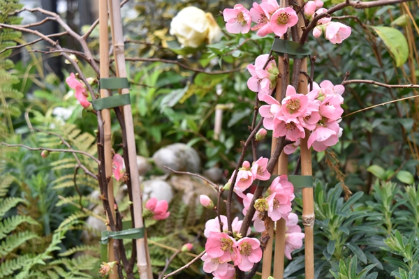
I returned to the Nurseries and spent time before lunch taking photos in the cutting garden where there was a superb display of tulips.


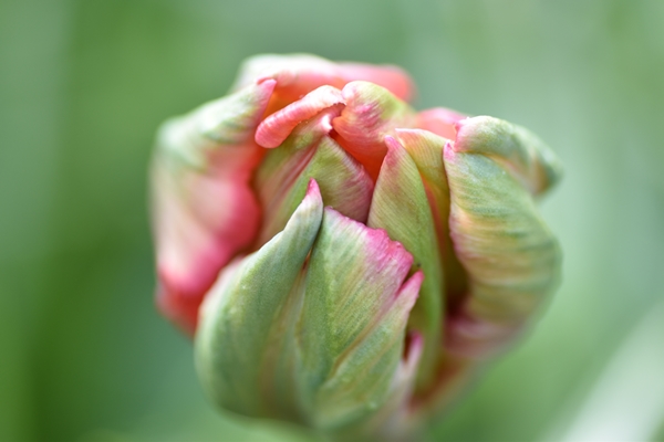


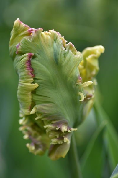

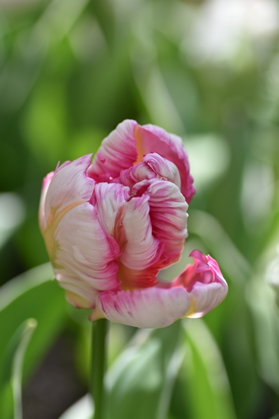


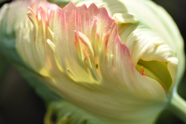

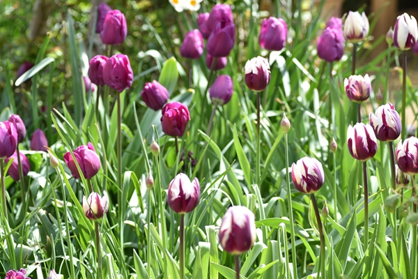
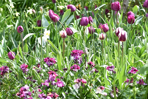
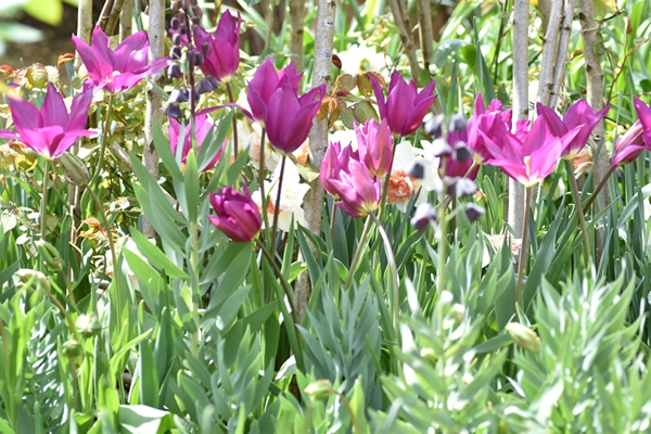
There were so many beautiful flowers to photograph


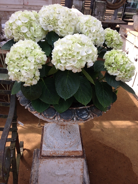
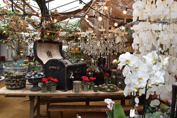
And of course the highlight of my visits to Petersham is the shop. I love the way it is styled with plants, flowers, furniture, accessories etc. And I am always tempted to buy something!


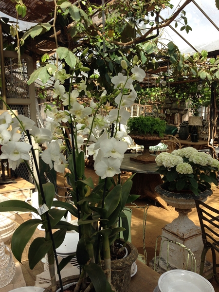
These two beautiful bowls of flowers greeted you as you enter the restaurant
SEEKING STYLE INSPIRATION?
If you’re working on your own home decorating project and looking for some inspiration, please get in touch and see how I can help.
You may also like to read
Make a statement with your table lamps
Hi everyone. Firstly I must apologise for the lack of blog posts in the last few weeks; in fact since 5 March when I posted the last one. I've had a manically busy few weeks having taken on a number of new clients. Also, I am preparing for a photo shoot of my flat in mid April which has been stressing me out somewhat. So I've been furiously upcycling some of my furniture with Annie Sloan paint (separate blog post shortly) and changing lampshades on all my table lamps.
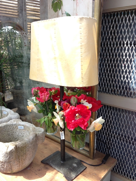
Table lamps can be so boring and serve no other purpose than to provide a lighting source. Gone are the days when you only had a limited choice of shades, mainly 50 shades of beige or cream!! Now you can buy the most divine shades and make a real statement, a wow factor, even if the lamp base is a bit "meh". The reverse is a statement lamp base with a plain shade that doesn't compete. However, beware as you can spend hundreds of pounds on a lamp shade and even thousands of pounds on a lamp base. It's a matter of finding something affordable and you really love.
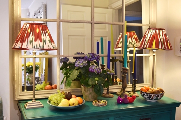
There is a great shop in London called Pooky Lighting which sells affordable and fun lamp bases and shades so I popped in and bought three pairs of lampshades for the bedrooms and kitchen. What a difference they have made to the rooms; the lighting has transformed the spaces from "meh" to "tah-dah" !!!
In the kitchen I changed the shades from plain taupe coloured silk to these gorgeous silk Ikat pleated shades by Pooky Lights. In the sitting room I replaced a pair of beige linen shades in the alcoves with black & white Ikat ones which really draw the eye in.
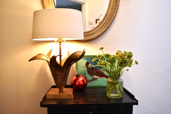
And finally, I bought a rather expensive but absolutely divine lamp base from Nicholas Haslam designed by Paolo Moschino. It is my piece de resistance but one of those items that you see and just have to have!! It is solid handcarved brass and it was the way it opened up like a flower and had such beautiful flowing lines that made me fall in love with it. The jury is out on whether any of my friends like it !!
I would love to hear what sort of table lamps you have and would be happy to offer some advice if you are thinking of changing them so do contact me.
You may also like to read
Featured
Inspiration for home styling
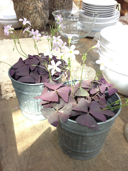
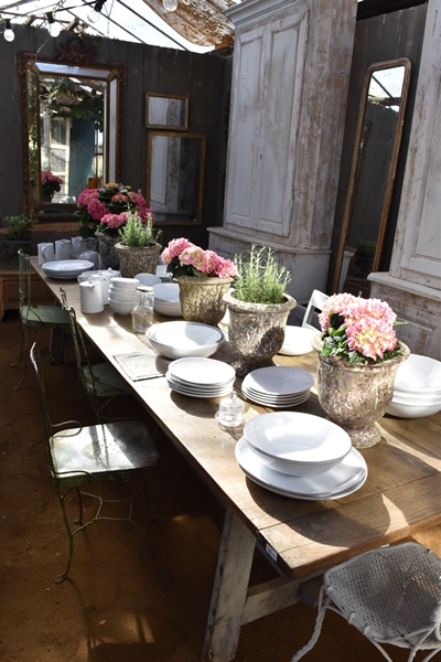
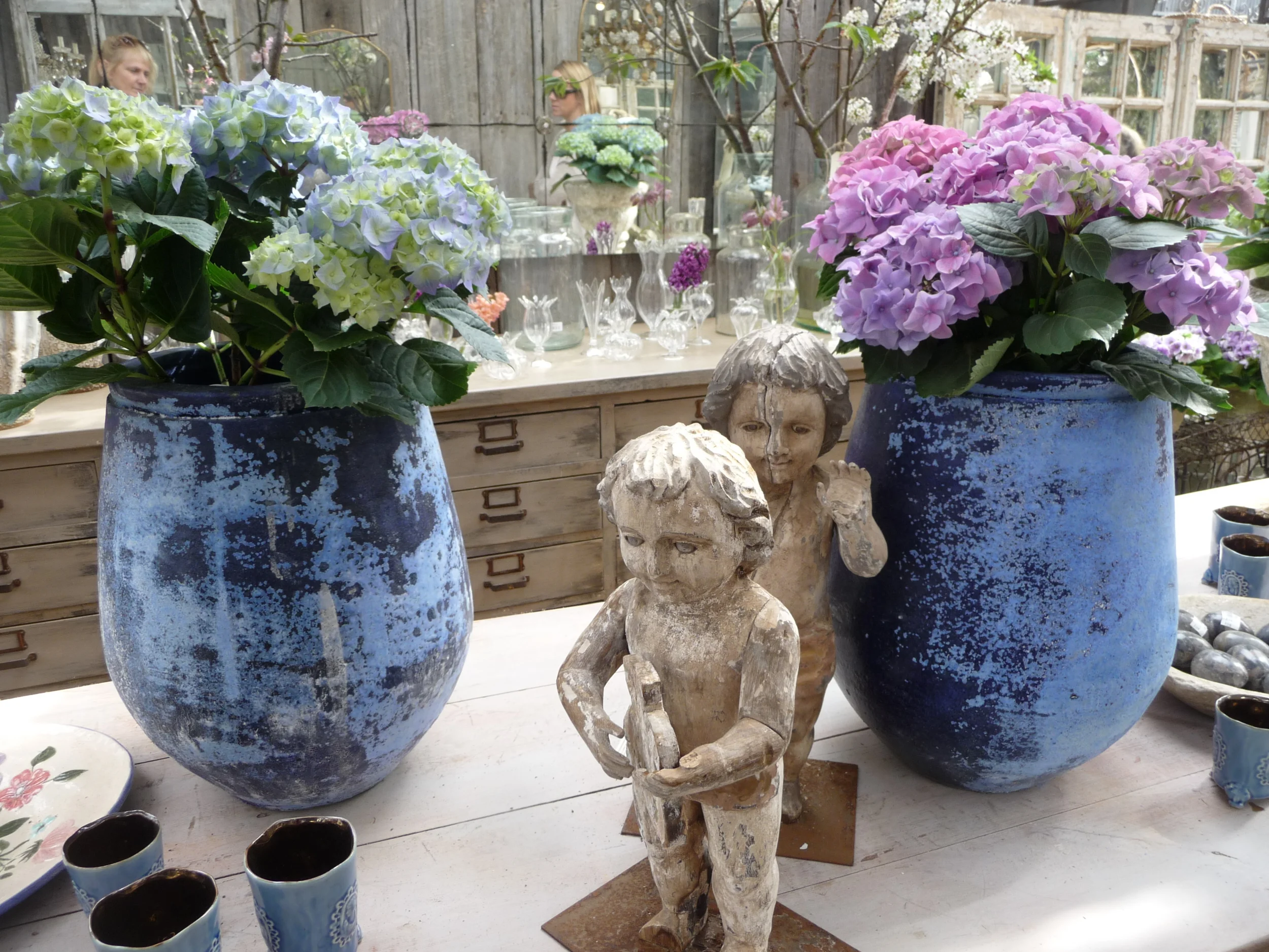
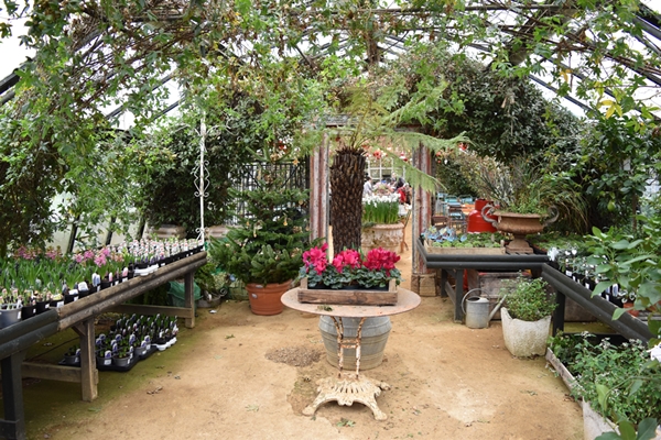
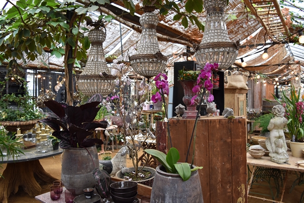
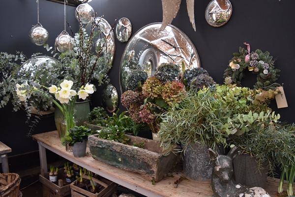
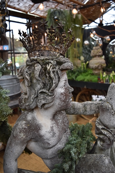
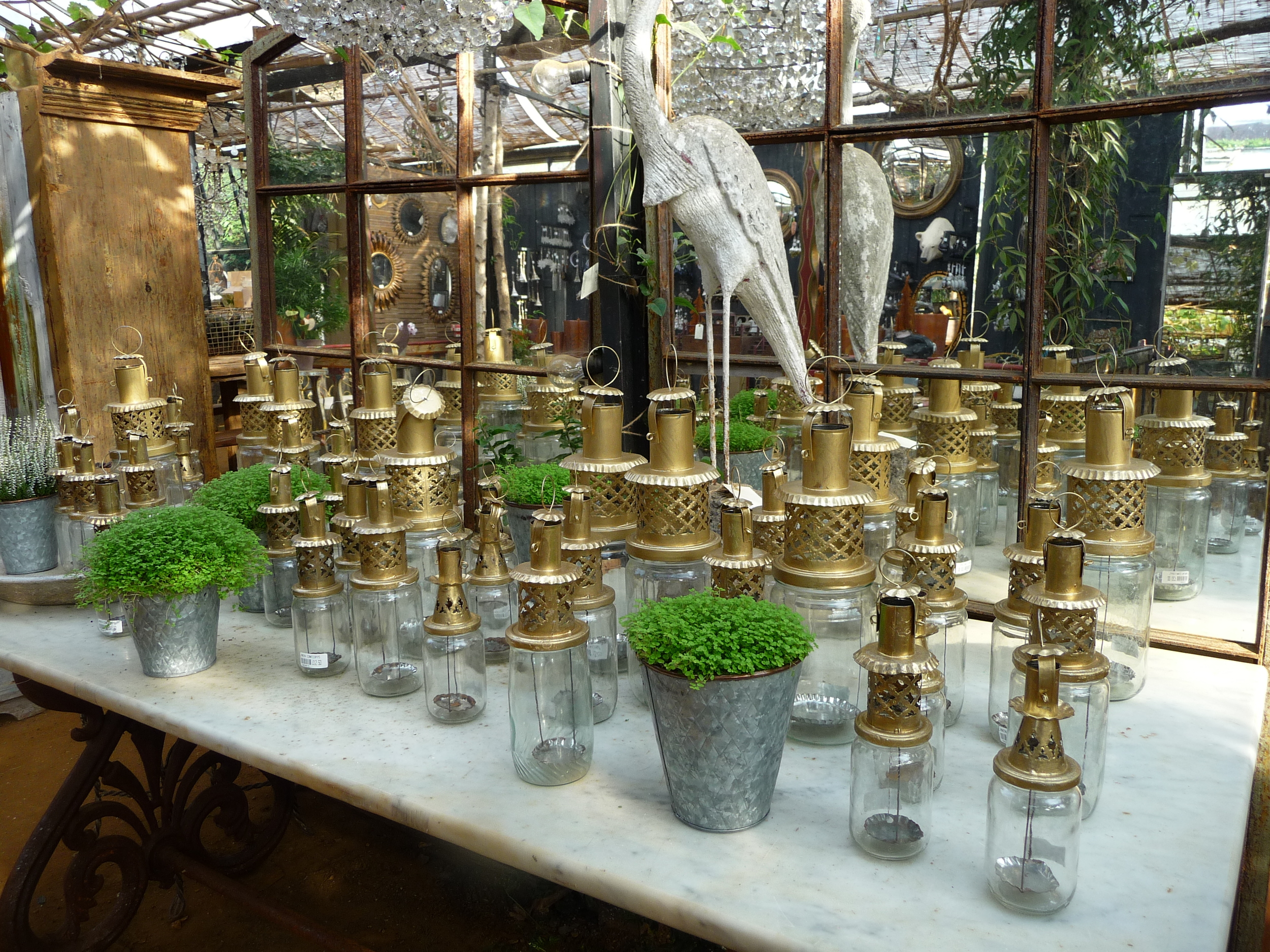
As regular followers of my blog know, one of my favourite haunts is Petersham Nurseries which is about 20 minutes from my home. It's somewhere I go for inspiration and to take photos. It gets my creative juices going and all I want to do is take loads of photos and buy lots of plants and items for the home! I've become quite obsessed with photography since I invested in my first DSLR camera, a Nikon D5500. Macro photography is my passion so Petersham is the perfect place to go as I can take closeups of flowers, plants and the gorgeous items for sale.
The way they style the shop and the glasshouses with plants and flowers is absolutely superb. And there is the added bonus of great food and coffee in the cafe or if I want to treat myself, the other end of the glasshouse where the shop is located is a Michelin star restaurant! The floors in the glasshouses are just earth, even in the Michelin star restaurant but that's what makes Petersham so unique.
If I have some free time and the sun in shining my first thought is to head to Petersham. I could bore you with loads of superlatives but I'd rather stimulate your creative juices with a visual feast. It's not the same as being there in person but it gives you a good idea of why I love the place so much.
Some advice when looking at the photos below. Look at the way they style the items in the shop as this should help you when you style your own home - the way they group items, colours they put together, textures etc. This is one of the things that I really find helpful when I go there. I hope you enjoy my photography; don't all budding photographers aim to take the perfect photo?!
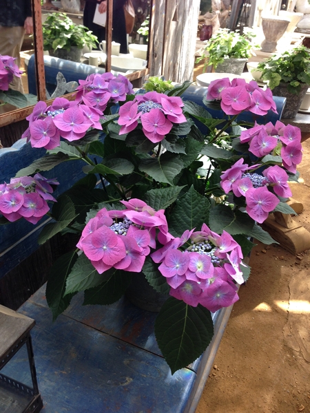
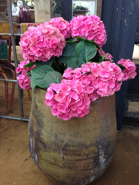
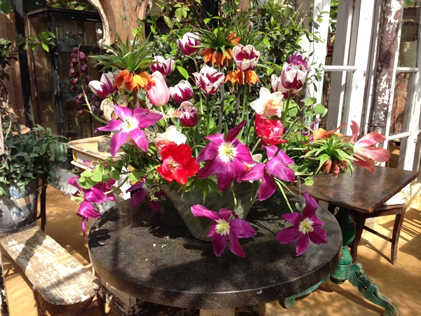
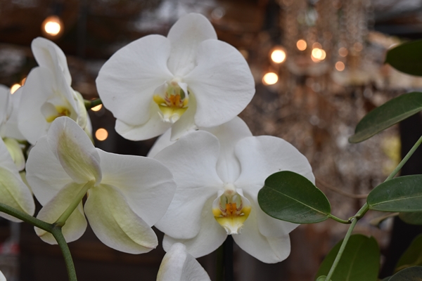
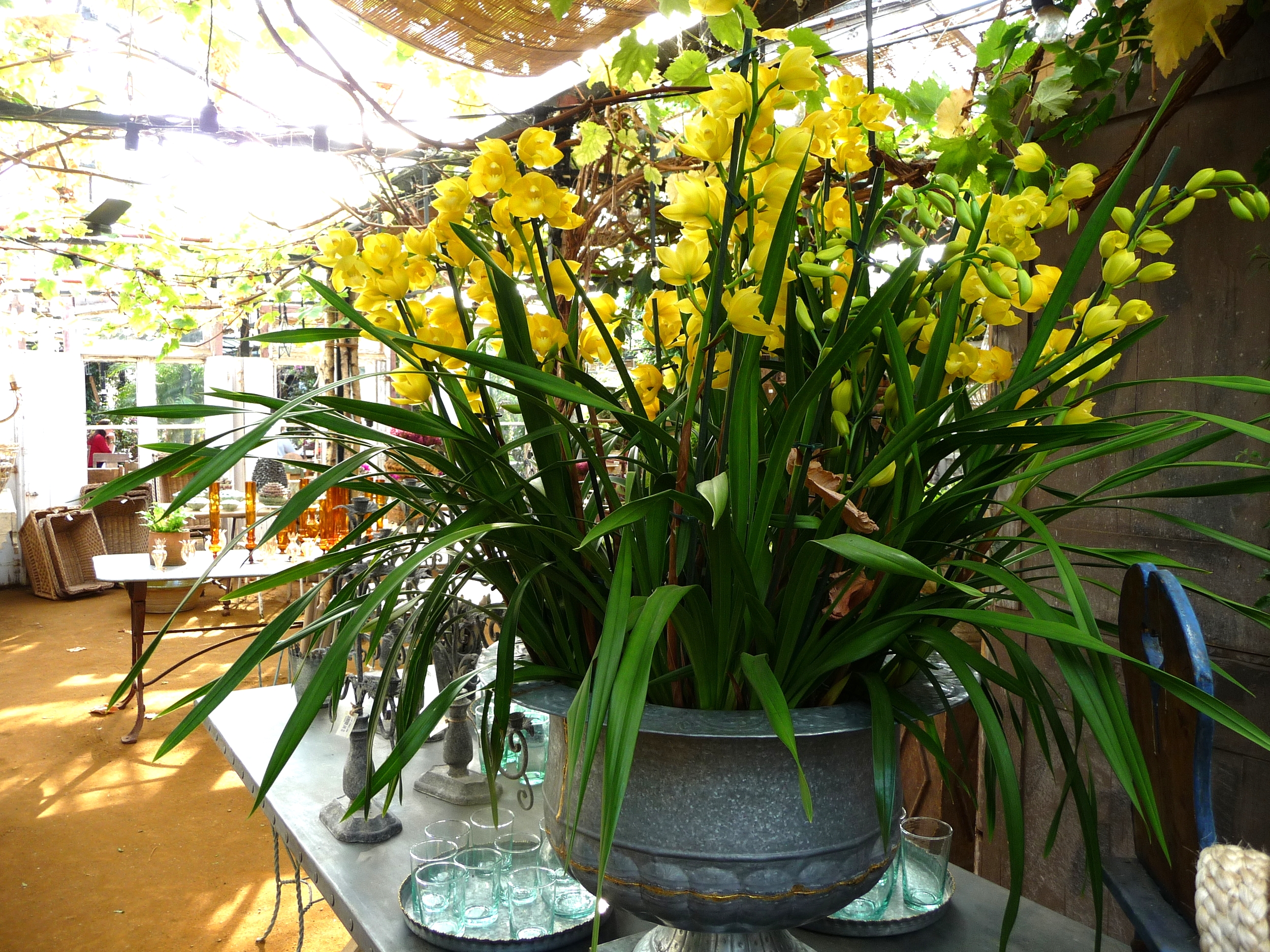
I'll start with some closeups of the flowers


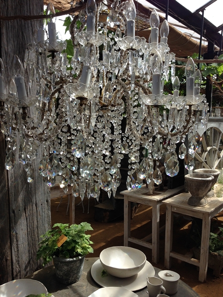
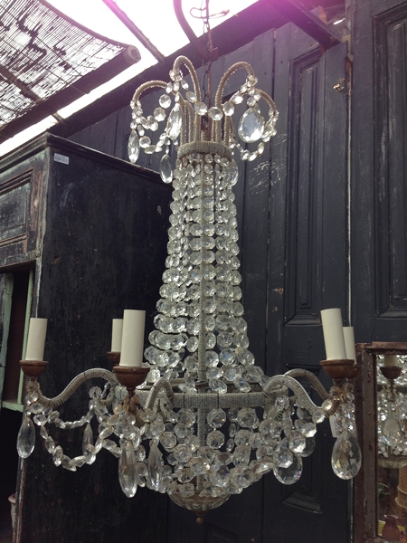
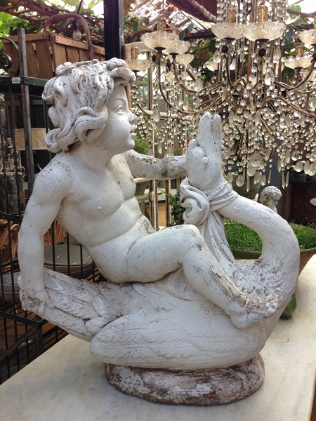
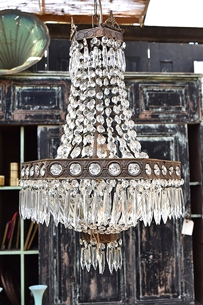
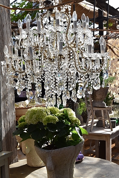
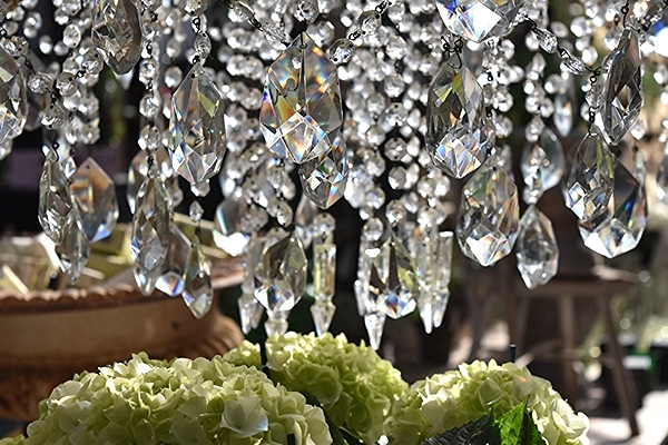
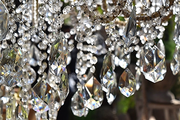
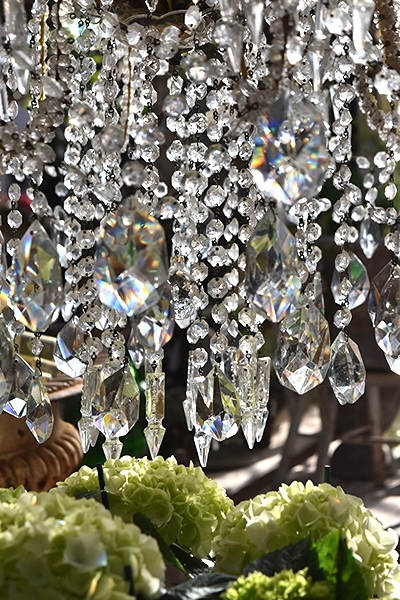
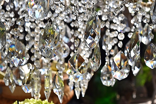
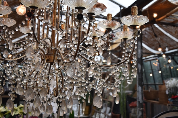
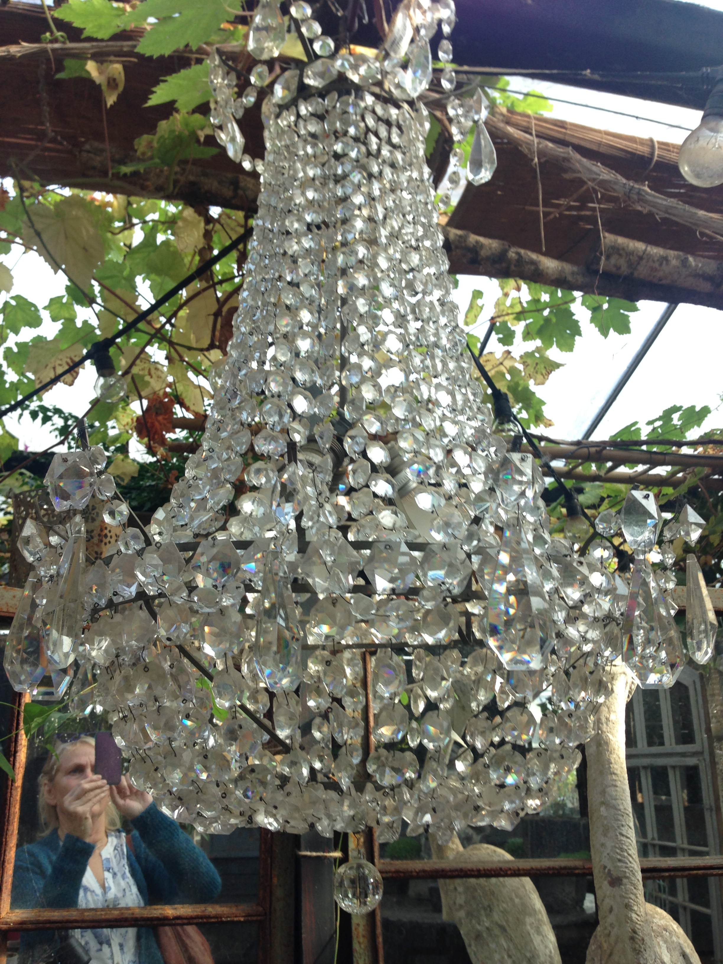
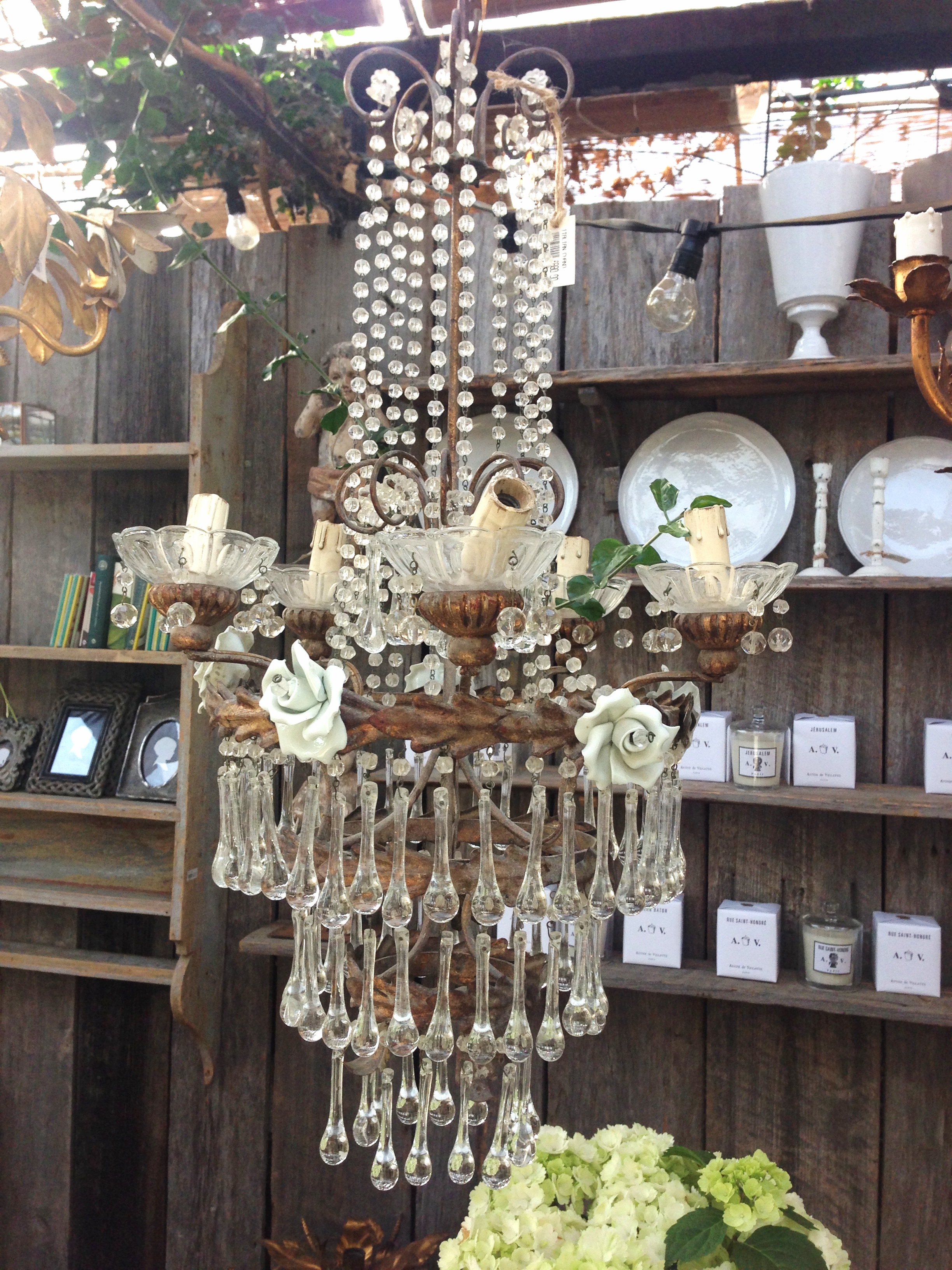
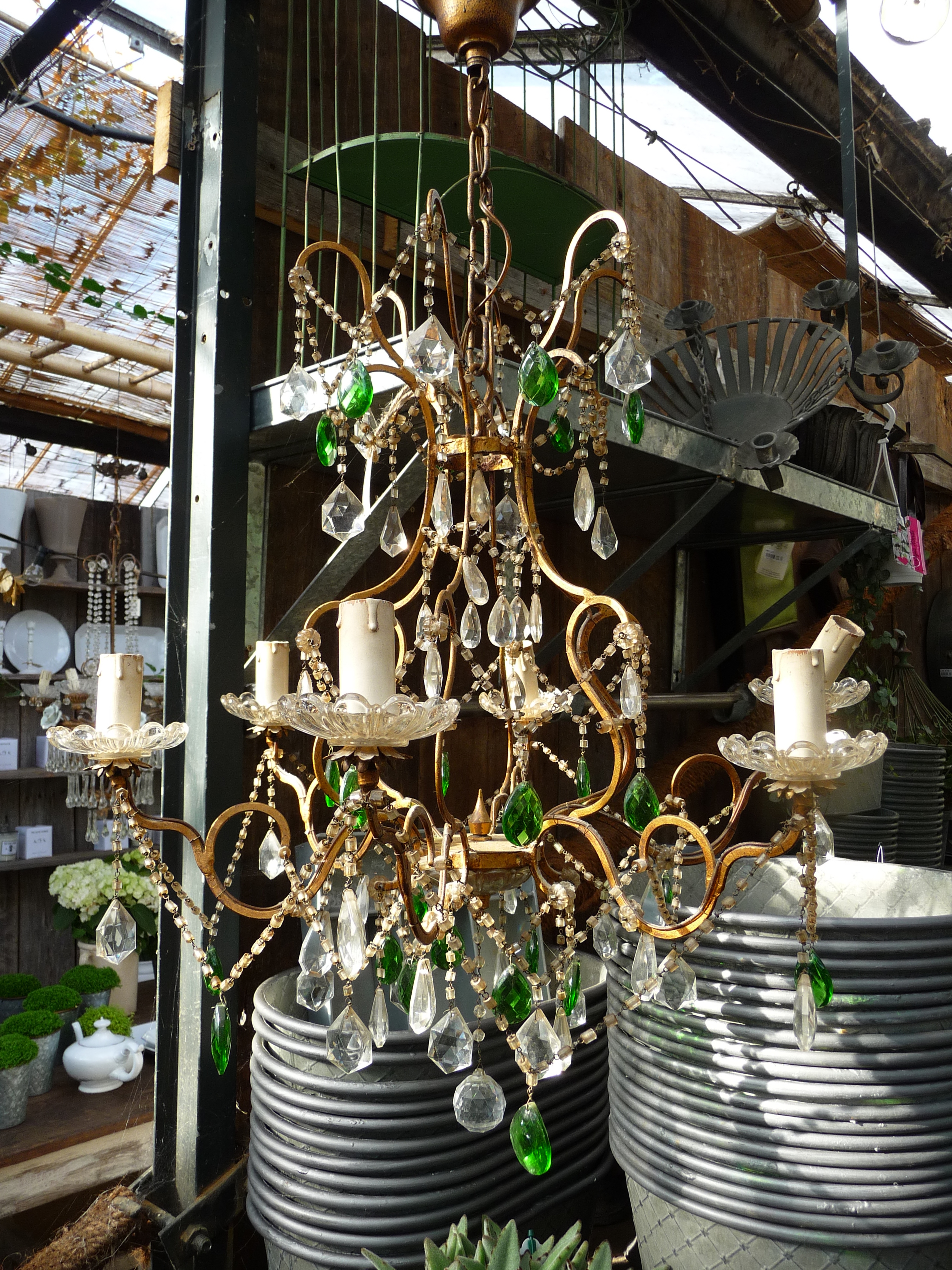
I have a passion for vintage chandeliers and Petersham always has a range of the most beautiful ones (in fact I bought a small antique French chandelier from them a few weeks ago which is being wired up currently and will then have pride of place of my kitchen table).
The sun was shining on one particularly large chandelier this time, and I was mesmorised by the colours in the crystals so became rather "trigger happy" with my camera. These images come with a health warning - you may need your dark glasses on !
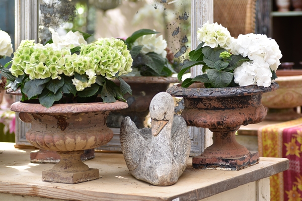
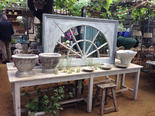
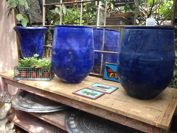
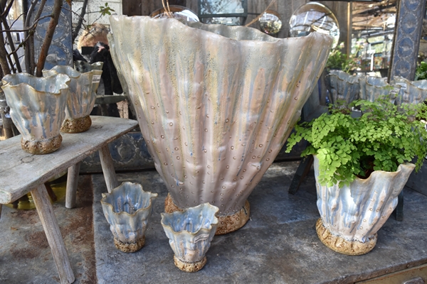
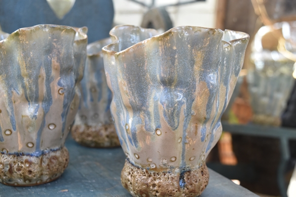
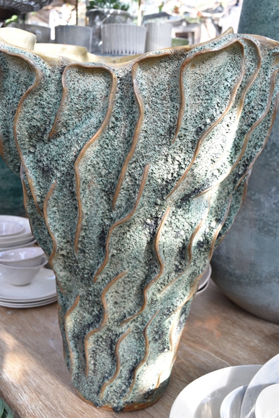
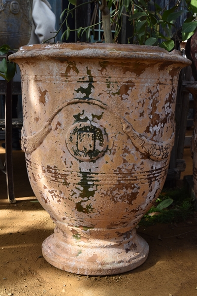
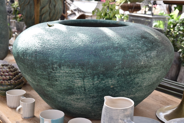
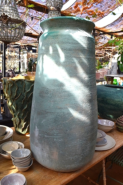
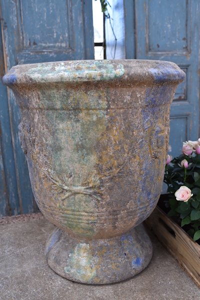
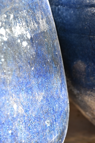
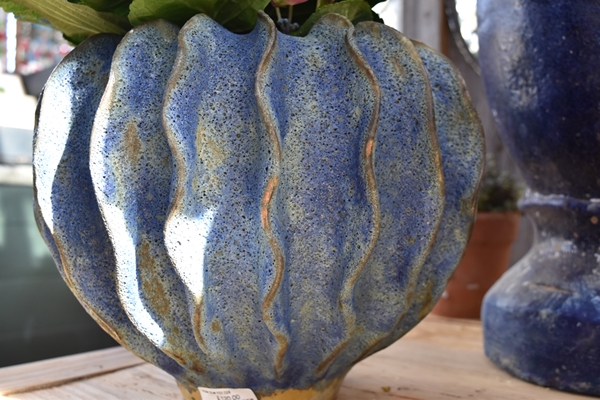
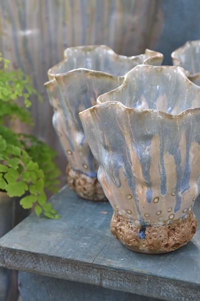
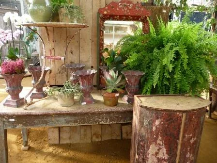
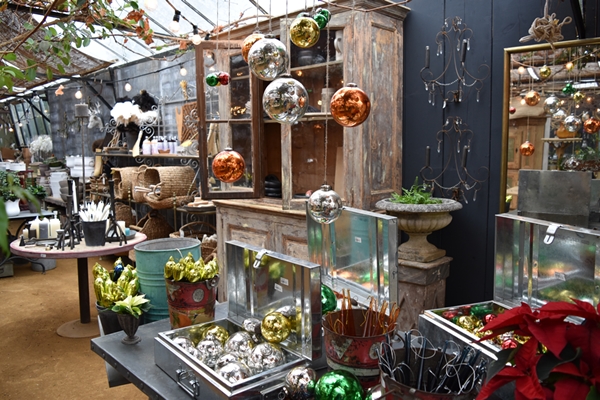
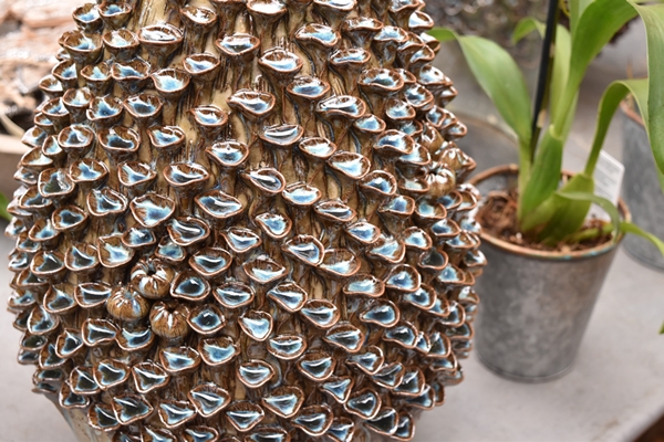
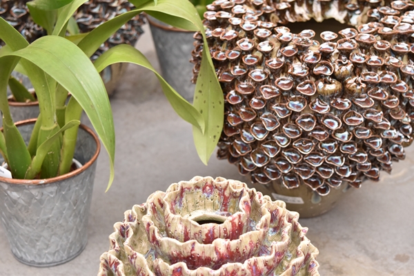
There was a lot of new stock in the shop since I was last there a week ago and quite a number of ceramic pots with incredible shapes and textures. You can see from the scale of the small items next to these pots the sheer size of some of them.
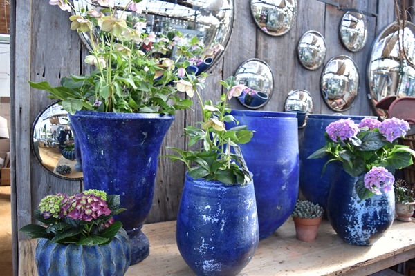
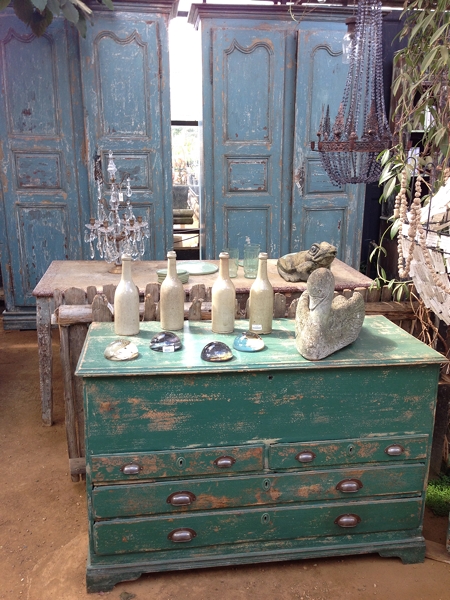
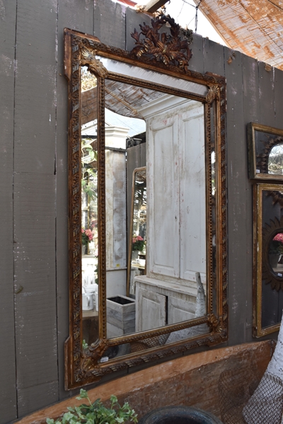
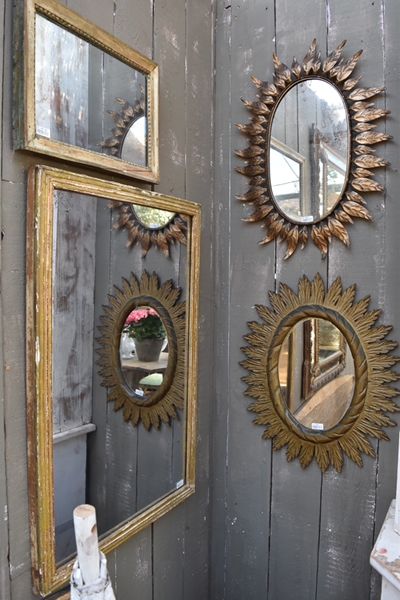
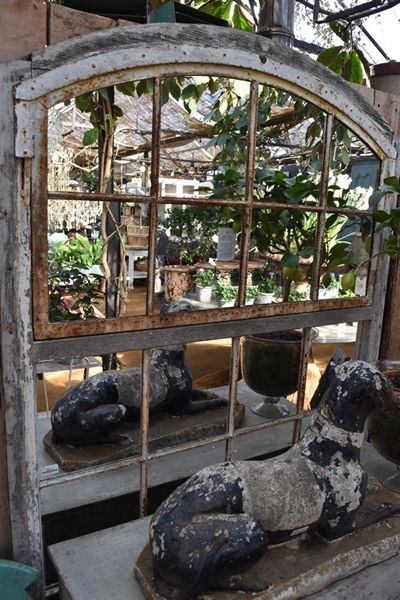
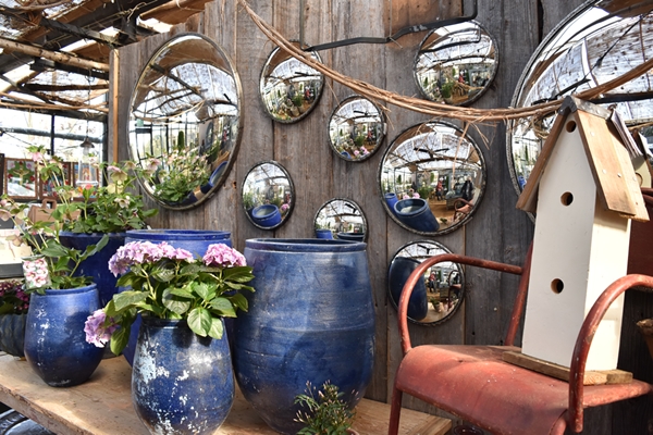
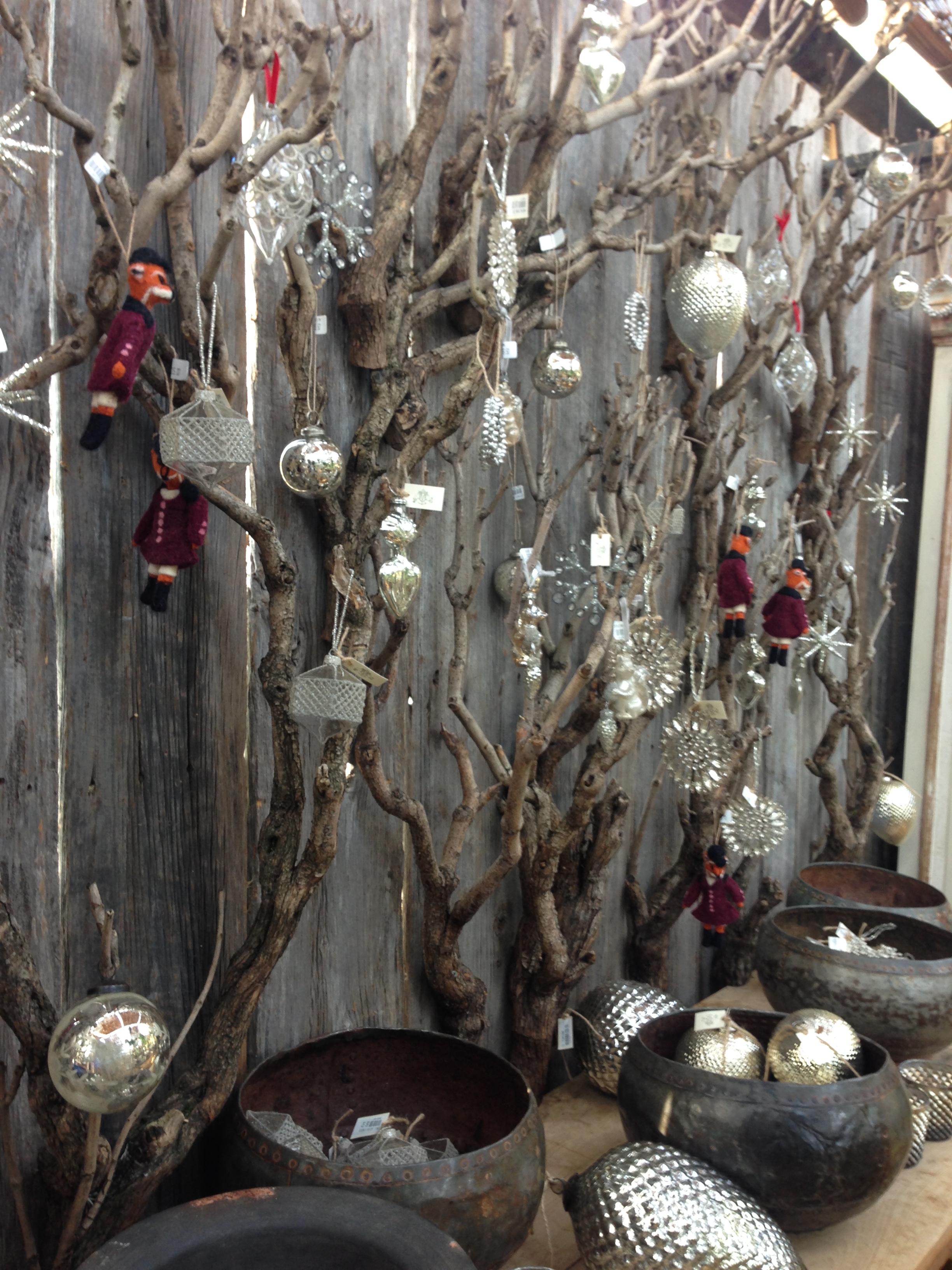
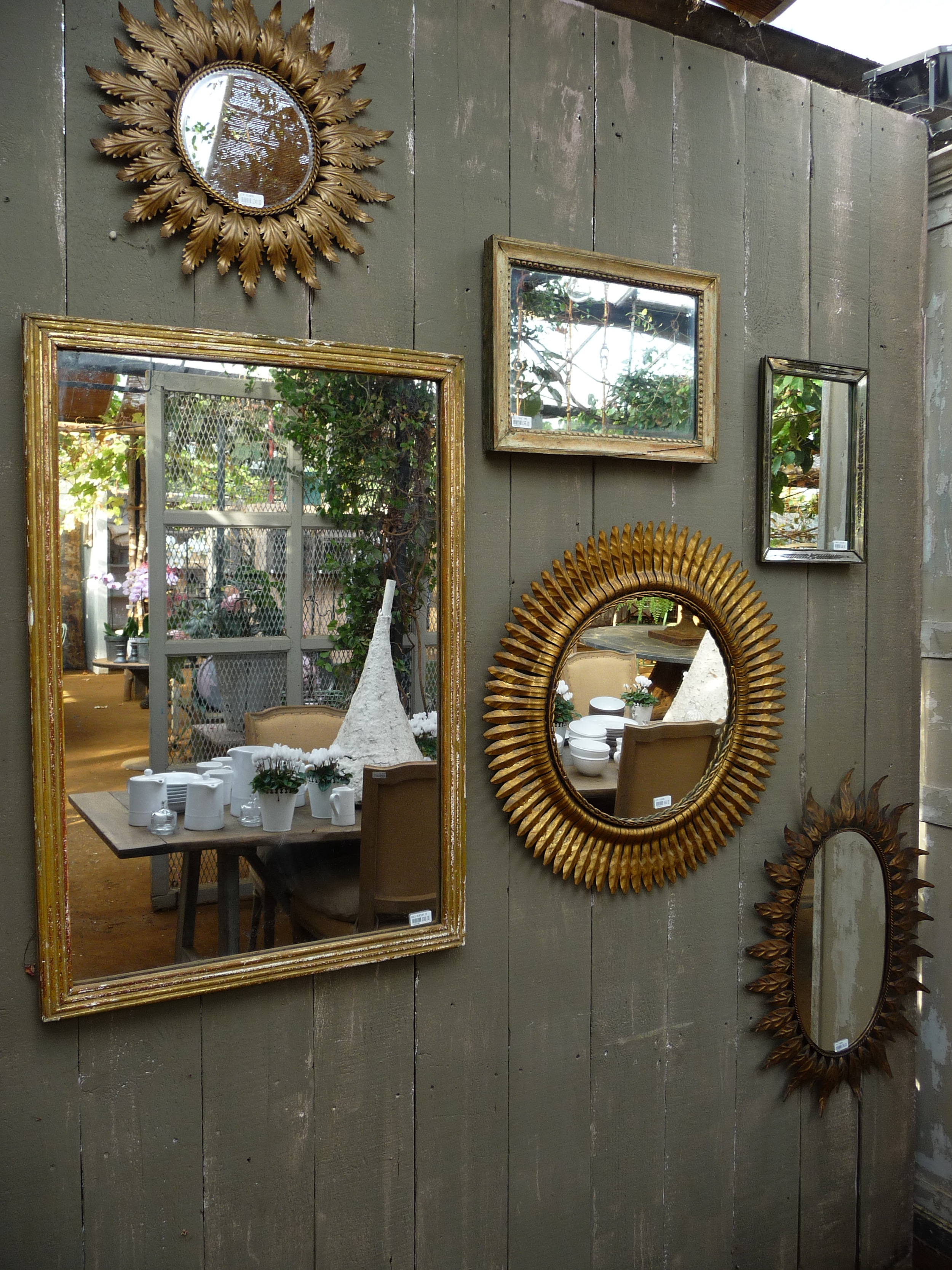
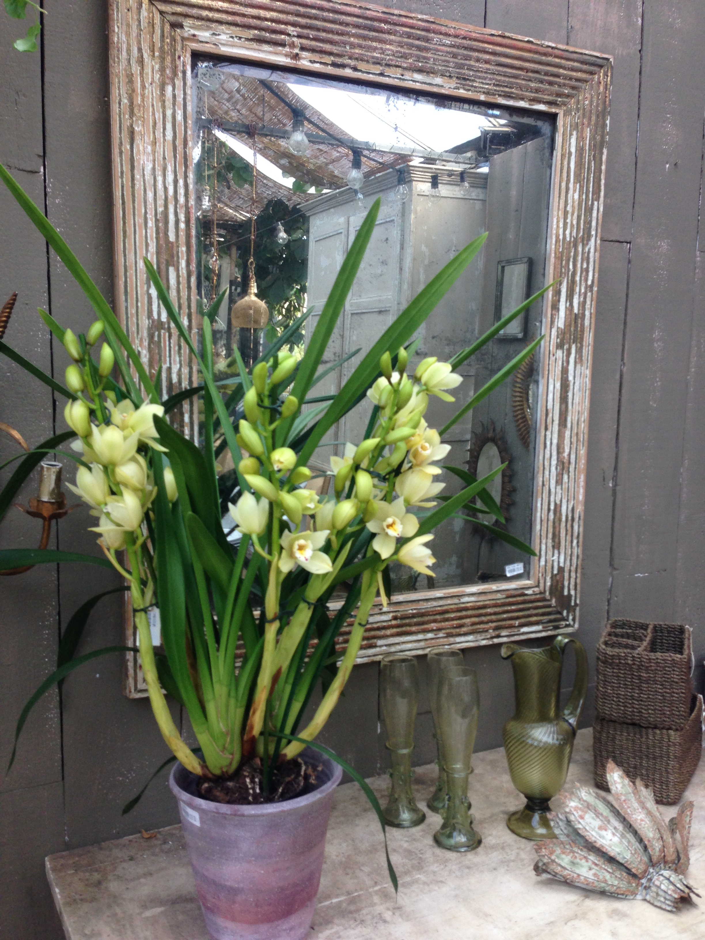
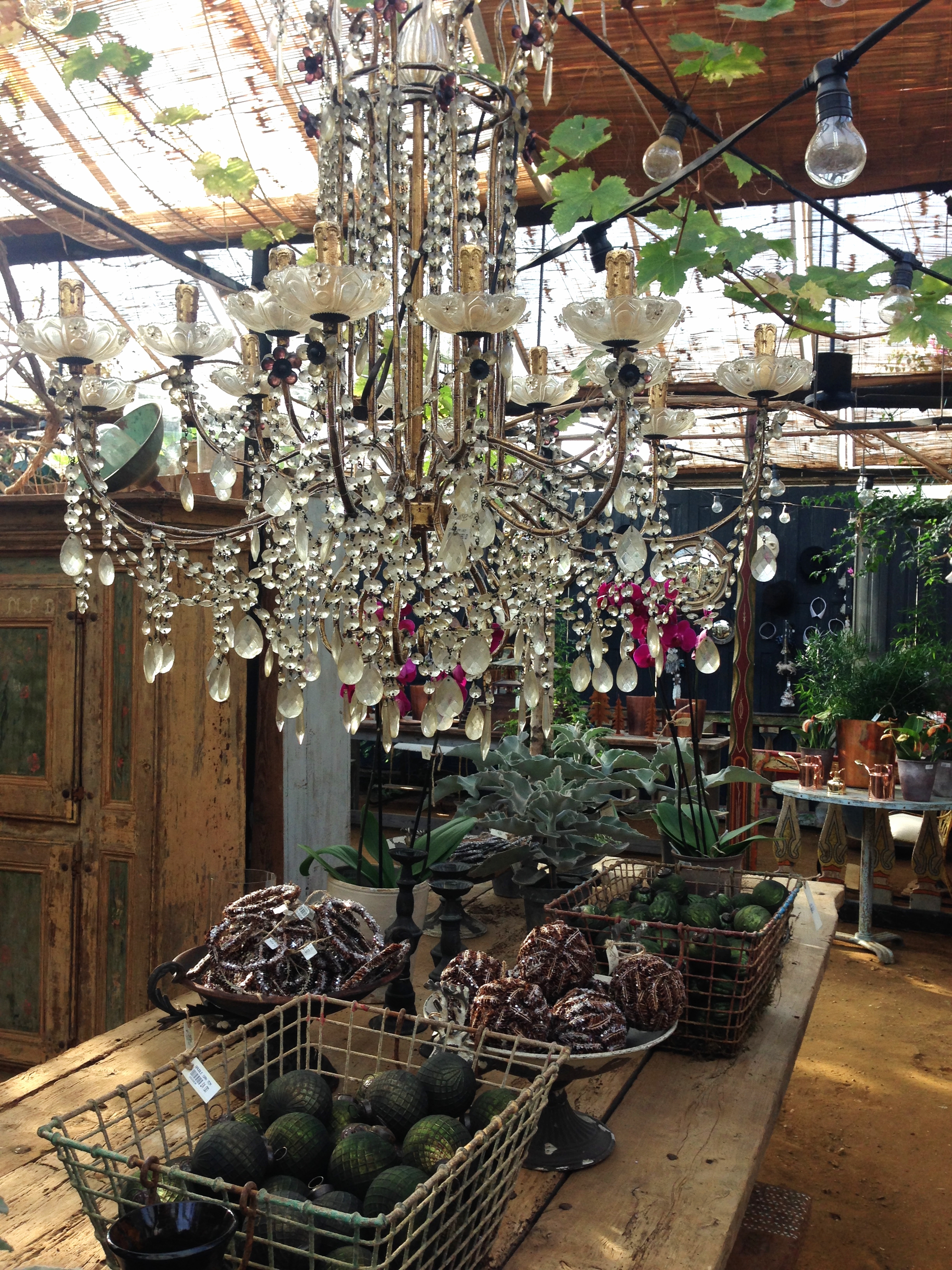
Petersham always has a good selection of vintage mirrors. I have bought quite a few over the years and recently have been buying some of their convex mirrors in various sizes. And then there are so many other interesting items on display which you think "I want that" but then "where can I put it in my home?" and then "oh heck, who cares, I just want it" and you go ahead and buy it !!
I hope you enjoyed these images and that they have given you some fresh ideas about how to style your own home. If you have any questions or comments, please don't hesitate to contact me.
You may also like to read
Featured


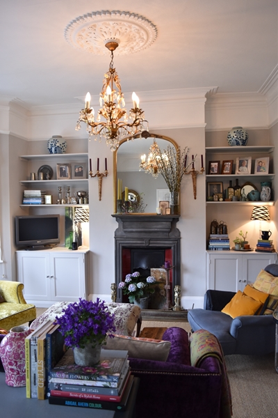
Decorating living spaces with grey
I decorated and styled the ground floor living spaces of a Victorian home in South West London. The clients love the colour grey but weren't averse to pops of colour.
Read moreFind inspiration for Christmas at Petersham Nurseries
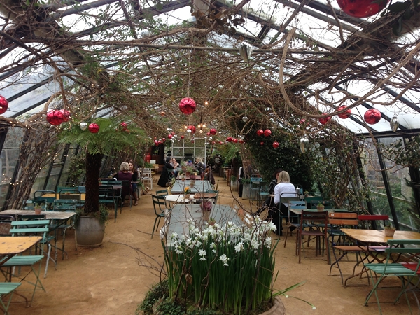
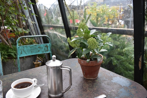
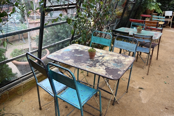
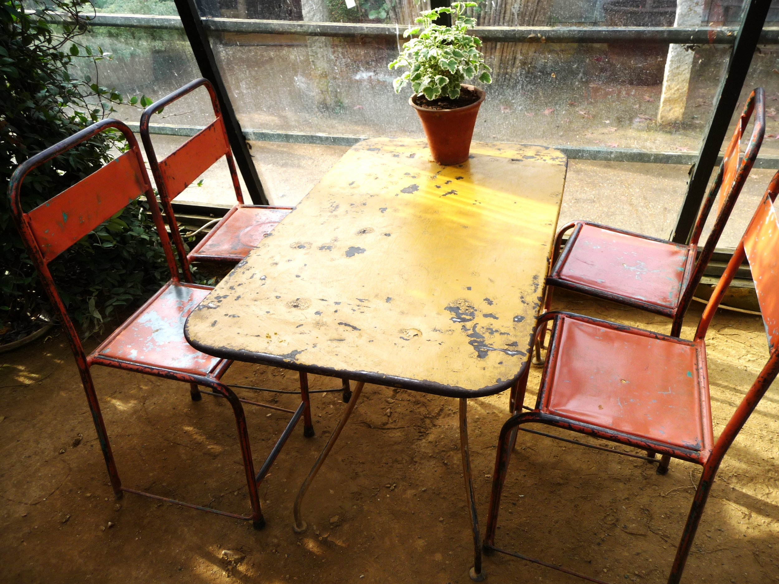
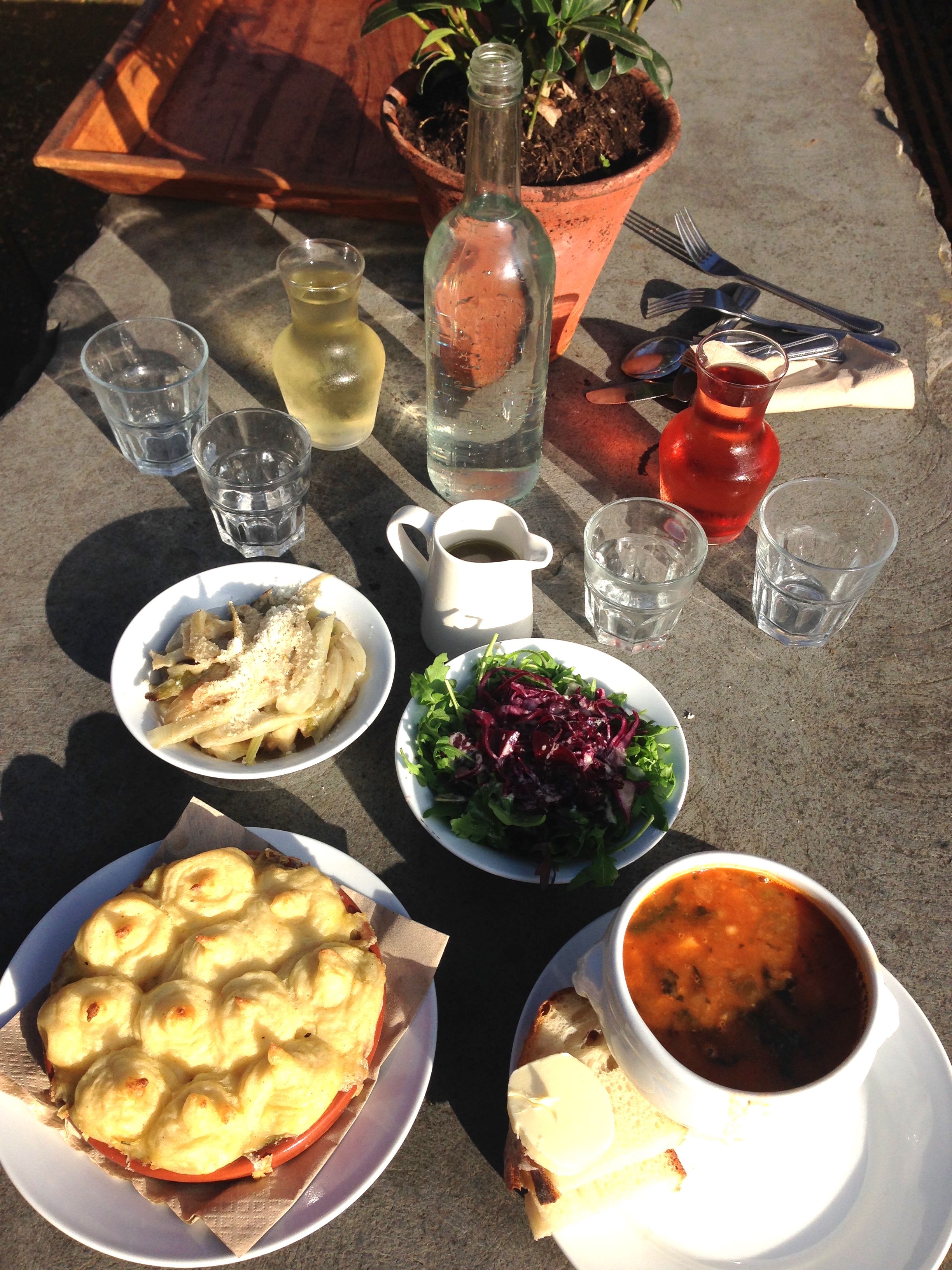
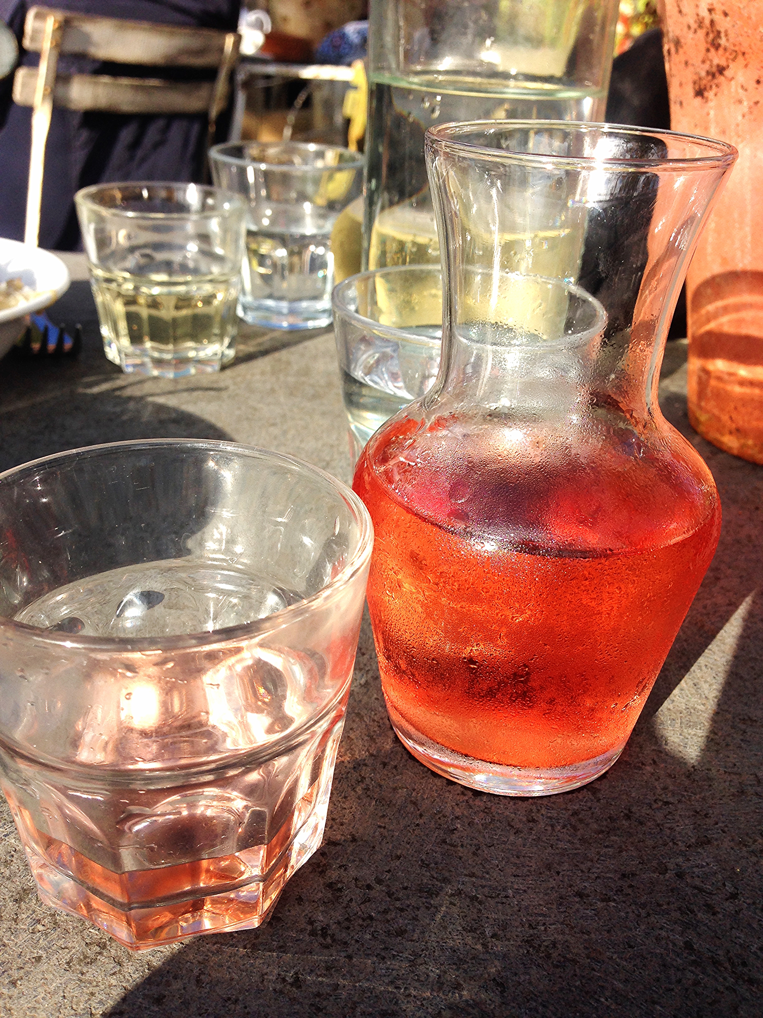
Hi everyone. I guess you are all frantically preparing for Christmas - decorating your homes and trying to decide what gifts to buy and what food you will eat. I got off to a late start this year so on Friday I decided I needed some inspiration. So I headed to my favourite mecca for inspiration and soul soothing, Petersham Nurseries. For those of you who are regular readers of my blog, I'm a sucker for Petersham and I've done quite a few blog posts on it. They are usually highly visual posts i.e. few words and loads of images, because Petersham is all about visual stimulation. I therefore have decided that what you all need is few words and loads of gorgeous photos to feast your eyes on. Hopefully they will inspire you on how to decorate your homes and your Christmas trees and also what gifts to buy. If you are lucky enough to live in London or the surrounding area, jump in the car and head over to Petersham. Take a tray of coffee and cake into one of the glasshouses or a tray of lunch depending when you arrive. Here's my coffee and delicious apple cake. Don't you just love these vintage painted distressed metal tables & chairs?
I took my new Nikon DSLR camera this time and spent three hours practising my photographic skills. I hope you are impressed with some of them; I'm very much a beginner but I'm really enjoying the learning curve!


I hope you enjoyed that. Now it's back to the grind of lists and shopping. Bring on the festivities!
I'd love to get some feedback from you about how you prepare your homes for Christmas so please write to me and I promise to respond!
You may also like to read
Featured
Inspiring locals with my 'Colour in the Home' talk
Hi Everyone, I guess you are in the throws of starting to decorate your homes for Christmas and furiously buying presents. It's a lovely time of year; I love all that anticipation.
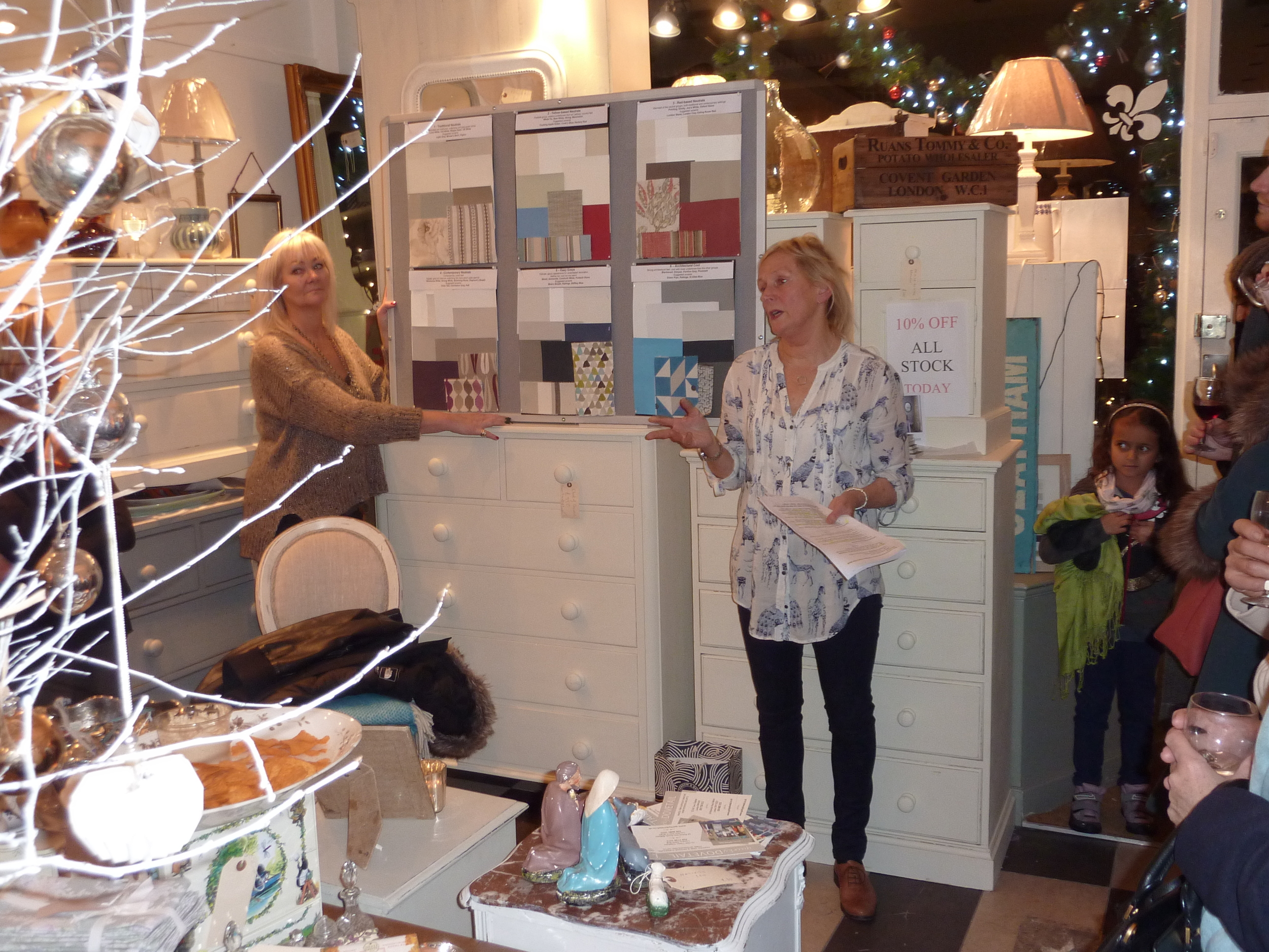
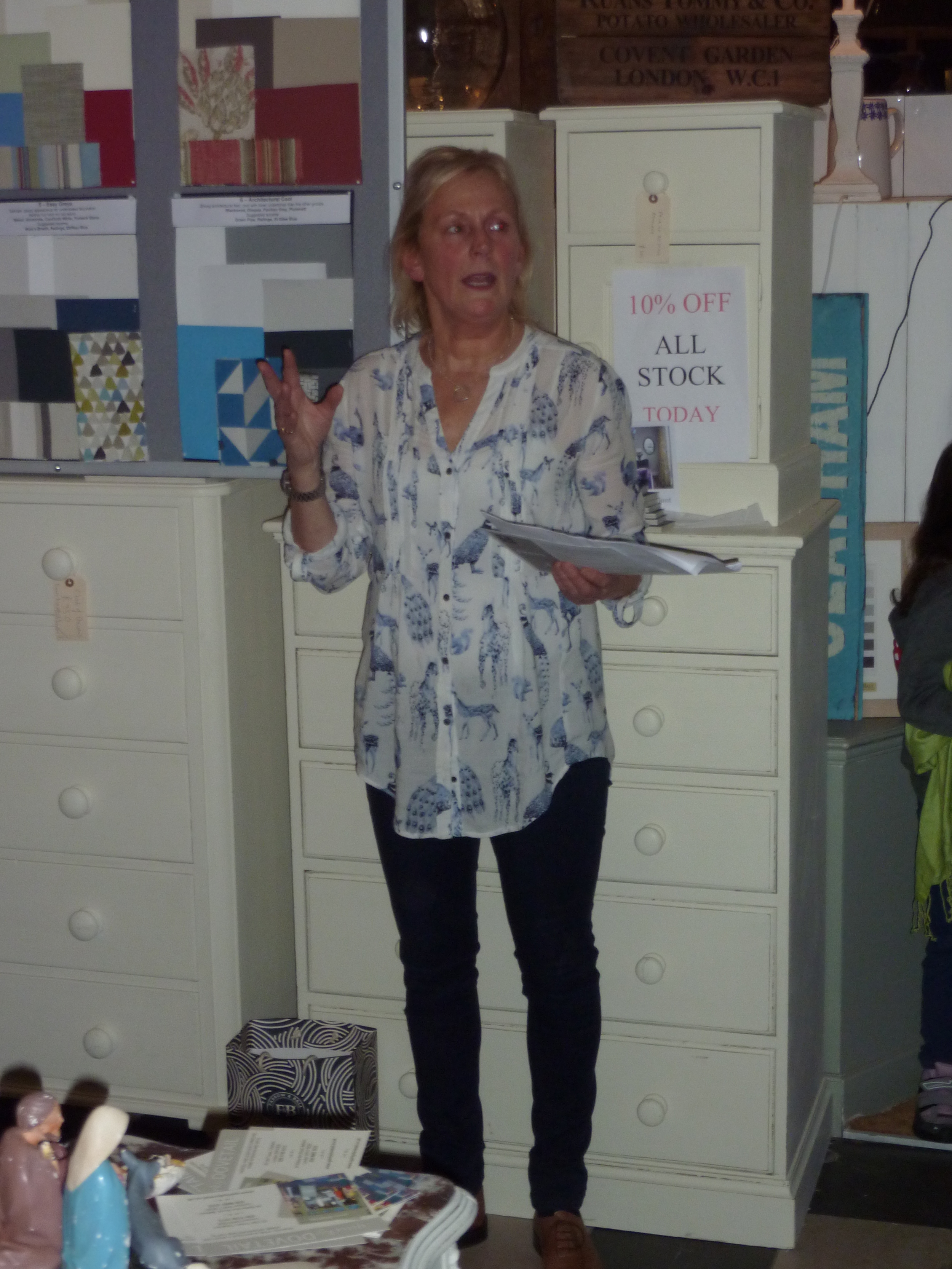
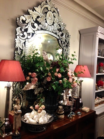
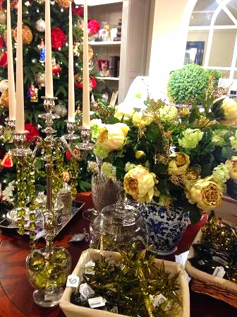
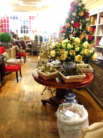
Last week I gave a talk on 'Colour in the Home' at the local interiors shop where I work two days a week, Quirky Dovetail. This is a lovely local interiors shop where I've been working (running the shop) part-time for the last three years. We specialise in up-cycling old furniture and painting it in Farrow and Ball neutral paint colours as well as selling antique and vintage items and homewares. The event at which I spoke was our annual Christmas shopping evening which is always well attended by regular clients, new clients and friends. Given that I am an interior decorator and colour consultations are a crucial part of my services, and also I'm absolutely passionate about colour, I decided to give a half hour talk on how to use colour in the home. The majority of our clients are afraid of colour so I wanted to show them how they could inject some colour into a neutral colour scheme. Grey is definitely the trend currently and many people paint rooms grey, add grey flooring and furniture but then wonder why the room looks bland and insipid. I hope I inspired them enough to introduce some colour; the feedback after my talk certainly gave that impression!
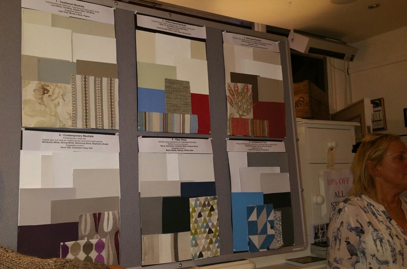
Given that Quirky Dovetail paint furniture in Farrow and Ball paint, I used the six Farrow and Ball neutral families as the basis for my talk. There are so many colour brands and each paint chart has way too many colours but I like the fact that Farrow and Ball have created these six neutral families to make our lives easier when selecting a colour scheme. And Farrow and Ball paint is particularly lovely with such high levels of pigment and such depth of colour.
I know the word 'neutral' can sound really dully and boring, even a bit of a cop-out to some of you, however neutrals are easy to live with, elegant and un-demanding if they are used correctly. It's all about how you put the neutral shades together as to whether the effect is sophisticated or insipid.
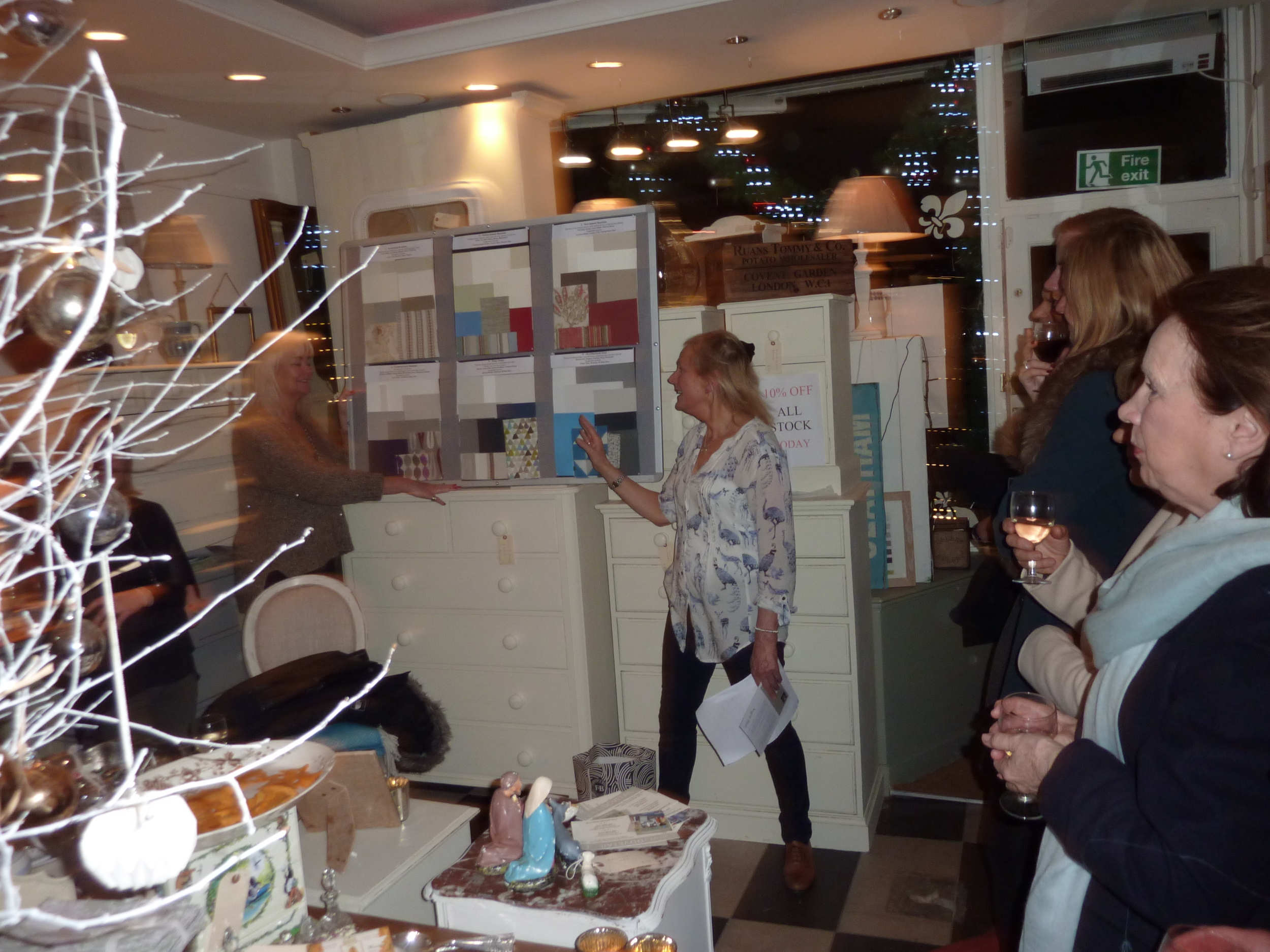
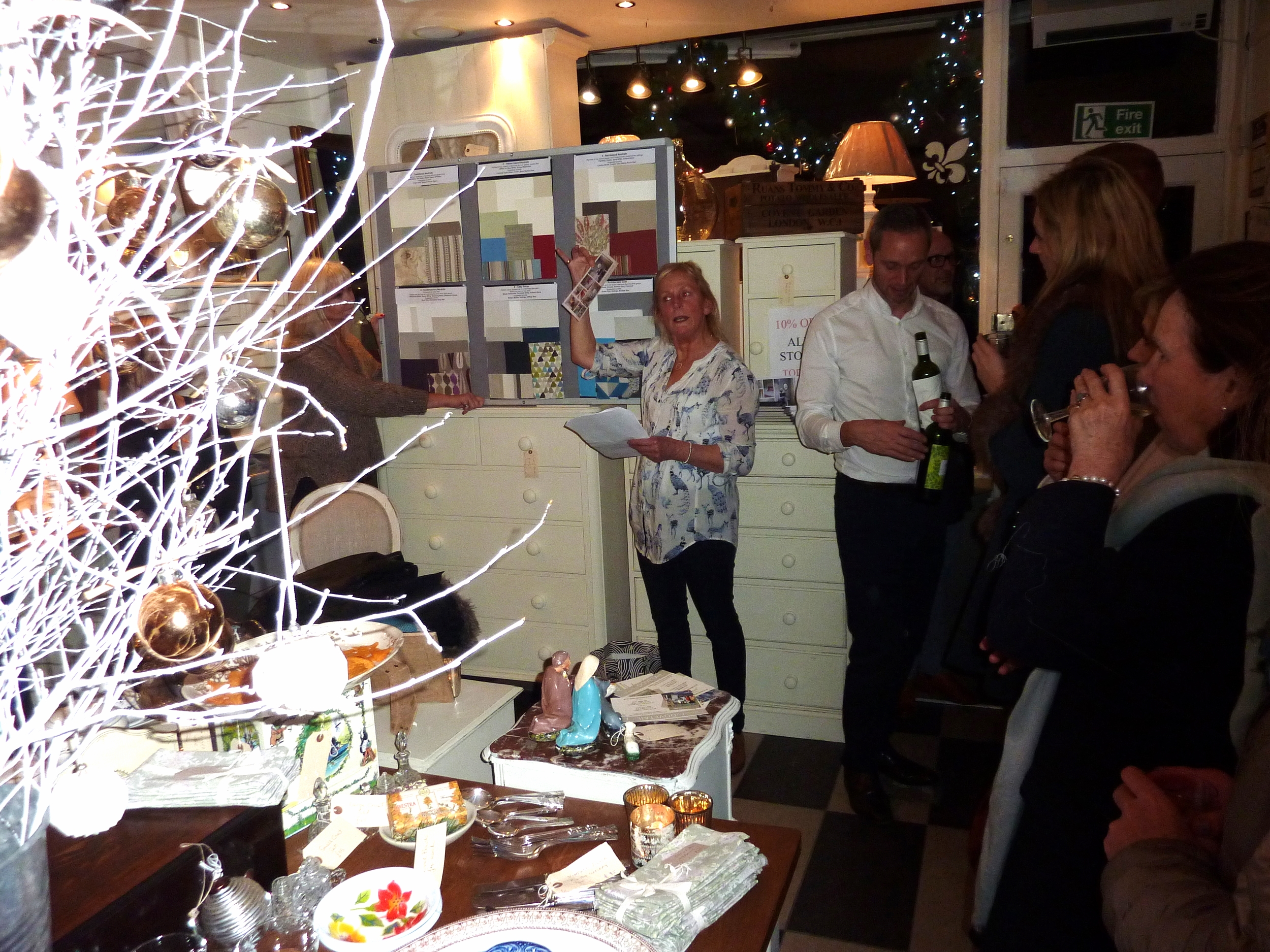
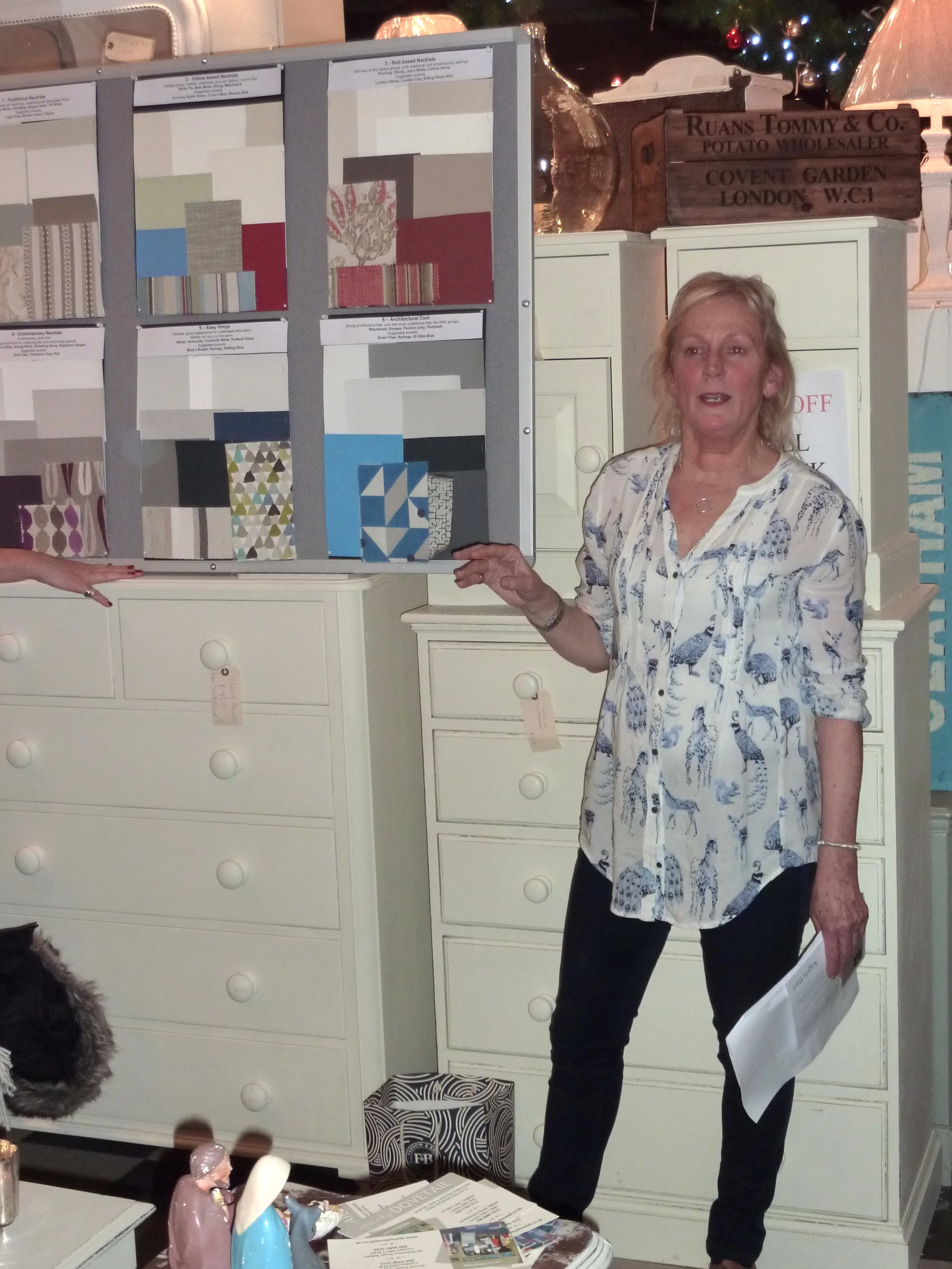
I prepared a board for each of the Farrow and Ball neutral families and I included some accent colours and also a couple of fabrics to create a sort of mood board so that the audience could imagine how these could work in a room.
For those of you are not familiar with the Farrow and Ball neutral families, they are:
Traditional Neutrals - Soft grey-green tones, sophisticated - Lime White, Old White, Slipper Satin, Off White. Suggested accents: Light Gray, Mouse's Back, Pigeon
Yellow-based Neutrals - Creamy undertones, prettiest group, country feel - White Tie, New White, String, Matchstick. Suggested accents: Cord, Cat's Paw, Tanner's Brown, Mouse's Back or for a country scheme try Cooking Apple Green, Cook's Blue and Rectory Red
Red-based Neutrals - Red undertones, warmest group - Pointing, Dimity, Joa's White, Oxford Stone. Suggested accents: London Stone, London Clay, Eating Room Red
Contemporary Neutrals - Lilac undertones, appear grey, add edge but retain warmth - Wimborne White, Strong White, Skimming Stone, Elephant's Breath. Suggested accents: Dovetail, Charleston Gray, Pelt
Easy Greys - Neither too warm nor too cool, delicate gauzy appearance - Wevet, Ammonite, Cornforth White, Purbeck Stone. Suggested accents: Mole's Breath, Railings, Stiffkey Blue
Architectural Cool - Cool with blue undertones, have architectural edge - Blackened, Dimpse, Pavilion Gray, Plummett Suggested accents: Down Pipe, Railings, Stiffkey Blue
Here are my boards of the six neutral families and accents:
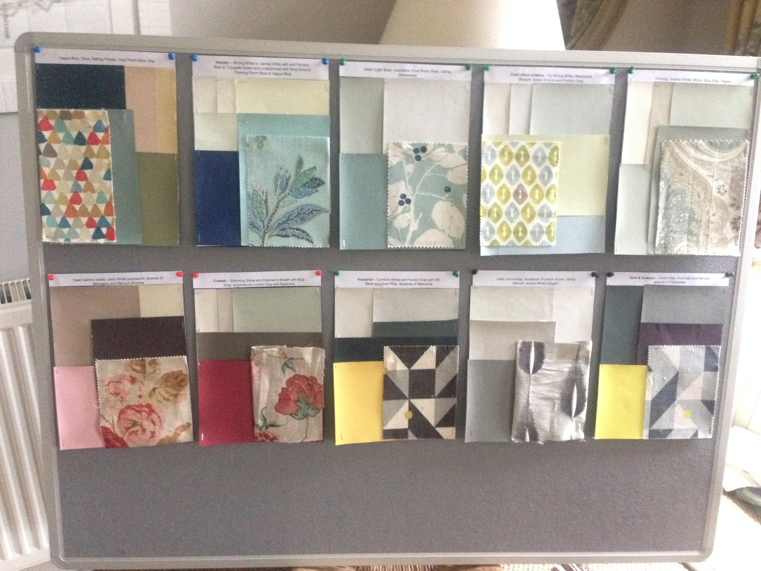
I also created some separate colour schemes on smaller boards again with a complementing fabric and these were pinned to the reverse of the presentation board for viewing after my talk.
We had a full house for my talk and the evening was animated and sociable fuelled by plenty wine and food and lots of shopping! Never the most flattering when you are being photographed talking animatedly and passionately and waving your arms around but here goes .......... !1


I would love to hear how you have introduced colour into your home and what paint brand and colours you have used. Or if you have any questions you would like to ask me, don't hesitate to get in contact.
You may also like to read
Featured


An invite to an exclusive blogger event
Hi everyone. I had the pleasure of being invited by India Jane to an exclusive blogger preview event today, Tuesday 1st December, at their flagship store in Kings Road, Chelsea, London. For those of you not familiar with India Jane, it's a family-owned home interiors business which was founded in 1992. Their signature style embodies the understated elegance of updated classics and sleek lines of contemporary sophistication. They have ten stores in the UK but none abroad, at least not that I'm aware of. There were five of us (all ladies!) handpicked discerning bloggers of interiors!! We were given a talk by their head of Marketing and PR, the very charming James Neil, on the key trends and latest products of India Jane while being offered bubbly and nibbles. We were also offered 15% discount on everything we purchased and it was very much the embarrassment of the choice as to what to buy as it all looked so incredibly inviting, beautiful and luxurious. And if that wasn't sufficient, they offered us a goodie bag when we left which I discovered this evening when I got home, contained a selection of gorgeous India Jane homewares. I know Christmas hasn't come yet but I felt as if all my Christmases had come at once!
I adore this time of year when the shops are dressed and styled to the hilt. Indian Jane is certainly no exception! I'm no stranger to India Jane; I have a house full of their furniture, mirrors, soft furnishings, accessories and lighting (I have no less than five of their chandeliers in my home!). However I never tire of browsing one of their stores as they are styled within an inch of their lives but with the utmost taste. Glitz and glamour but understated and refined. What more could you want?!
I took some photos on my iPhone but they aren't the greatest quality (says the gal who has just done a course in DSLR photography!) so do excuse the poor quality of some of the shots. I think I was overcome with the emotion of trying to decide what I could afford to buy when all I wanted to do was transport the entire shop to my home!


India Jane is one of those shops, you have to buy something. I've never left empty handed! I'd love to hear about any interiors local shop that you frequent and the things they sell that you cannot live without.
You may also like to read
Featured
Another inspiring day at Petersham Nurseries
Well, I'm not sure what season this really is as it's nearly as warm as late summer and we are already at the end of October. Talk about Indian Summer - it's last way beyond the end of September. This weather is unprecedented - warm (up to 20C) and no wind or rain. The trees are the most incredible colours, the best autumn colours in many years due to this late warmth.
It was a stunning, sunny day up to 19C last week so I decided it was time for another pilgrimage to Petersham Nurseries which is one of the most inspiring places in London for me. I get trigger happy with both my iPhone camera andmy compact Panasonic camera as there are so many beautiful things to photograph. The shop displays are styled so well and the use of plants and flowers in the styling is superb.
And of course the food in the cafe is wonderful so my friend and I arrived in time for morning coffee and a huge slab of cake, browsed the gardens, glasshouses and shop for two hours and then returned to the cafe for a tray of lunch dishes to share.
I've decided to devote most of this blog post to images, a veritable optical feast. Most of the images speak for themselves. I hope you derive as much pleasure and enjoyment from the images as I did seeing everything in person. There's lots to learn about styling in the home from these images so take note!!
I'll start with a selection of photos of how they styled some of the public spaces - the cafe where you queue to get your food, the loos (!) and the glasshouses where you can take your food on trays to eat.


Another group of images follows:


And the most mouth-watering photos I'll leave until last - the shop which is my favourite part of the whole Petersham experience. Check out the vintage chandeliers, they absolutely gorgeous. It is so beautifully styled and full of items/objects that I covet. I never leave empty handed!

You may also like to read
Featured
Meet an inspirational Kiwi - Charlie McCormick
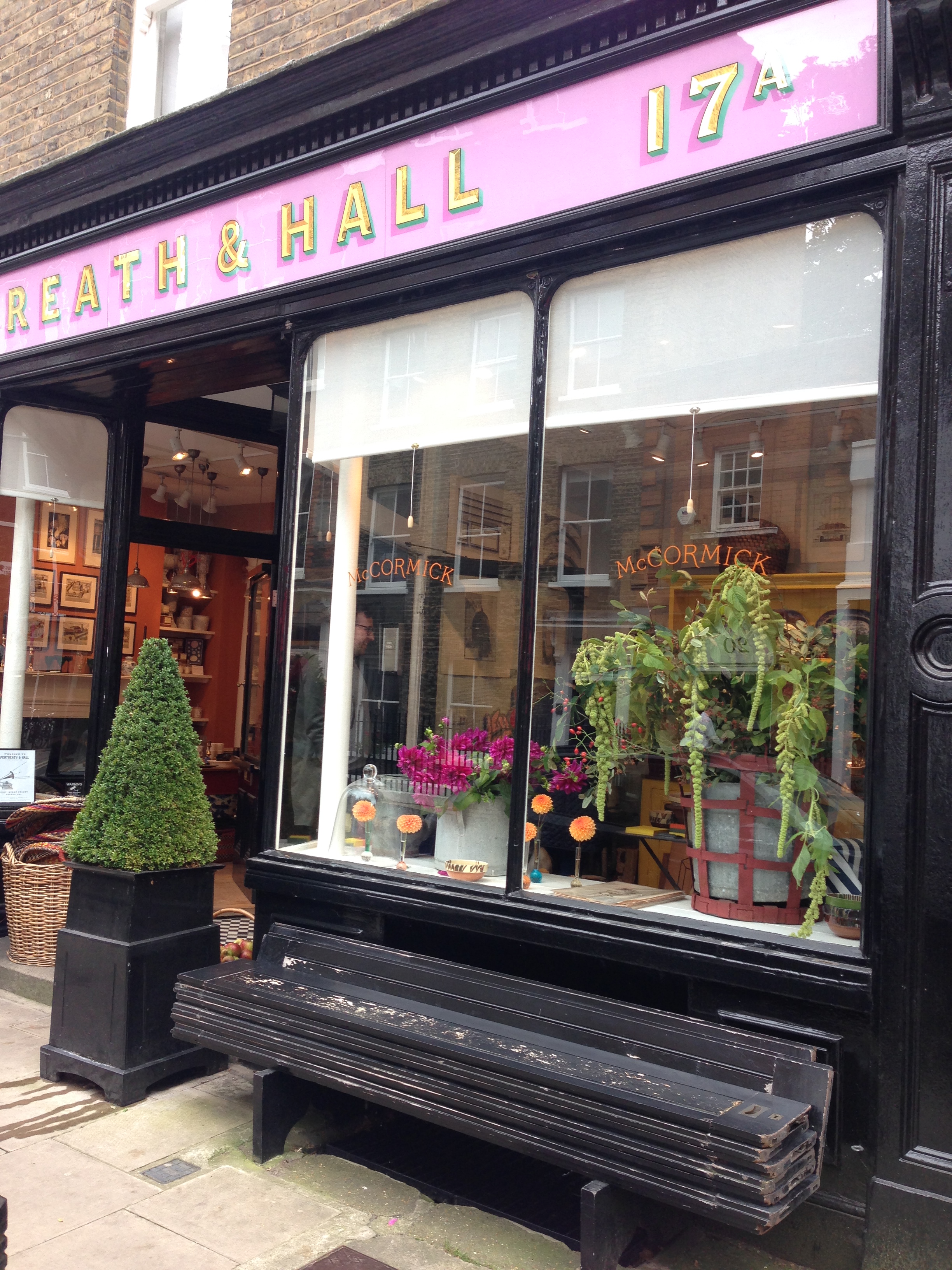
I had the great pleasure this week of meeting Charlie McCormick and his partner Ben Pentreath at Charlie's pop up shop next to Pentreath & Hall in Rugby Street, Bloomsbury, London. Charlie is a very talented, fellow Kiwi who grows magnificent flowers at their home in Dorset, is an excellent cook and has a superb eye for styling interiors. He also runs a supper club. Ben Pentreath, Charlie's partner, is a charming, well-known and highly talented architect and interior designer and he and another fellow Kiwi Bridie Hall, own the beautiful home products shop Pentreath & Hall.
I've been following both Ben and Charlie on Instagram for some time and am always inspired by their photos on Instagram and Ben's superb blog. I own a copy of Ben's stunning book English Style which shows the best of English Style.
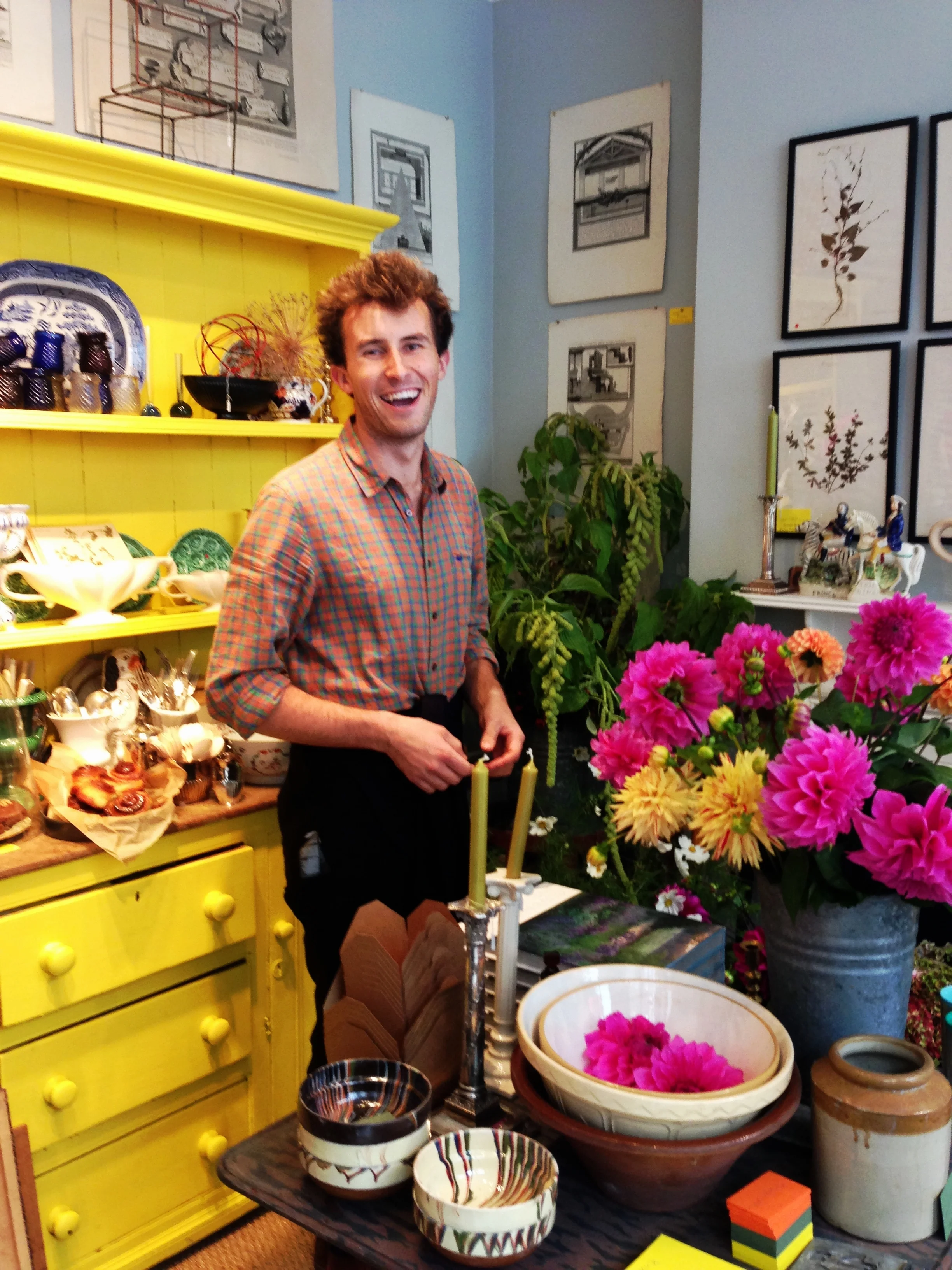
Anyway, this blog post is about Charlie's pop up shop which is open for the month of October. I read about it online and just had to pay a visit. I really wanted to meet Charlie as he comes from the same part of NZ that I do, though he grew up on a farm north of Christchurch and I was a city girl, from Christchurch. I was lucky enough to meet not only him but also Ben Pentreath on Monday so I felt very honoured. And of course, Charlie and I did the requisite selfie!
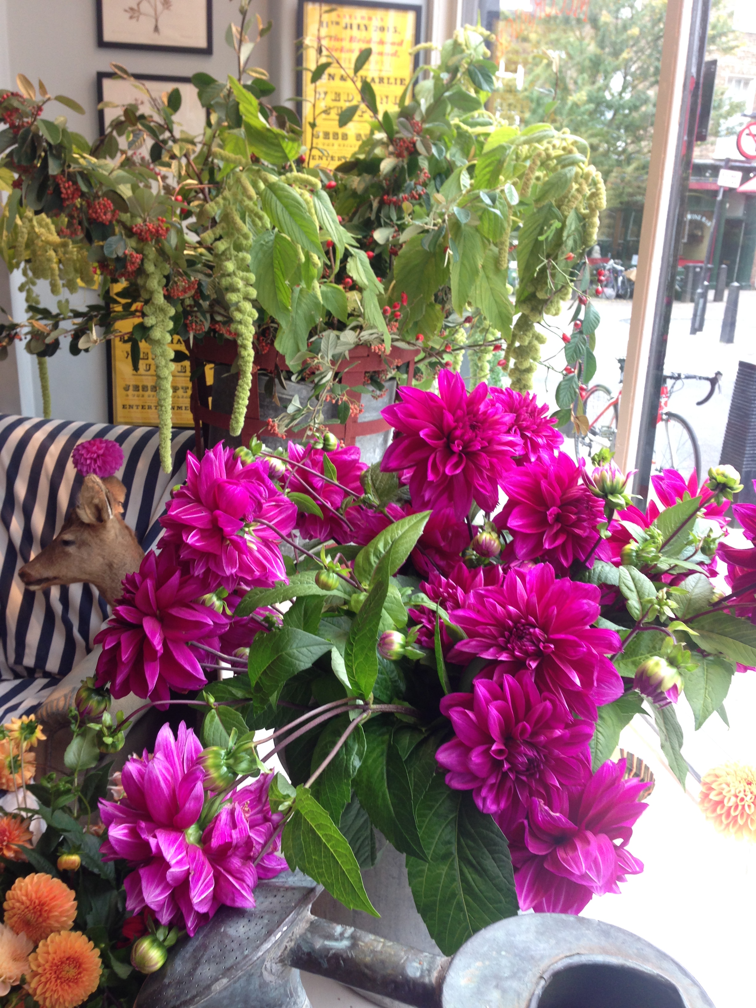
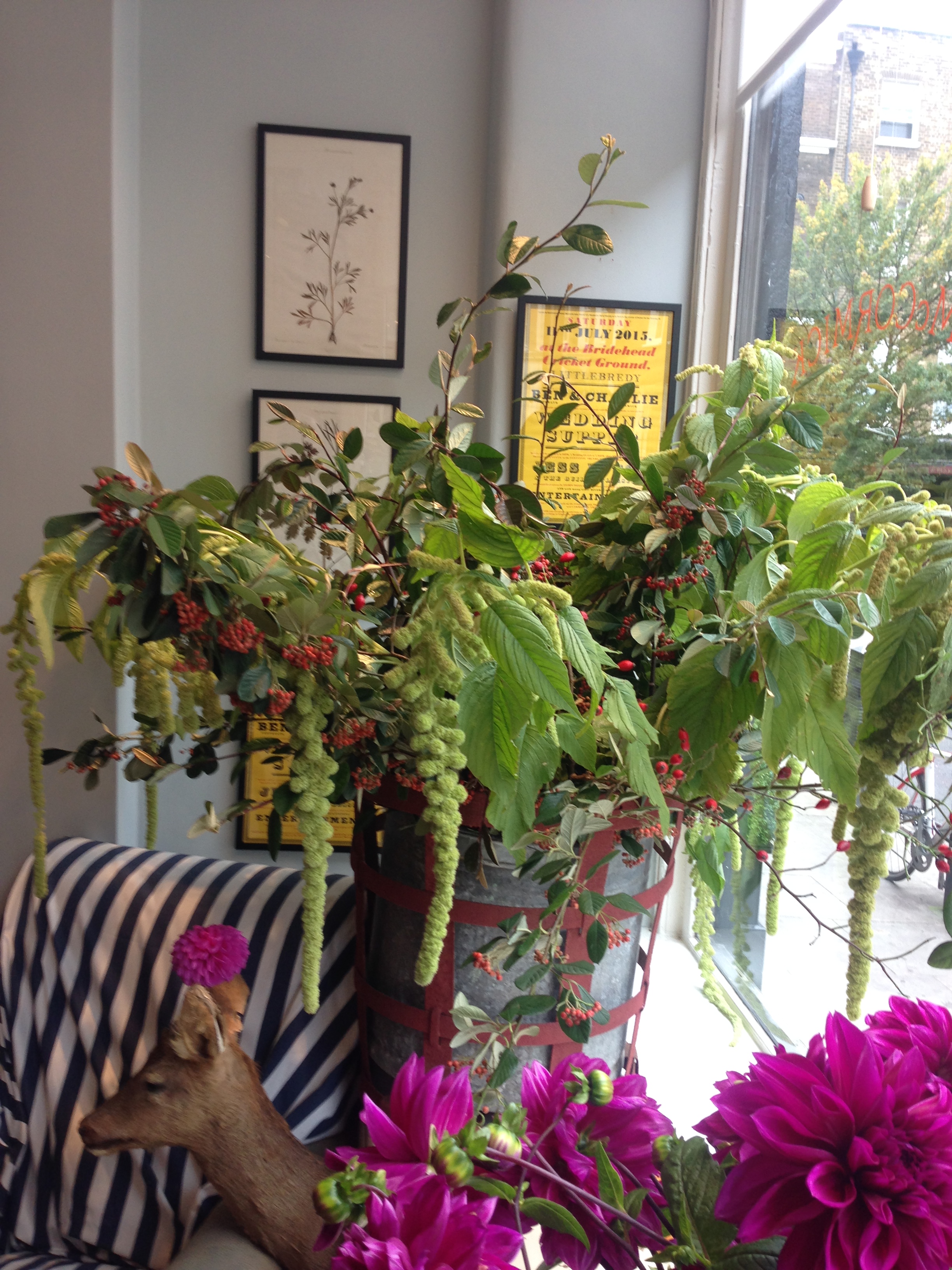
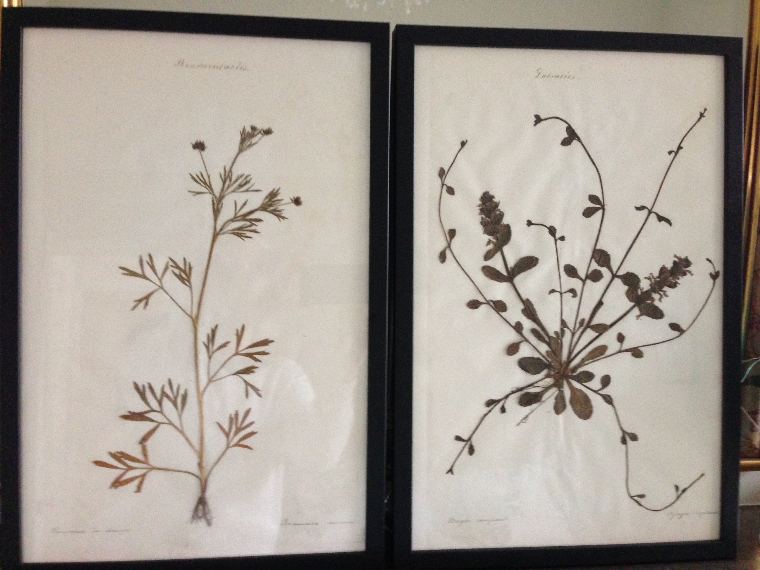
The pop up shop from the outside is very inviting thanks to the vibrant colours, textures and Charlie's superb styling touches:
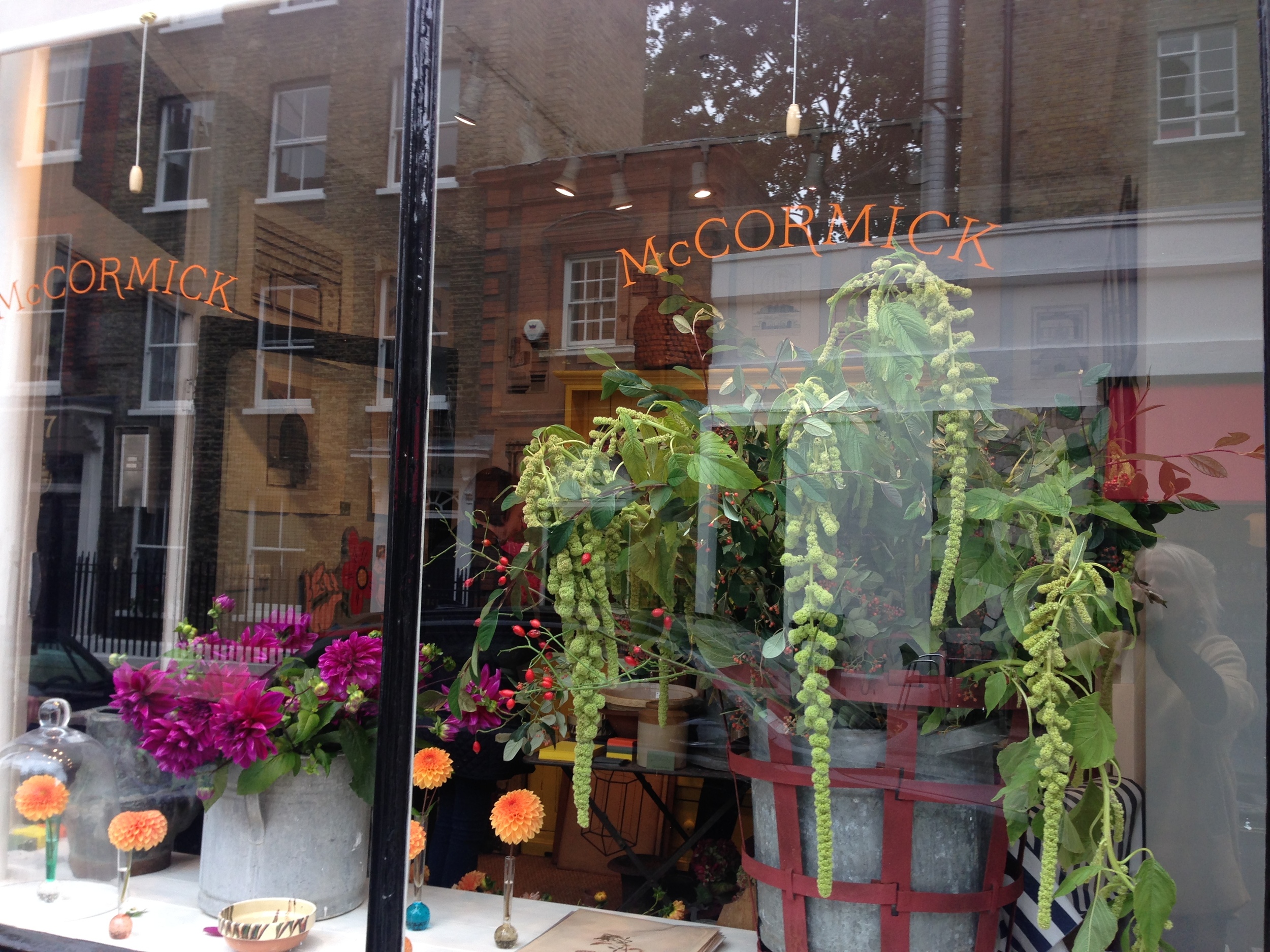
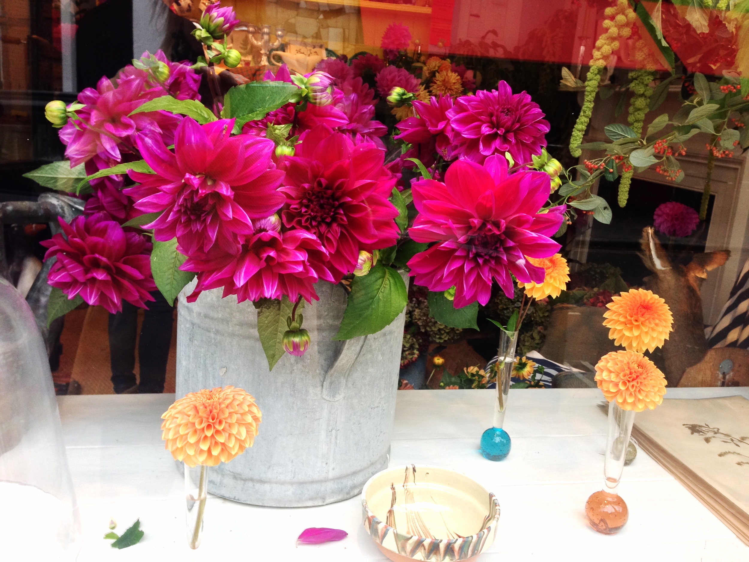
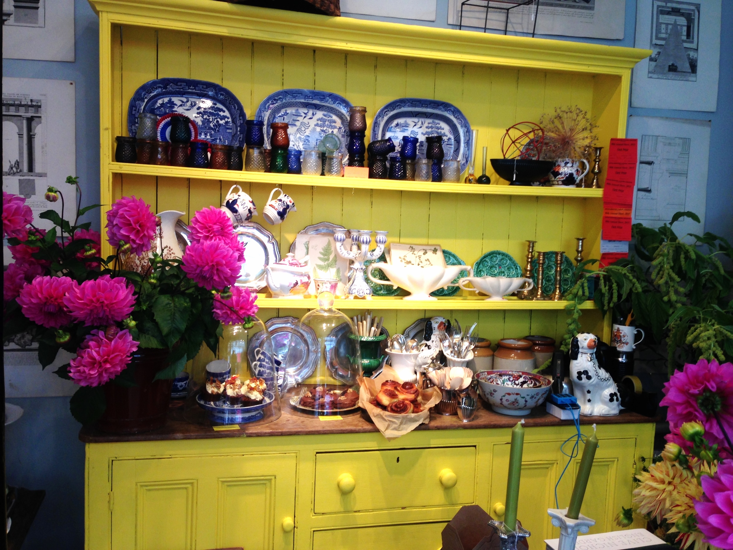
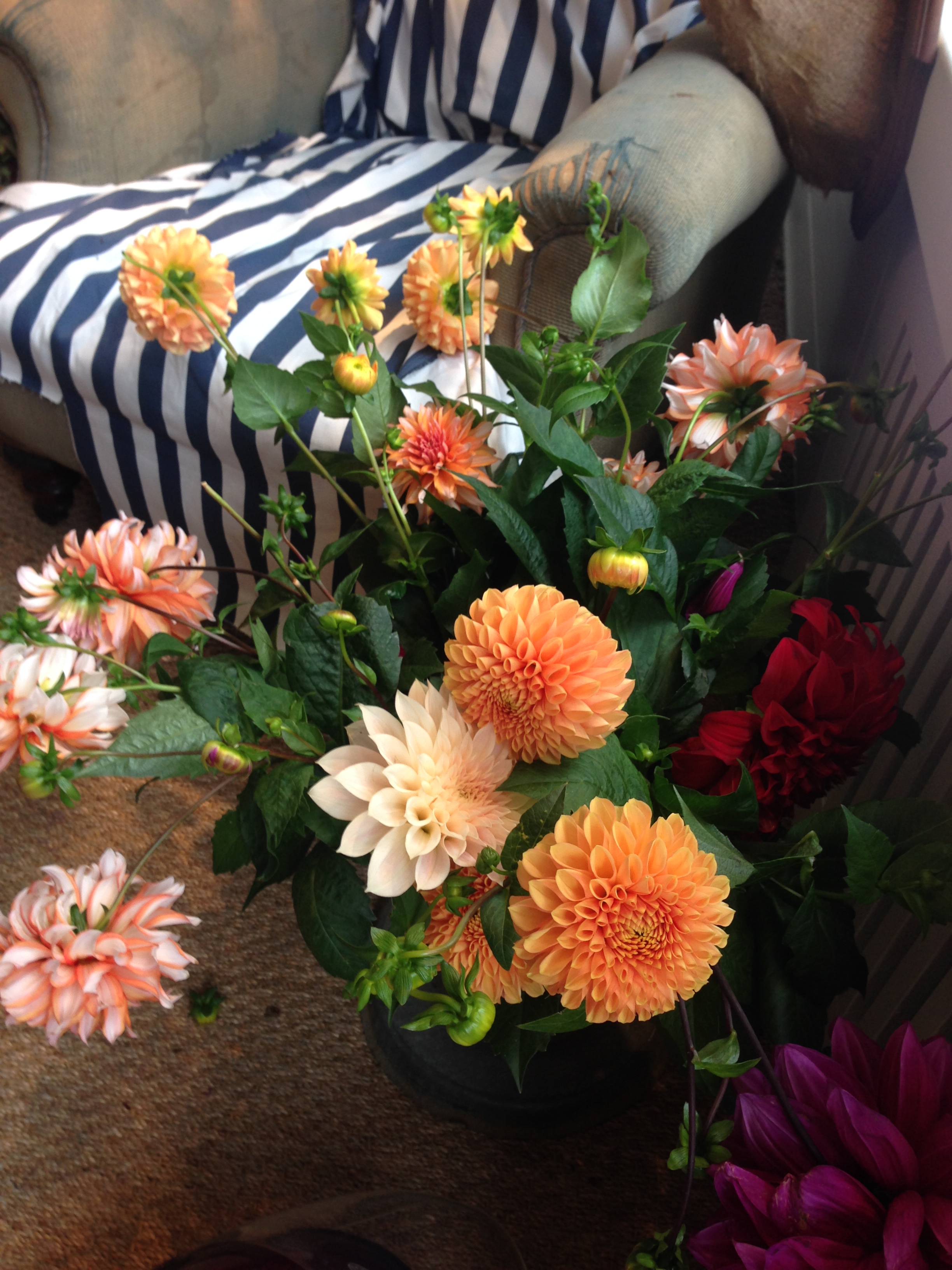
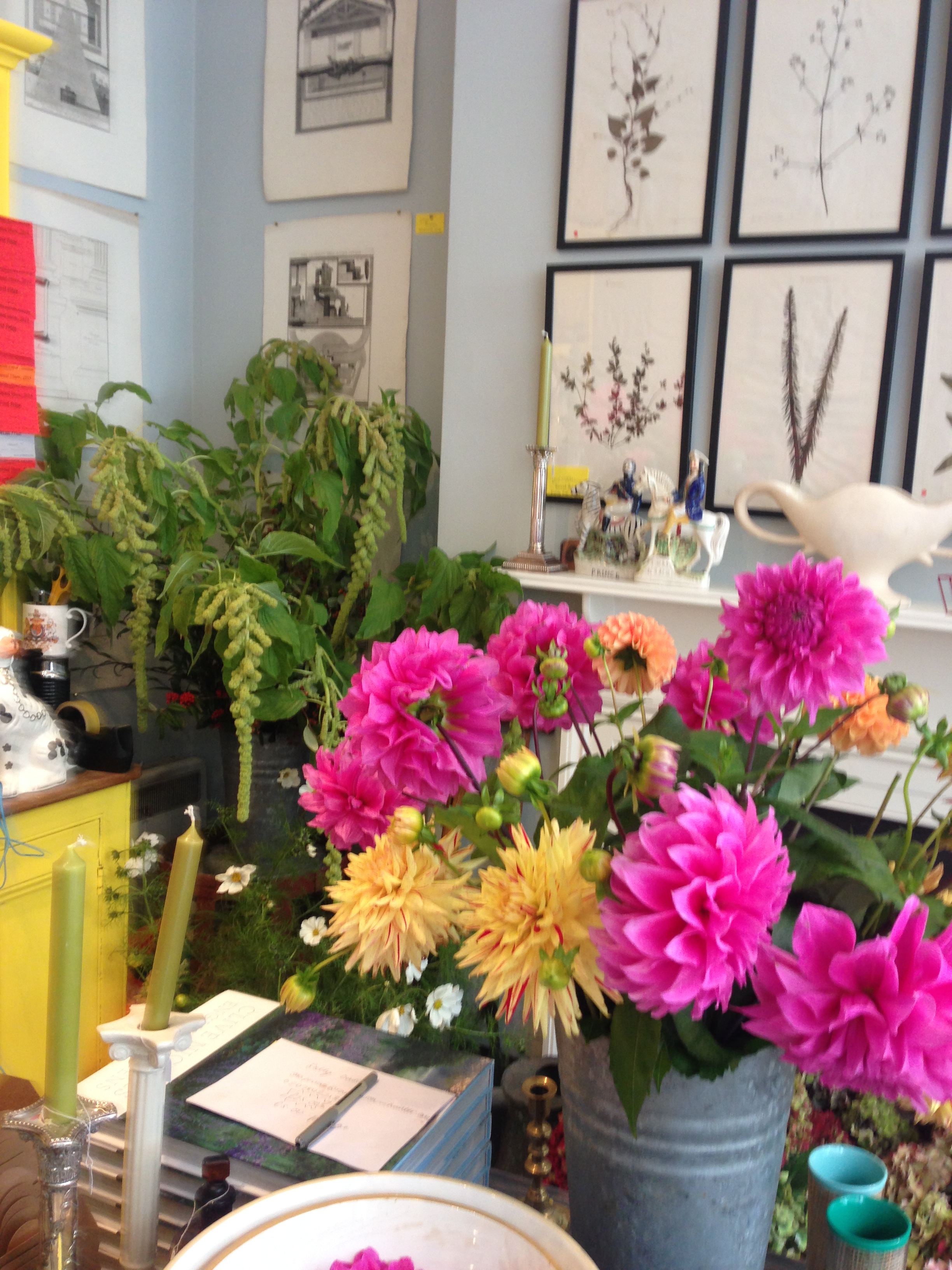
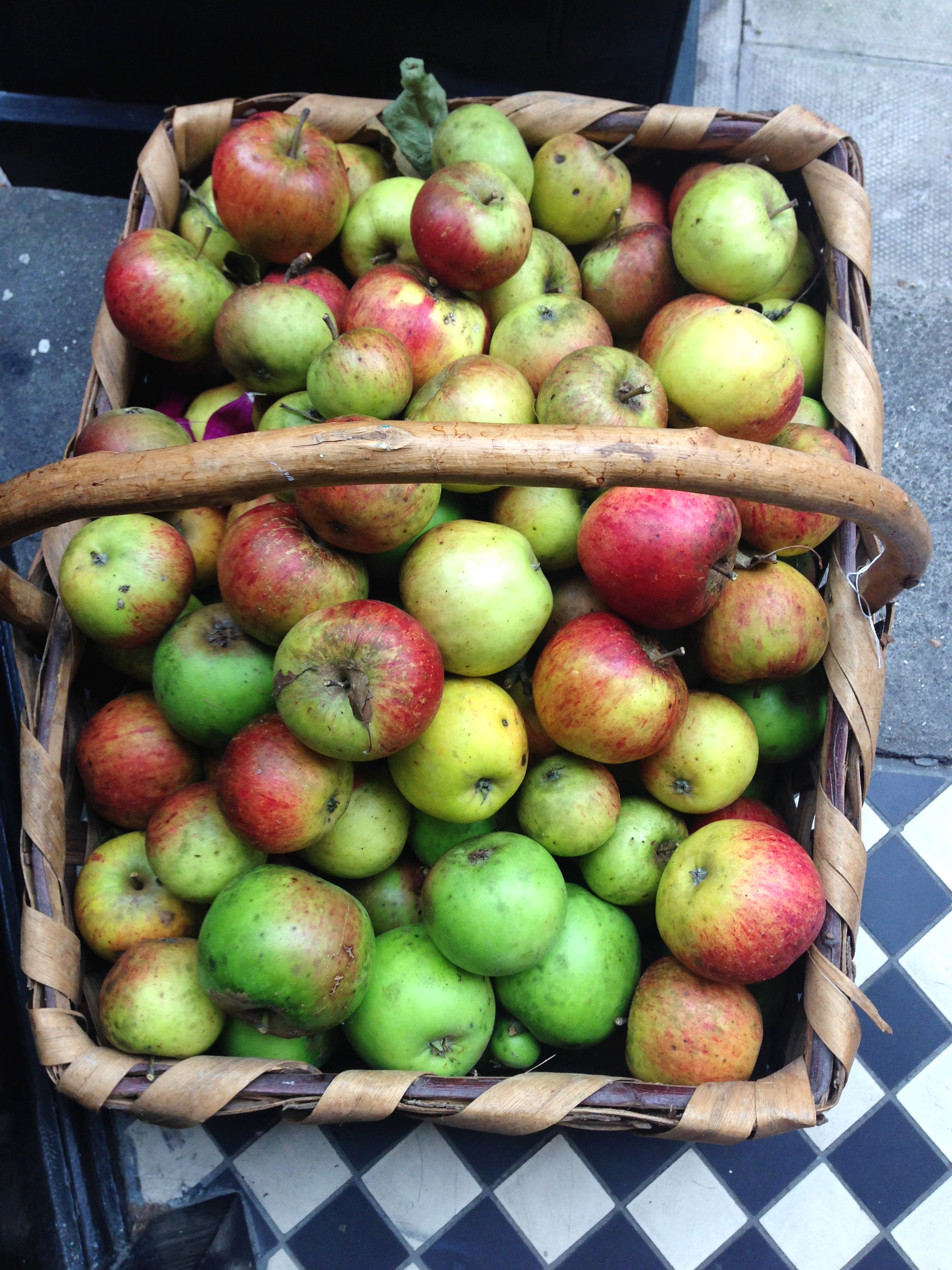
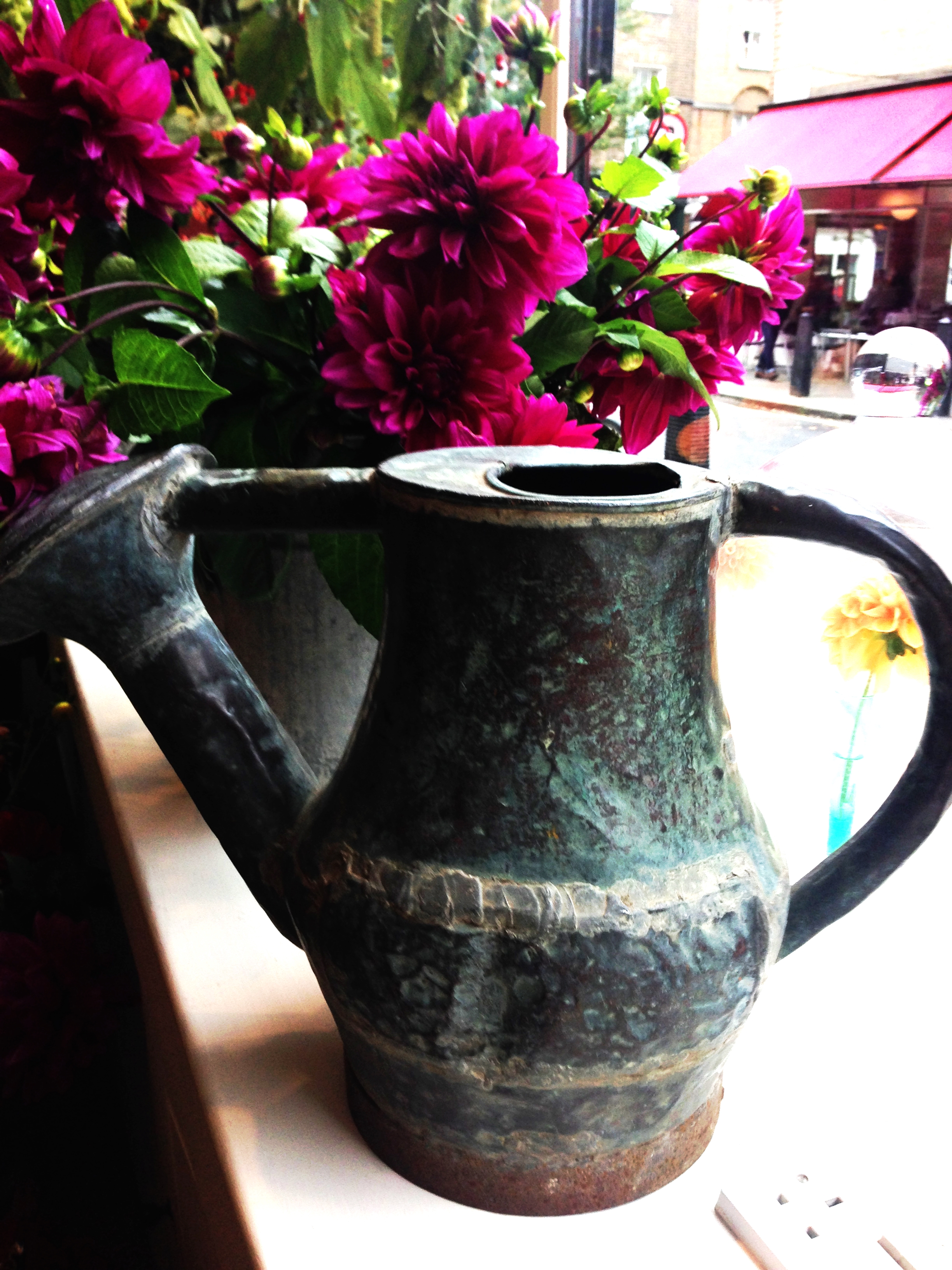
The inside has a stunning yellow dresser as the focal point laden with vintage items, Charlie's home baked cakes and a huge container of Charlie's homegrown vivid pink dahlias. There are several other containers of the beautiful dahlias dotted around the shop and in the window, a feature above the fireplace of stunning 19th century framed prints of pressed plants, rustic watering cans to die for and a huge basket of apples from Ben and Charlie's orchard just outside the door. I wanted everything in the shop but first I wanted to chat with Charlie. He is very down-to-earth, laid back and friendly like all of us Kiwis (!!) and he is incredibly multi-talented. I'm a massive foodie myself, as some of you may know from my tried & tested favourite recipes that I include on my blog so a note to self to book a place at one of his supper clubs so I can sample his renowned cooking.

I left the shop having purchased so many things that I wasn't sure if they would fit on my little Vespa moped. Note the dahlias squeezed in a bag on the right!! Charlie kindly gifted me one of his homemade Afghan biscuits for the road, to remind me of home. It's a traditional Kiwi biscuit made with cocoa powder and cornflakes, topped with chocolate icing and then half a walnut. I managed to demolish it a bit at a time at each traffic light where I had to wait!!
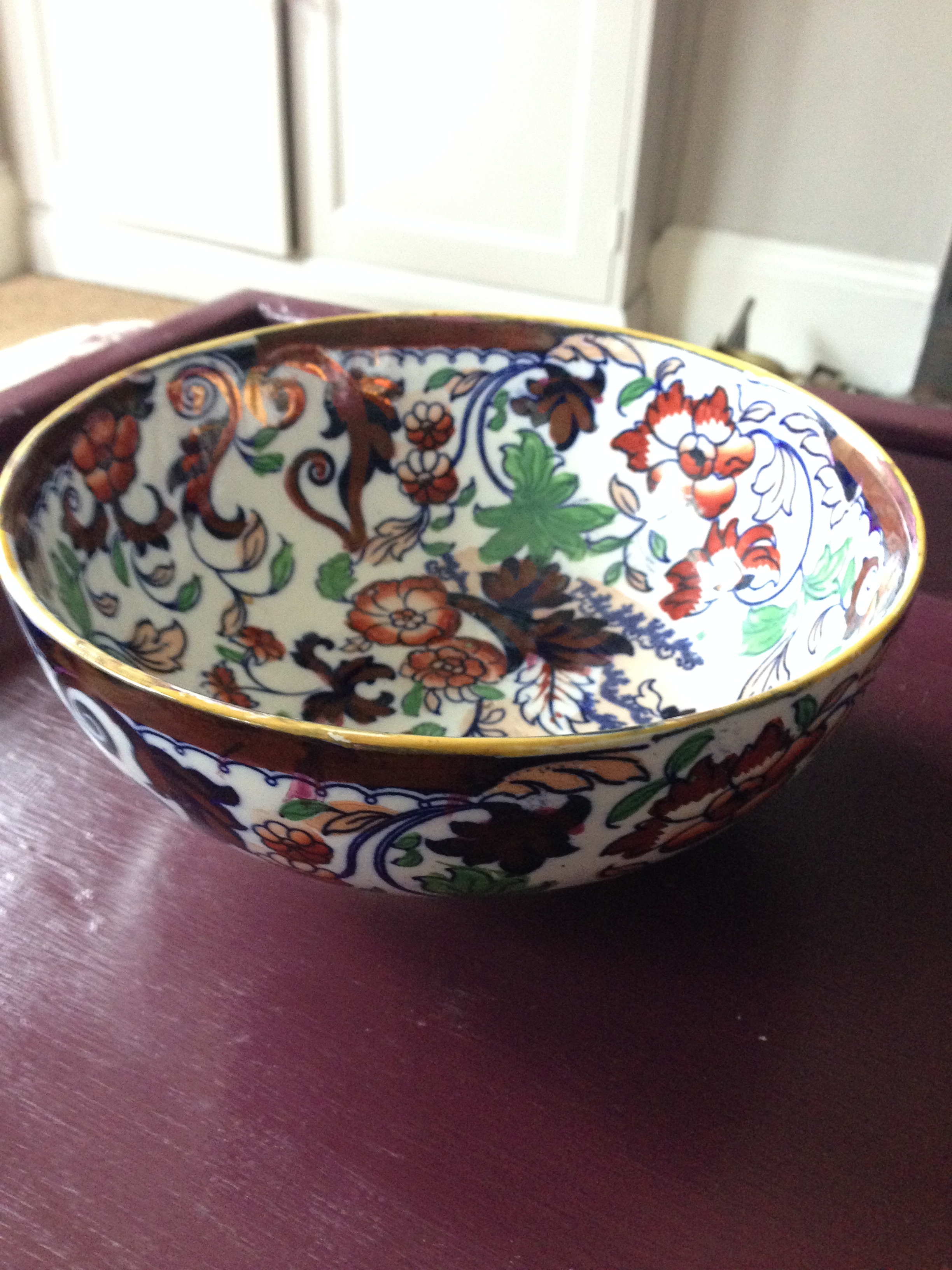
And my purchases, well, plenty of them and I am going back for more on Friday! I bought two of the 19th century prints, four vintage containers and some dahlias.

If you are lucky enough to live in London do try and visit Charlie's pop up shop. It's only there until the end of the month.
You may also like to read
Featured


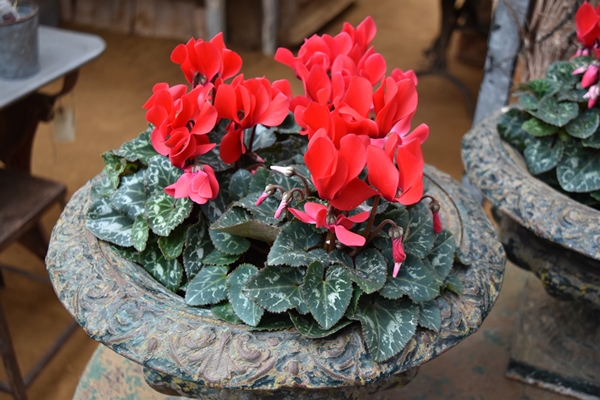
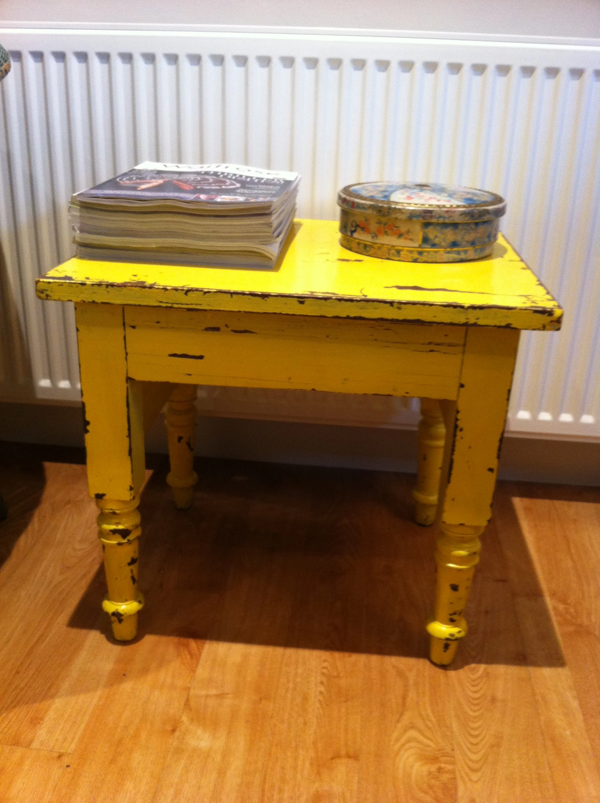
Transform a wooden tray with Farrow & Ball paint
It's way too long since I last painted something for my home so I've lined up several items, the first of which is this wooden tray that I purchased from Petersham Nurseries a couple of years ago. Don't get me wrong, it's a nice wood but it had lost its appeal so I wasn't using it so I fancied a change. Actually these are the trays that they use at Petersham Nurseries in the cafe when you buy your coffee, cake or lunch and they suit that environment as it's very rustic but it doesn't suit my home.
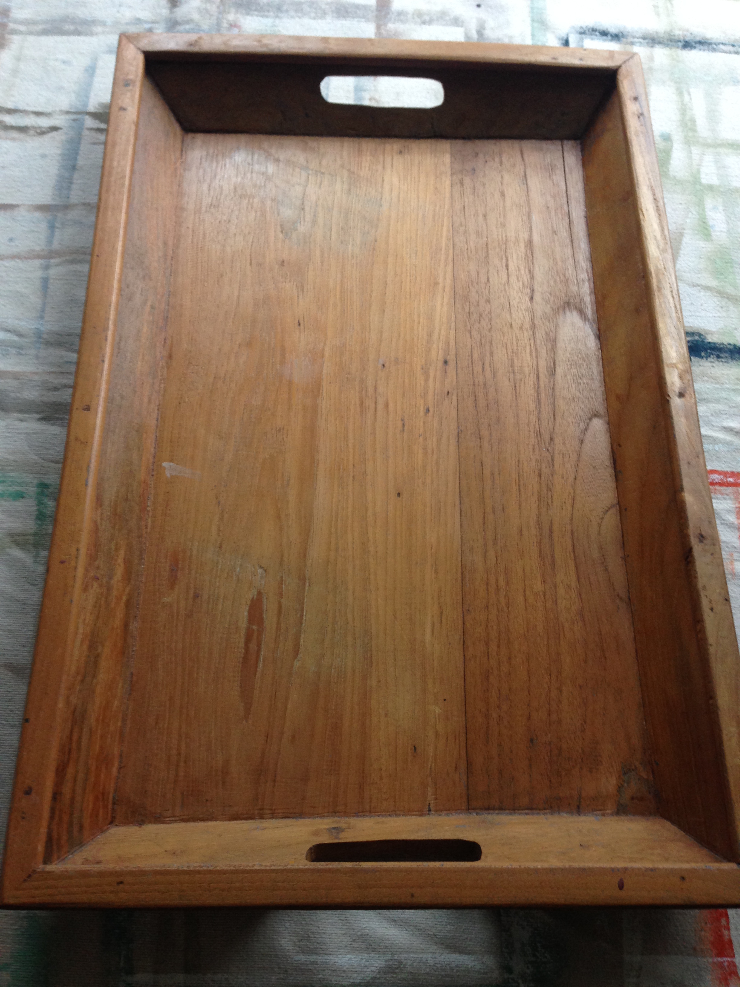
I usually paint with Annie Sloan paint as you don't need to key (rub the surfaces with sandpaper) or undercoat, you just slap on the paint, on any surface! However the Annie Sloan range of colours doesn't include a purple/aubergine colour (something I think they need to address) and I couldn't be bothered to mix the appropriate colours to create purple, so I decided that this time I would use Farrow & Ball 'Brinjal' which is a gorgeous aubergine colour. I ummed and ahed about whether to distress the edges of the tray to bring through some of the wood but decided it would be too much of a vintage look so I opted to paint it all over.
I painted three layers of the colour (I used less than two of the small sample pots)
and then used Annie Sloan clear Soft Wax which is a wonderful wax and way superior to any other clear wax I've ever used.
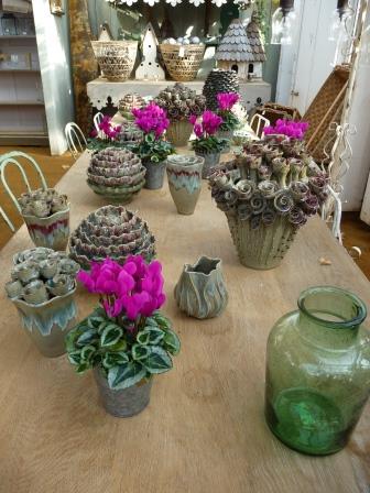
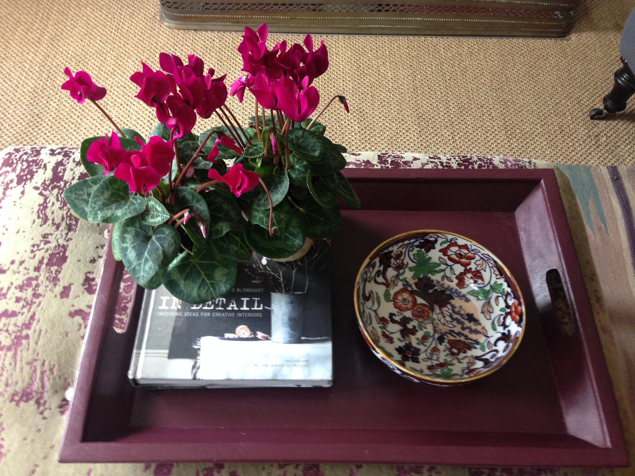
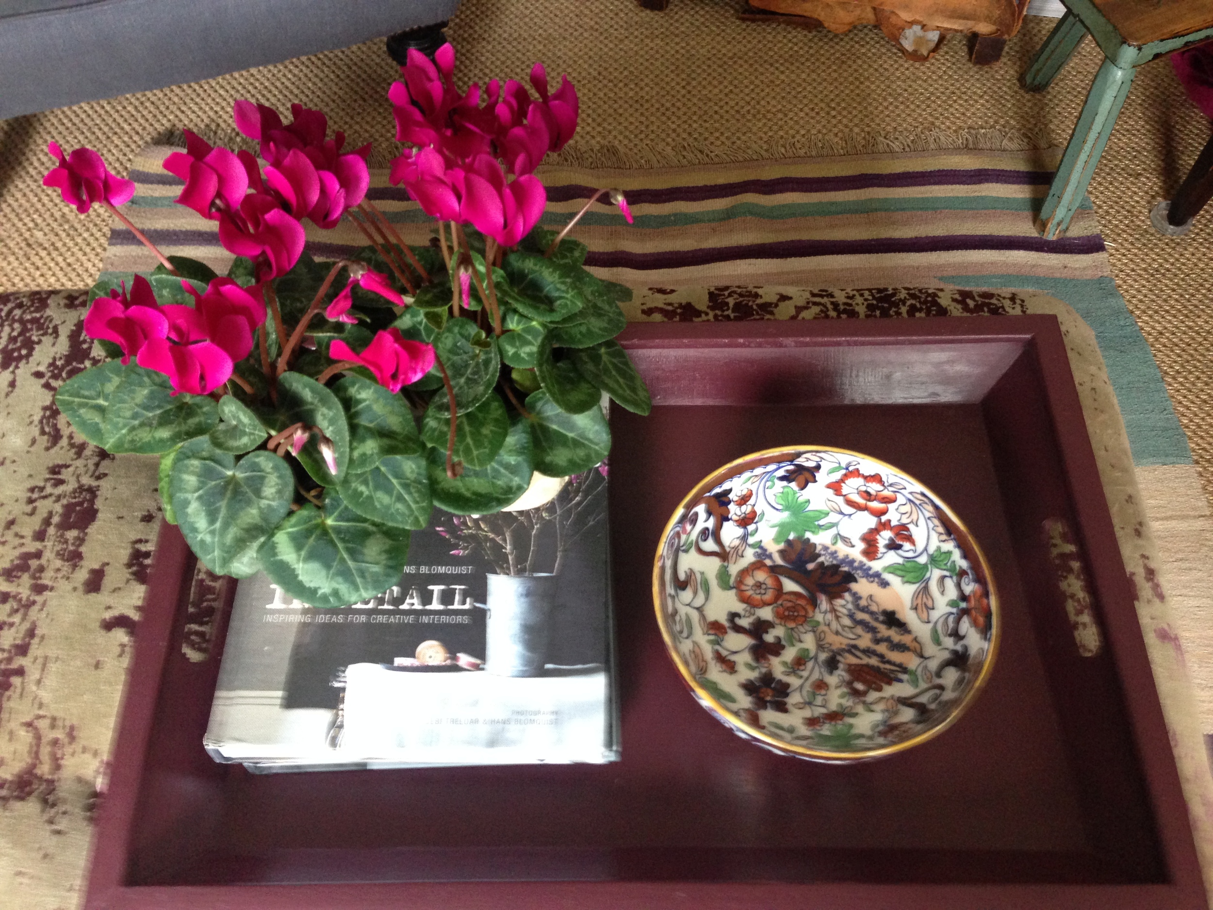
And voila, here is the finished article. Isn't it stunning?! I love the way it works so well with the colour of the cyclamen and the vintage bowl which I purchased this week from Charlie McCormick's popup shop.
I'd love to hear about things that you are painting for your home, what paint you use, what colours and paint finishes you like so do email me with your comments. I'll create a separate post for some more items that I'm currently painting.
You may also like to read
Featured


Are you a passionate collector?
Hi everyone. Last week was manically busy - working hard but also very exciting as I bought my first ever grown-up camera - a DSLR !! I've had a compact Panasonic Lumix for 11 years which I've used to take all the photos, including those on my blog, and frankly it's a pretty amazing little camera. It's never let me down and the quality of the photos is superb. I'd prefer to buy another Panasonic as they have the most fantastic Leica lenses but they don't (yet) make DSLRs, just Bridge cameras. In the DSLR range there are really only two brands to consider, Canon and Nikon, and from what I understand you are either a Canon person or a Nikon person. I'm neither, I remain brand agnostic and am more influenced by price and reviews. I ended up buying a Nikon (D5500) so I guess I'm now a Nikon girl!! So I've been stalking my new camera for four days now as it sits on the kitchen table, quite intimidated by it. I've managed to charge it and take a couple of pics but that's about it. I need to bite the bullet, read the manual and start to use it. Enough of that, this blog post is supposed to be about collecting items so here goes!
Do you have a passion for a particular type of item and are amassing a collection? For example, a type of china, all things "owl" related, teddy bears (hope not!), glassware, mirrors ....... the list is endless.
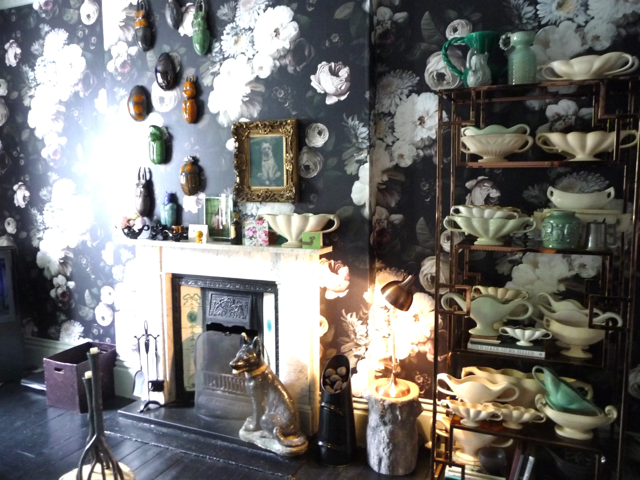
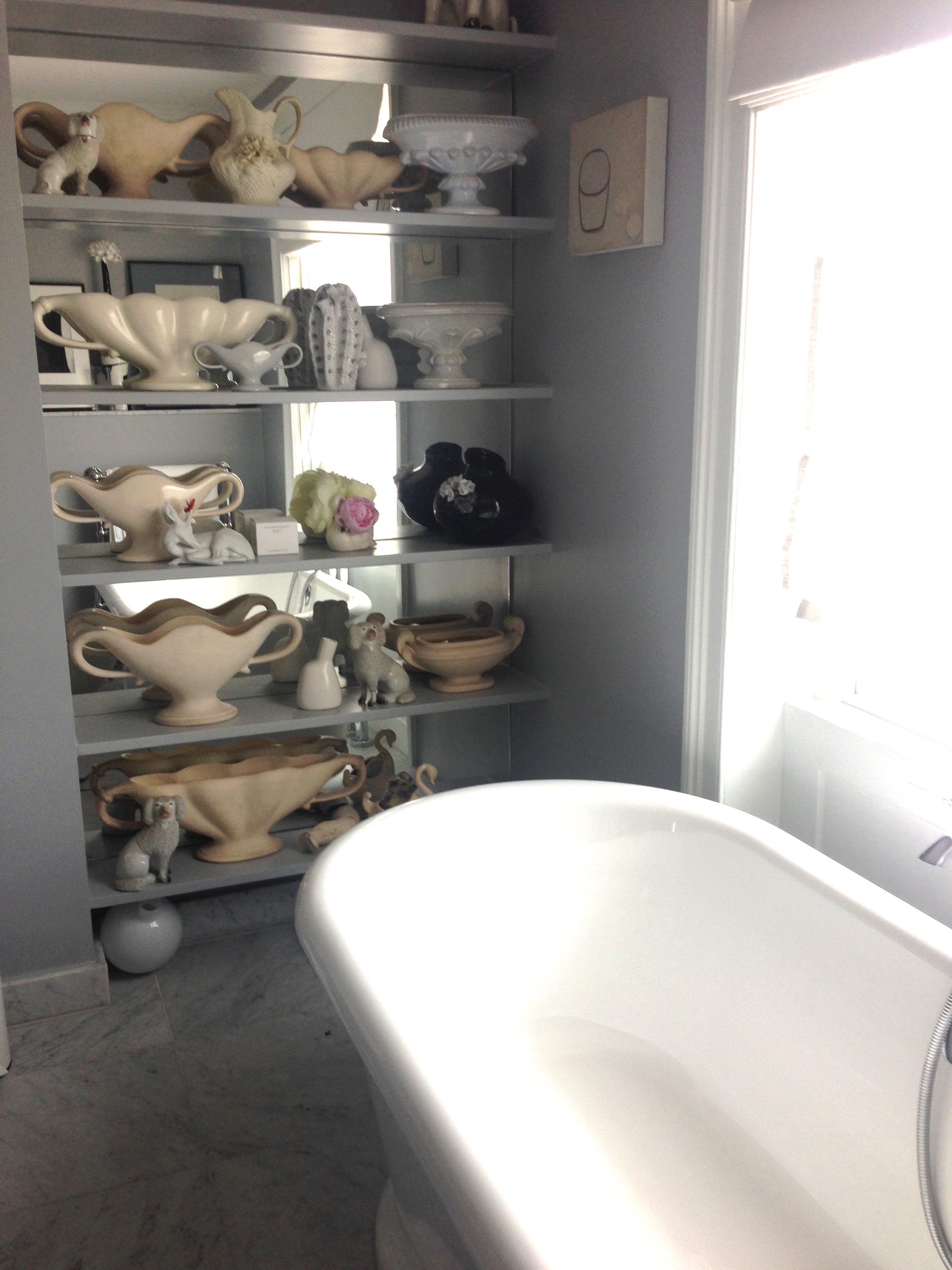
Some people collect a certain type of china. The photos below are the home of a florist who (obviously) collects Wade china vases. She has cleverly, to great effect, made a feature of them in a living room and also in one of the bathrooms.
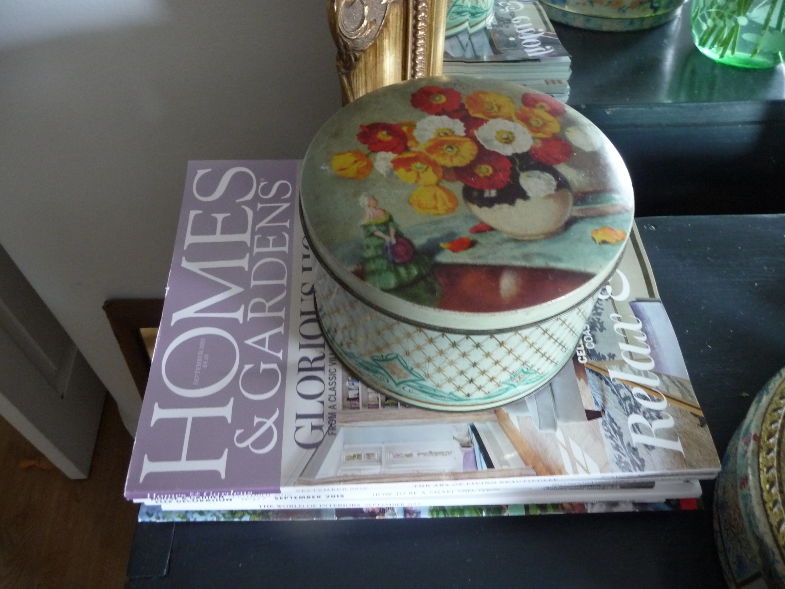
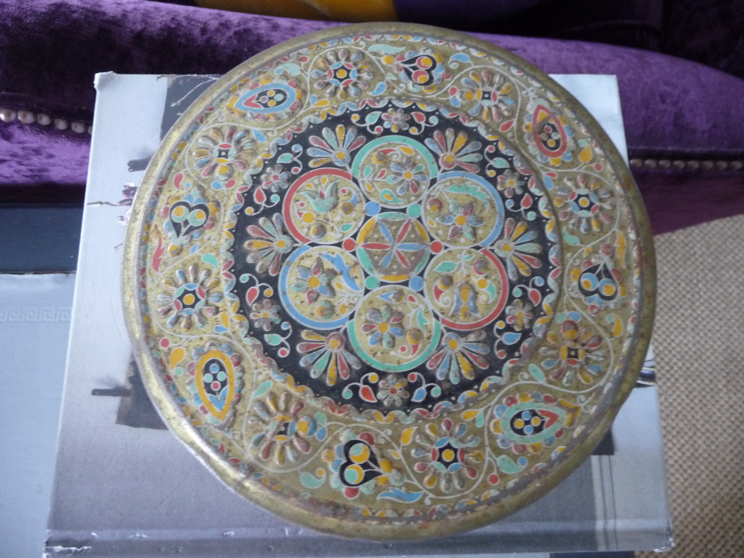
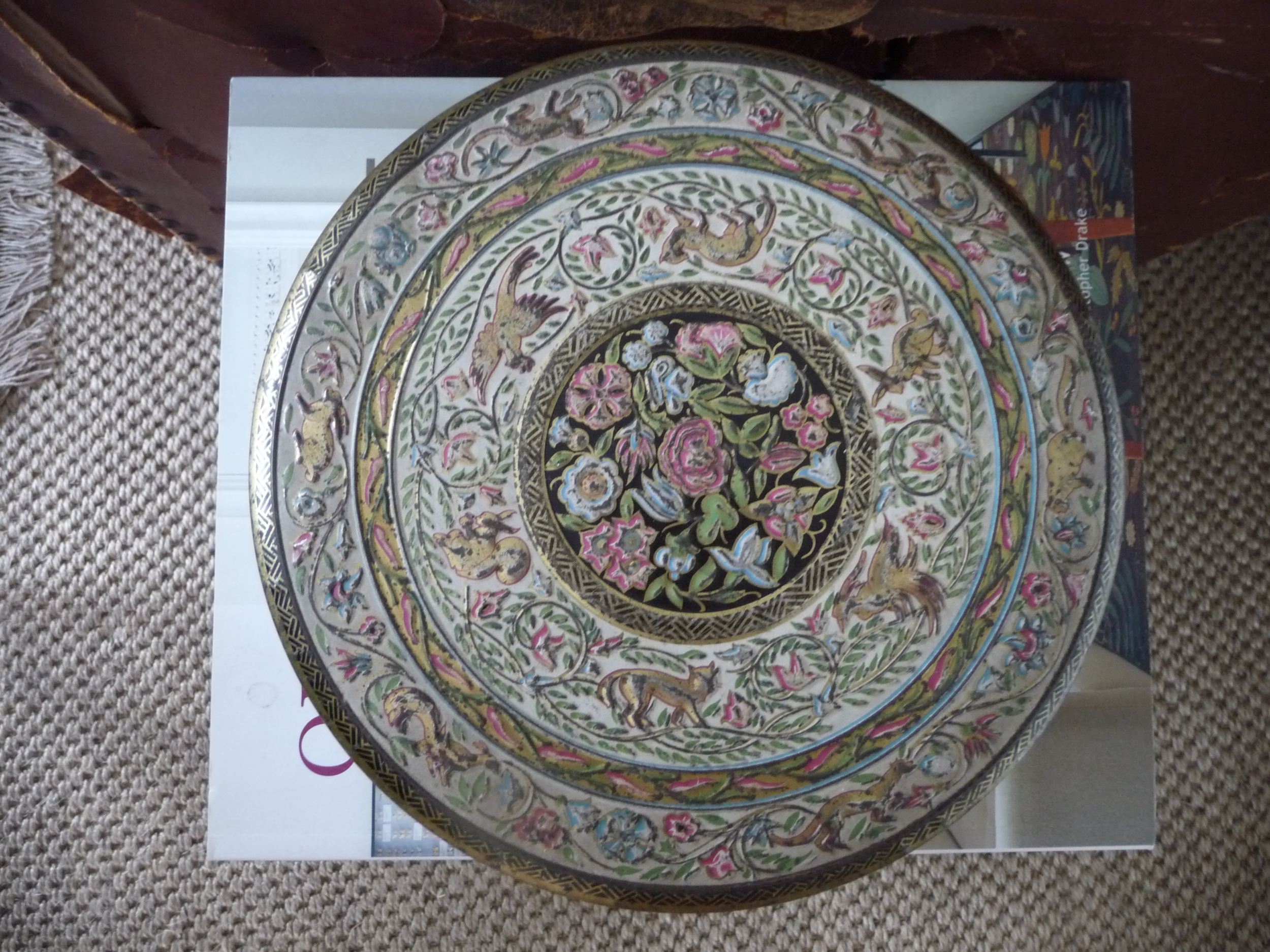
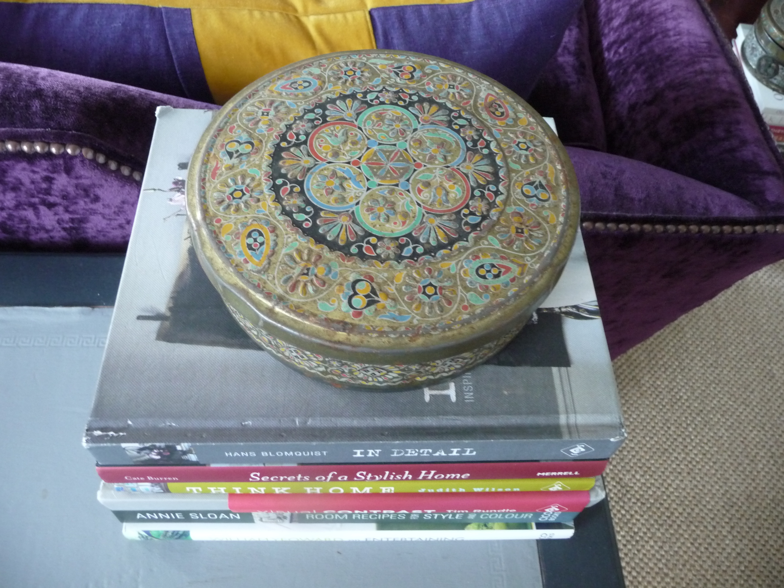
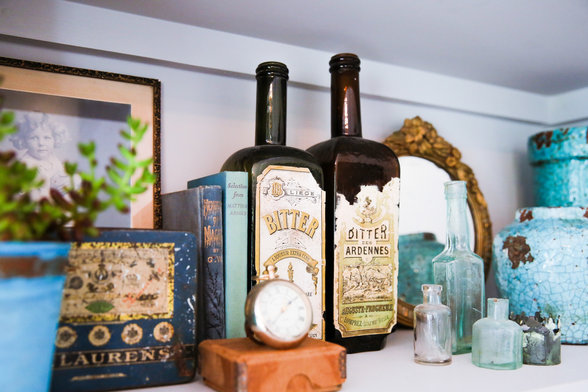
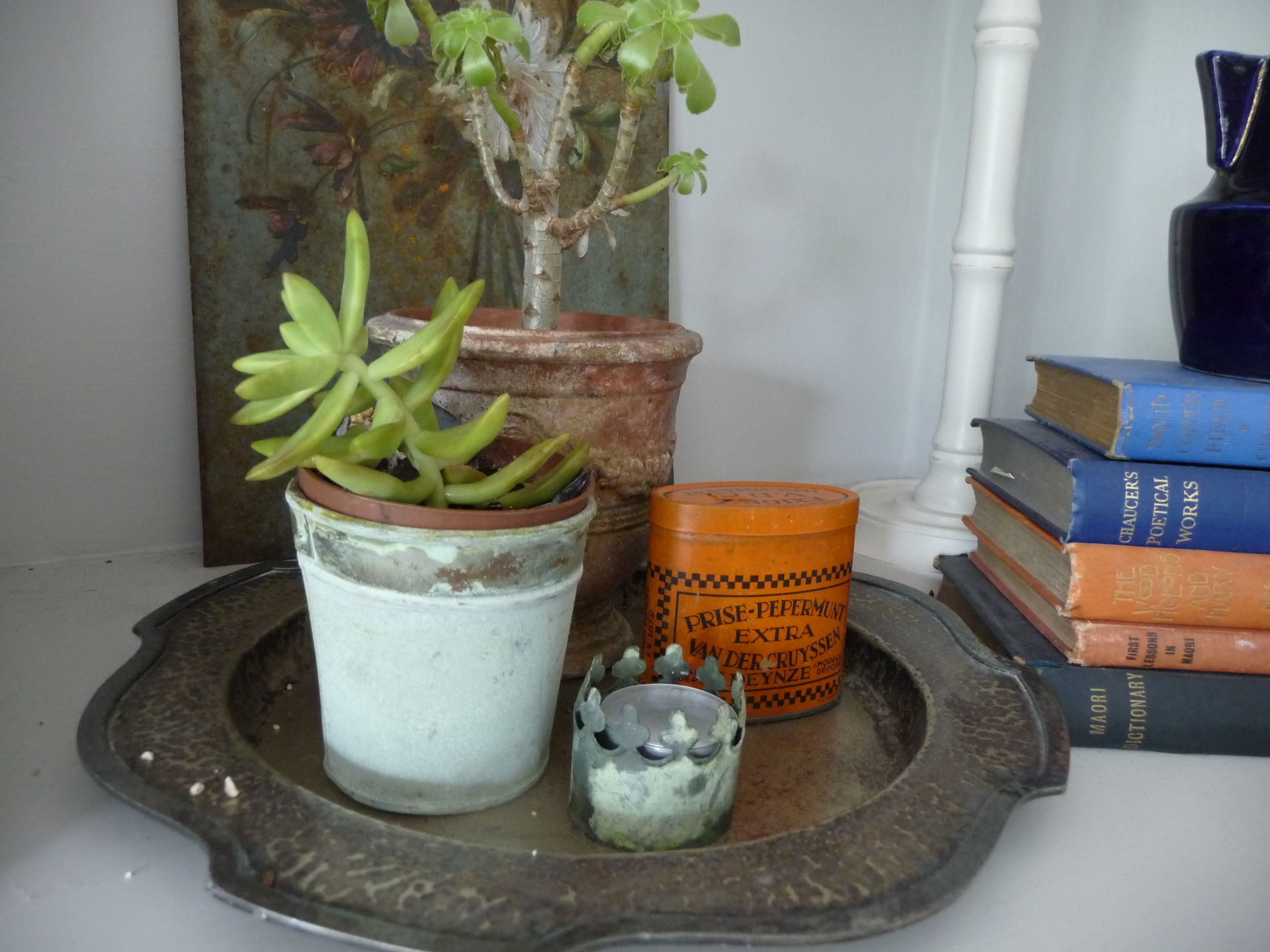
By nature I'm neither a hoarder nor a collector but I do adore mirrors and have over 15 mirrors in my home so technically that could class me as a collector, no?! Recently I've developed a love of small vintage tins and whenever I see one that I like, I buy it. Currently I only have six tins and I don't plan to avidly search them out just to add to the collection as and when I find them. I usually pick them up in junk shops, second hand shops or markets and the rustier the better. I've never parted with more than £22 for a tin and that's in a shop; if I am at a market or junk shop I can buy them for a couple of quid.
I'm all for collecting items but I think it's really important to display them in such a way that they become part of your interior styling, rather than just build up a clutter of them on a shelf to gather dust or in a cupboard where you can't see them. I'm also very practical by nature and a time management freak so I use most of these vintage tins for storing useful items like pen, paper, reading glasses, TV remote, stapler, post-its etc. The pretty tin on the pile of books (makeshift side table!) next to the chair I sit in to watch TV is particularly useful. Means I don't have to get up to find a pen and paper if I suddenly have a brain wave which often happens when I'm watching some mind-numblingly boring programme on TV! And being of a certain age where my eye sight is no longer perfect, if I can fit a pair of glasses in the tin all the better so they are strategically placed in each room, hidden in a tin where possible, so out of sight.
Here are the vintage tins I currently have. They may not appeal to everyone but I love the age of them, the old-fashioned design and subtle colours. The larger ones are old biscuit tins. They certainly don't make such beautiful biscuit tins these days, do they? Anyway, here are my tins and how I've used them as part of my interior styling.


I'd love to hear about what items you are passionate about and that you collect - what quantities you have, how you store or display them, where you find them to buy etc. Do let me know and I'm sure my subscribers would enjoy reading about your collections. I'd also love to get some feedback from you as to what topics you'd like me to cover in my blog.
You might also like to read
Creating a kitchen/diner in an Edwardian home
Here I gave a contemporary look to a client's extended Edwardian home. Given the passion the owner has for their outside space, it was crucial that the colours used in the kitchen/diner complemented the soft colours of the garden.
Read moreAdd panache to your sitting room
This client wanted me to transform their sitting room from a bland space into a sophisticated room for adults to relax in. This post includes ideas and inspiration for revamping your own sitting room.
Read moreGive your entrance the wow factor!
Here are some tips on how to create a wow factor that greets your visitors and welcomes you home.
Read moreA lesson in flower arranging at Perch Hill, Sussex
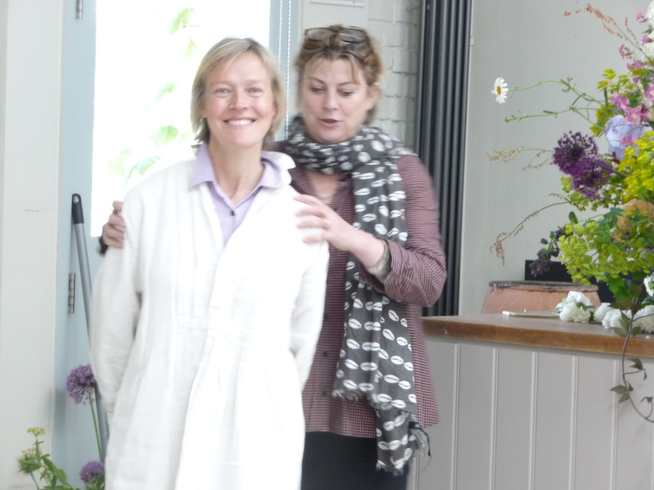
It's been a crazy week and I'm behind in my blog posts, still catching up on posts relating to my friend's visit - she's been gone over a week! My friend from back home who stayed with me for two weeks (see previous post 'Route Marching Around Richmond Park) very kindly paid for the two of us to attend a Sarah Raven course with the charismatic and charming Juliet Glaves of Thoughtful Flowers. The course was at Sarah Raven's inspirational garden at Perch Hill in Sussex which is in the most glorious setting. For those of you who don't know Sarah Raven, she is a well-known gardener, writer and television presenter and she runs a garden and cookery school at Perch Hill.
Juliet Glaves had a pop-up florist in The Designers Guild during the Chelsea Flower Show week. You can see the beautiful displays of flowers and arrangements she had in the Designers Guild in my post 'Designer's Guild Embraces Chelsea Flower Show' dated 25 May.
It was wonderful to head out of London in the car on a glorious sunny day and head into the countryside. Everything is very green and lush at present so it's the perfect time of year to appreciate the English countryside. I don't get out of London enough but have made it a resolution this year to escape London more often. It's so good for the soul!
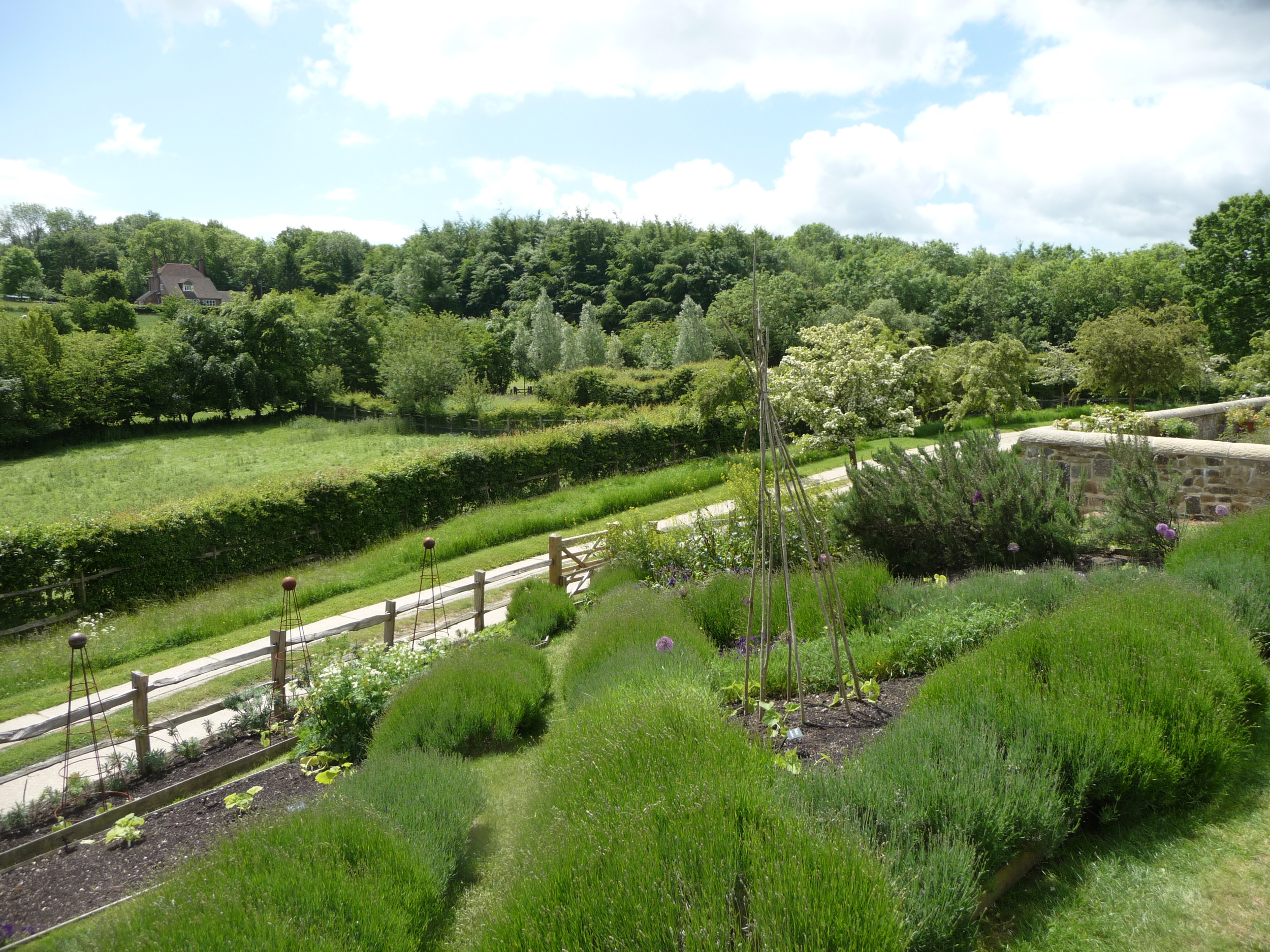
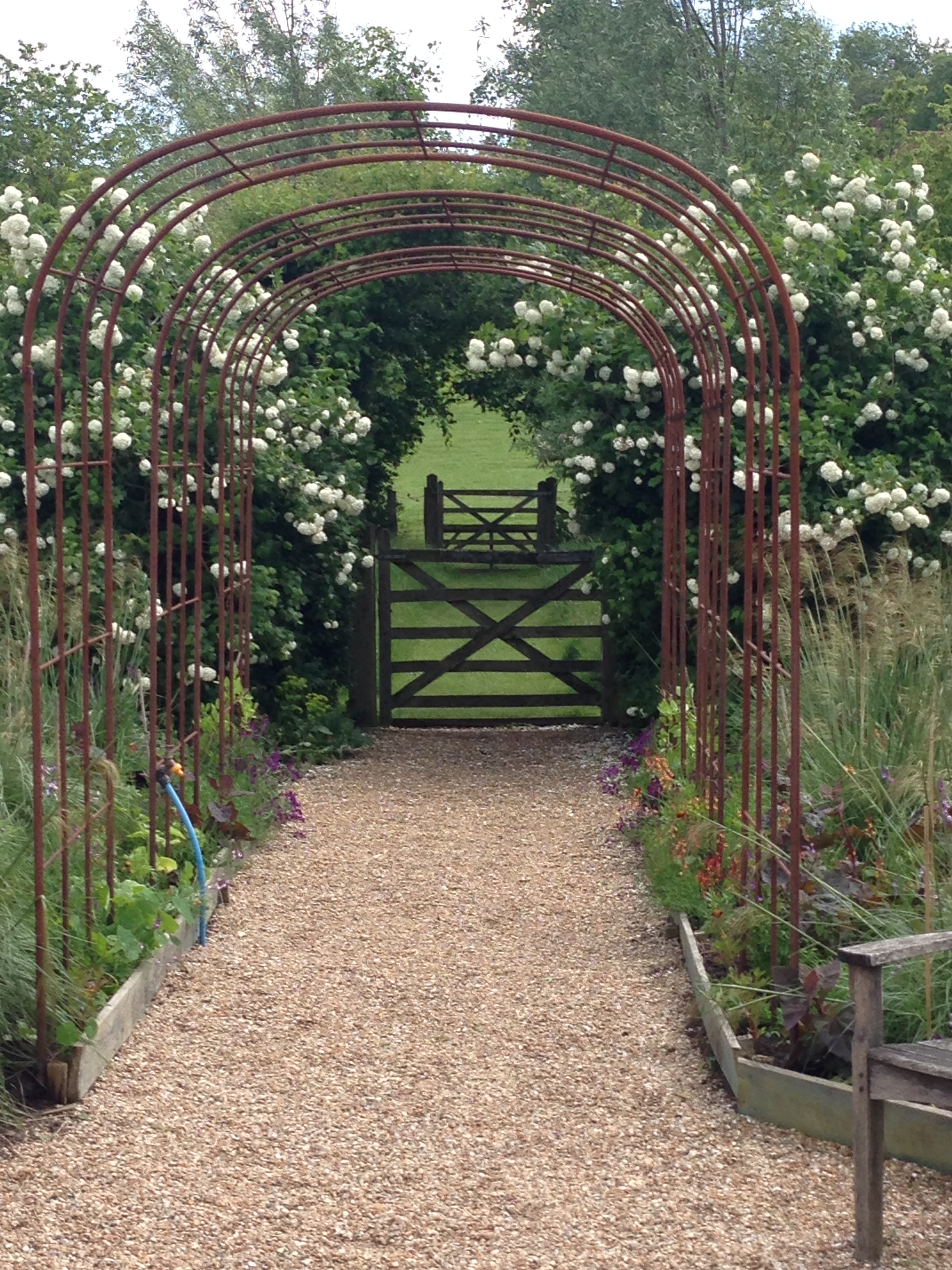
Perch Hill is off the beaten track down a long winding road. The entrance to it is stunning - the lichen covered gate and the purple and white wallflowers flanking one side of the driveway:


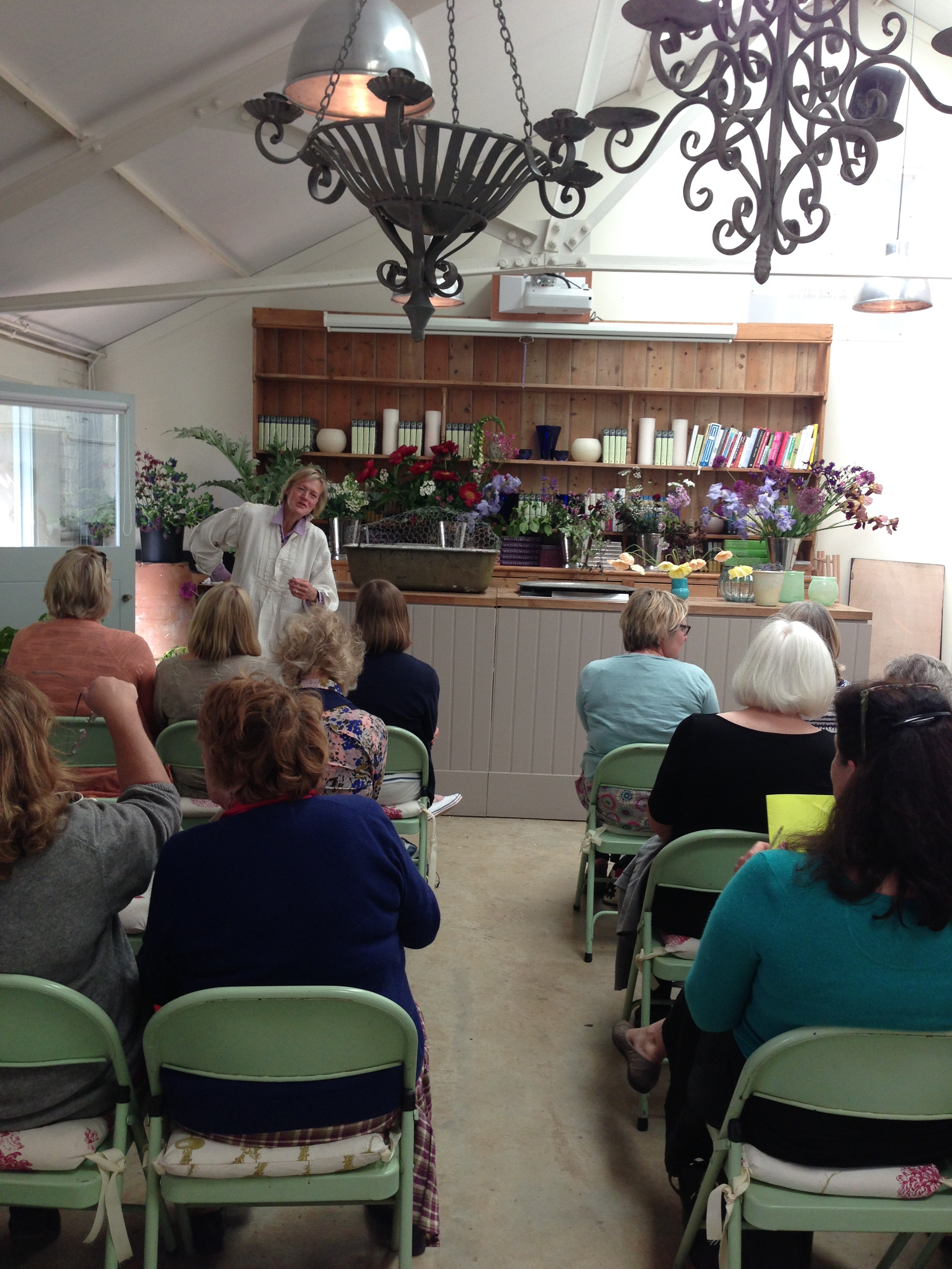
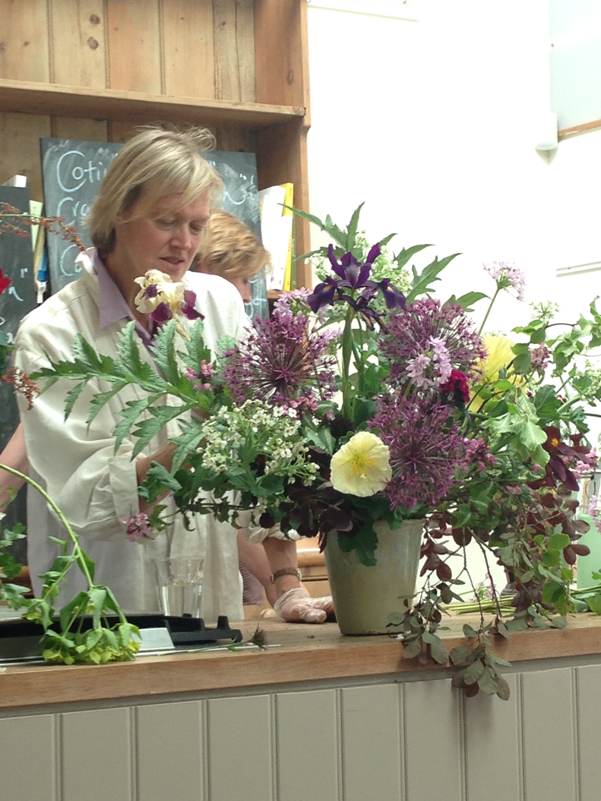
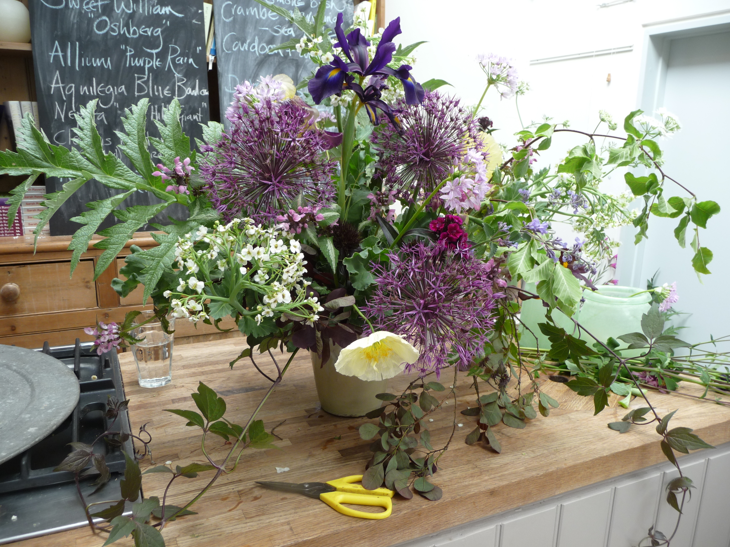
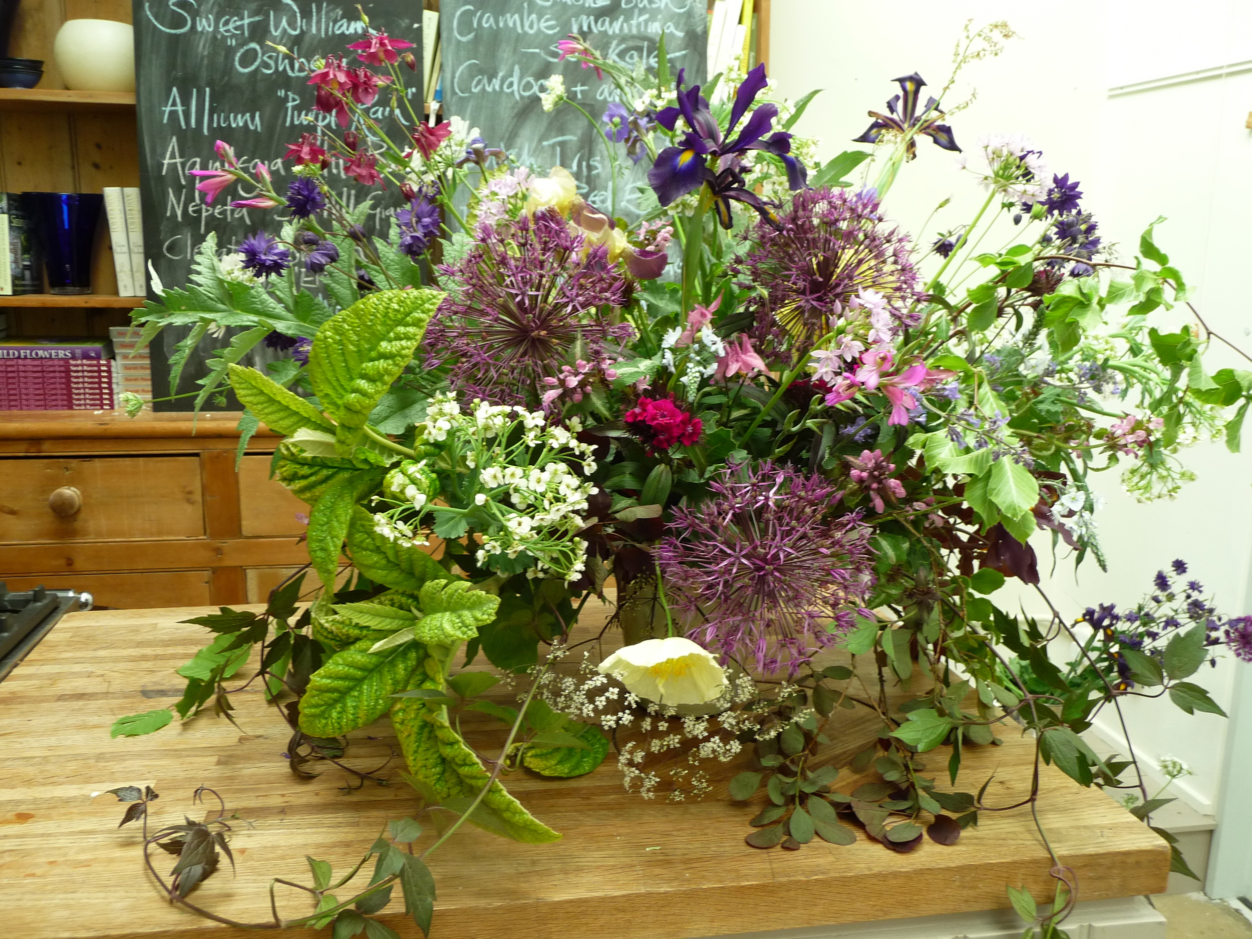
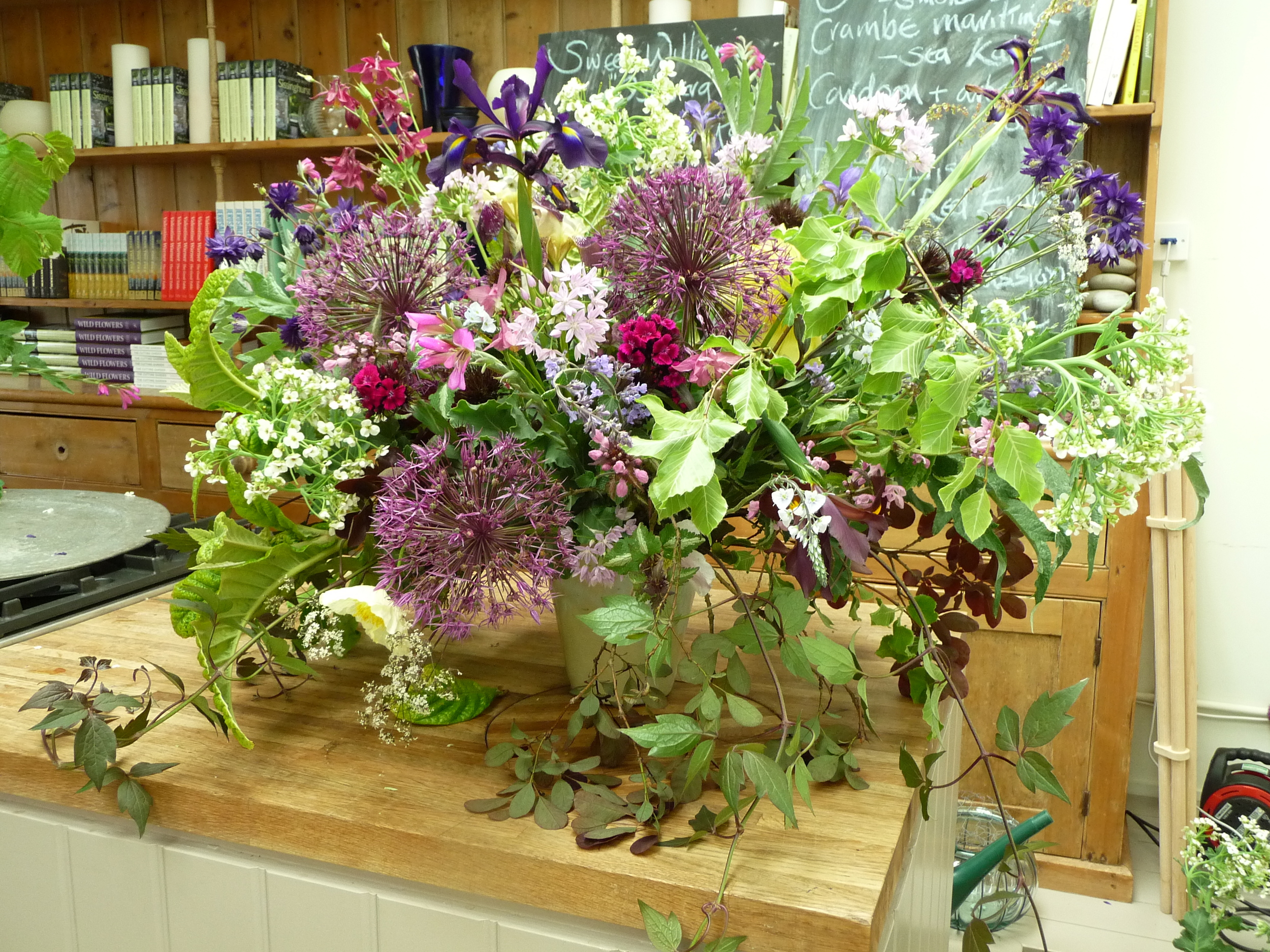
There were about 30 of us on the course, all women, and all passionate about flowers and flower arranging. Even as an experienced florist there was plenty to learn from Juliet Glaves, whose style of flower arranging is much less formal than the way I was taught. She and her husband grow all their own flowers as well as picking wild flowers from the hedgerows so all the flowers she used in the two arrangements she made were home-grown.
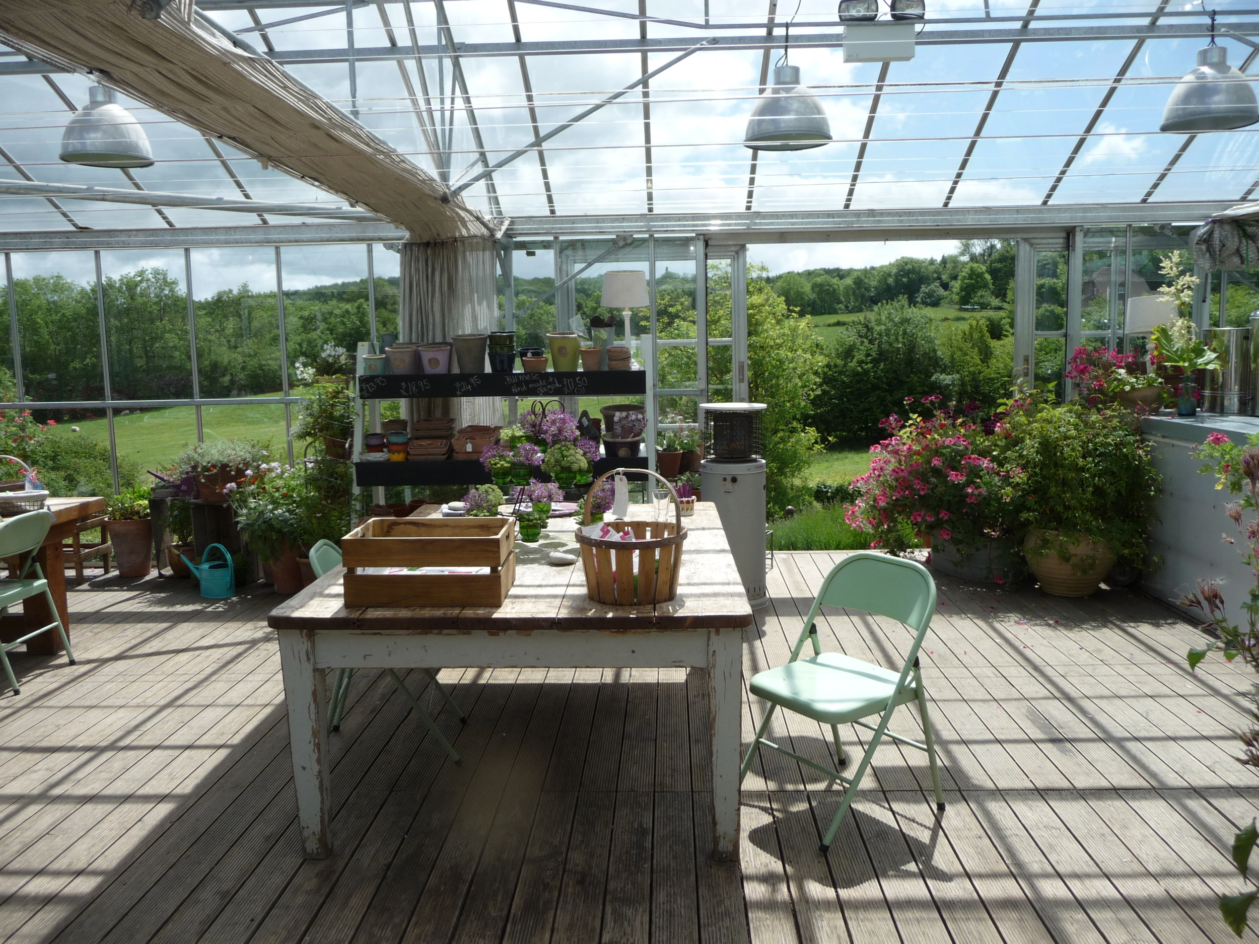
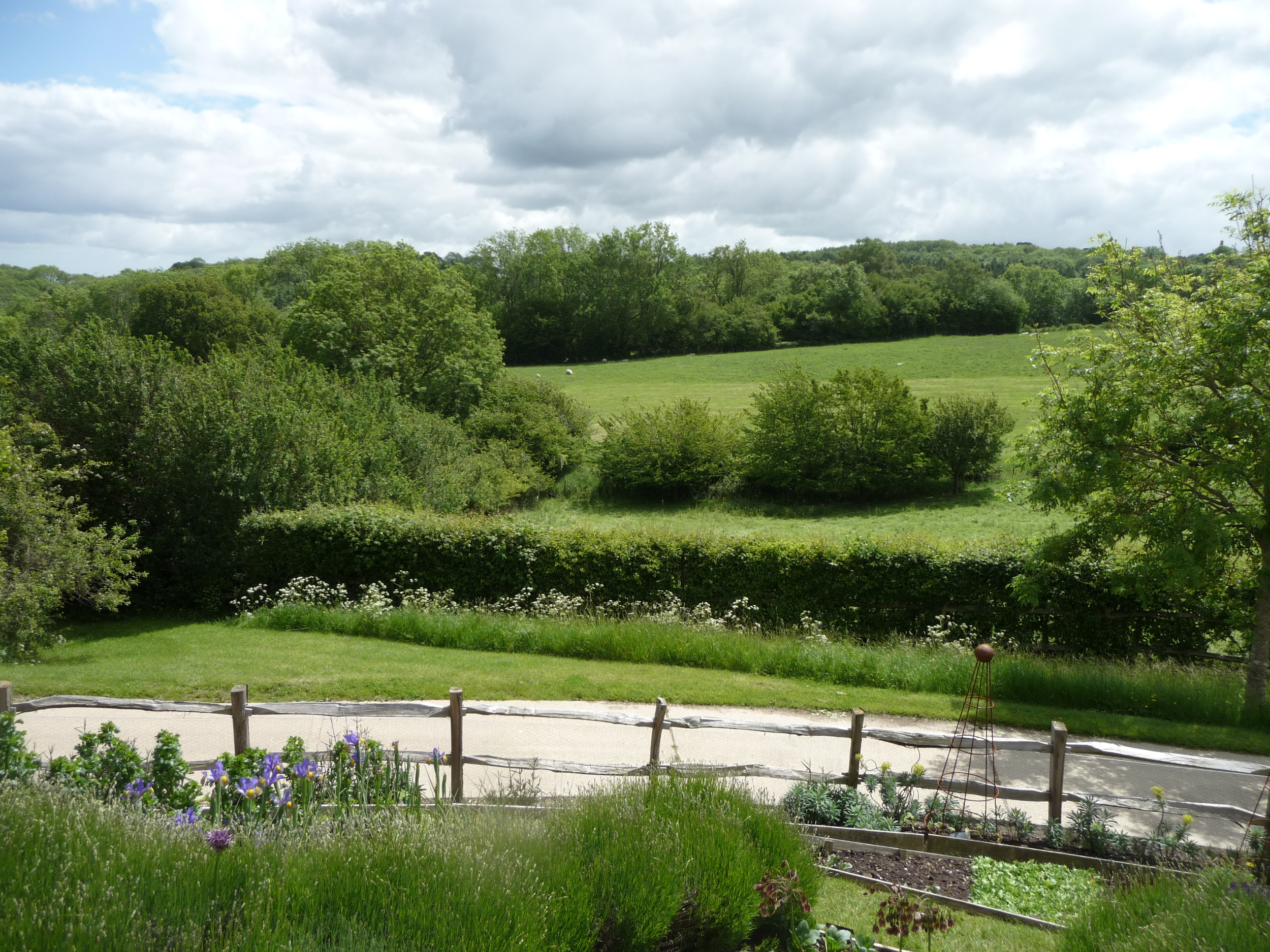
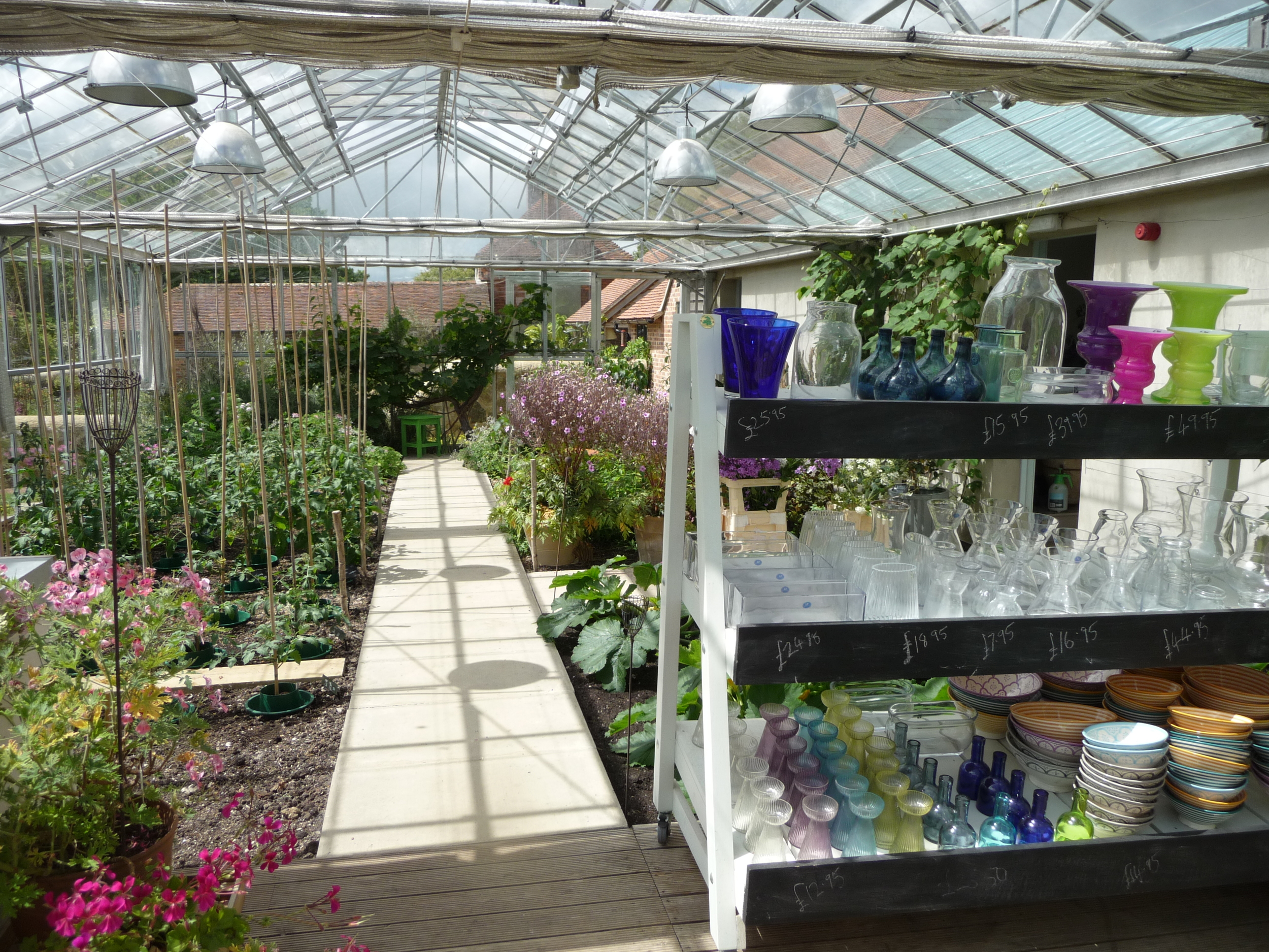
When you first enter the Perch Hill building, you walk through the small shop (full of lots of fabulous items to buy) to a large glasshouse/conservatory which has the most spectacular view of the countryside. Coffee and delicious cakes were served here while we soaked up the view.

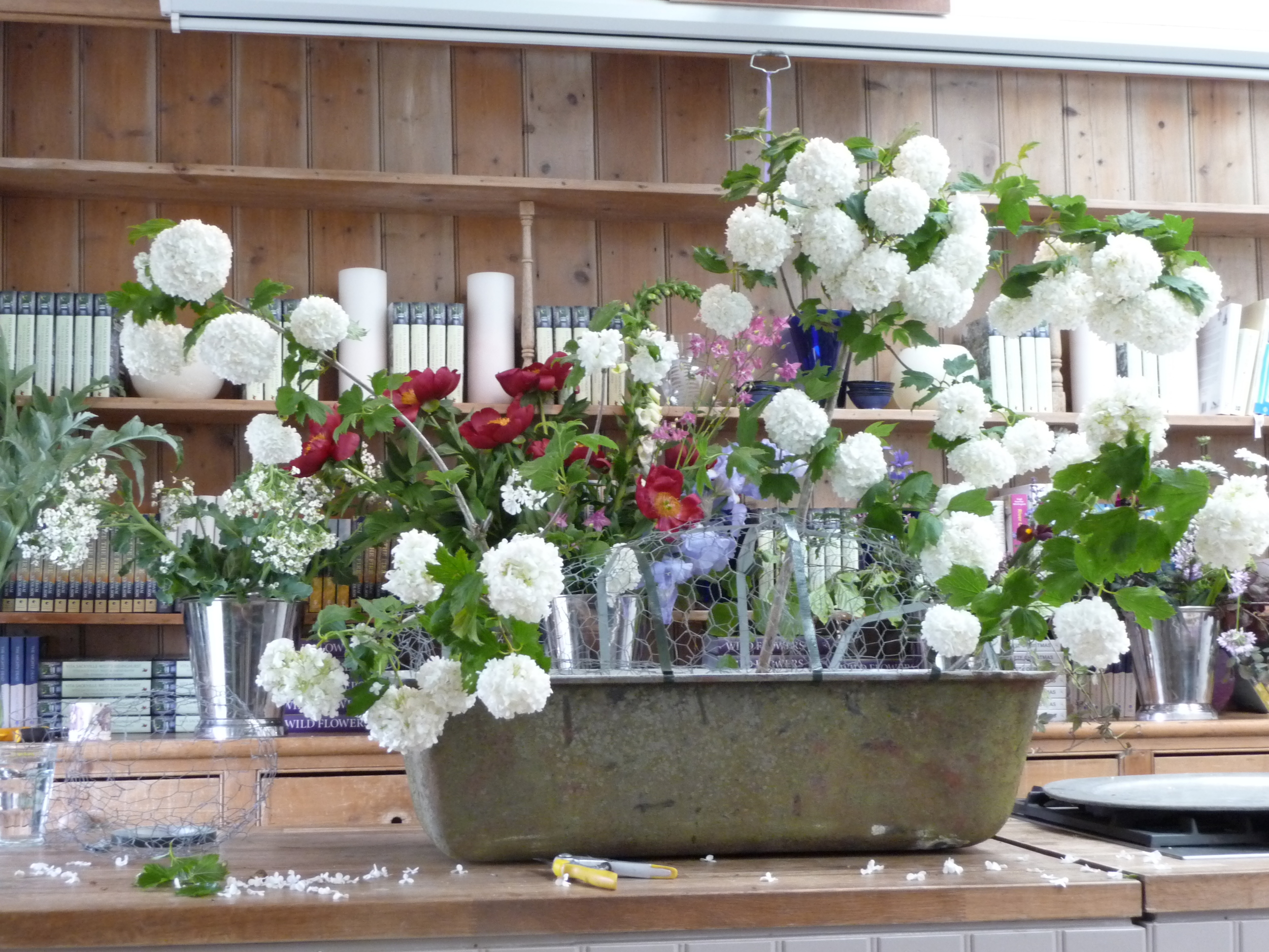
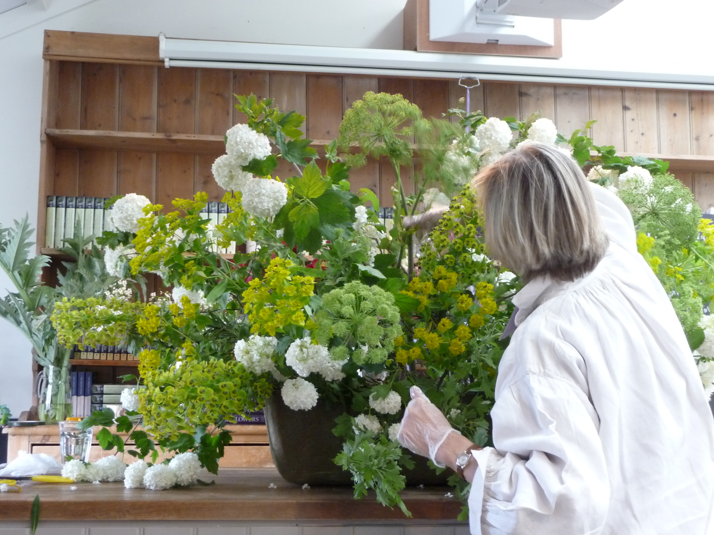
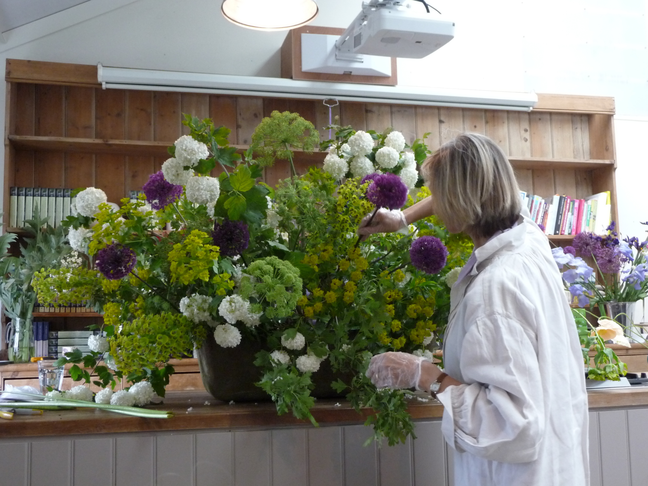
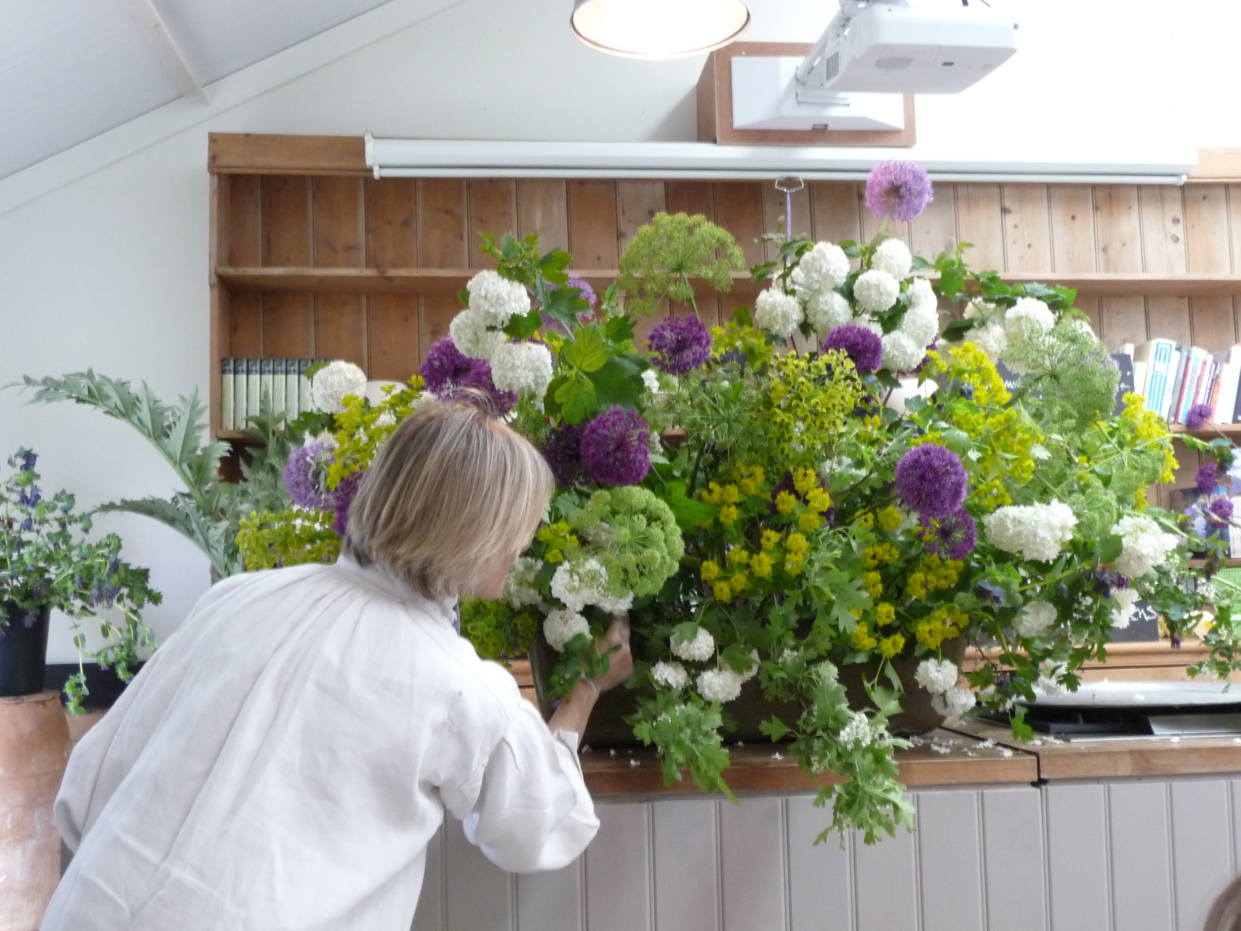
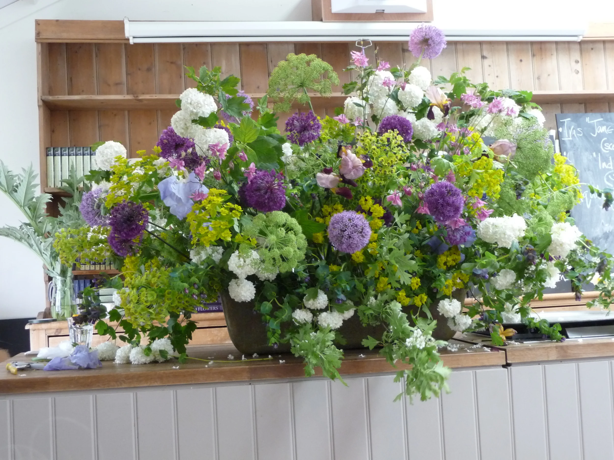
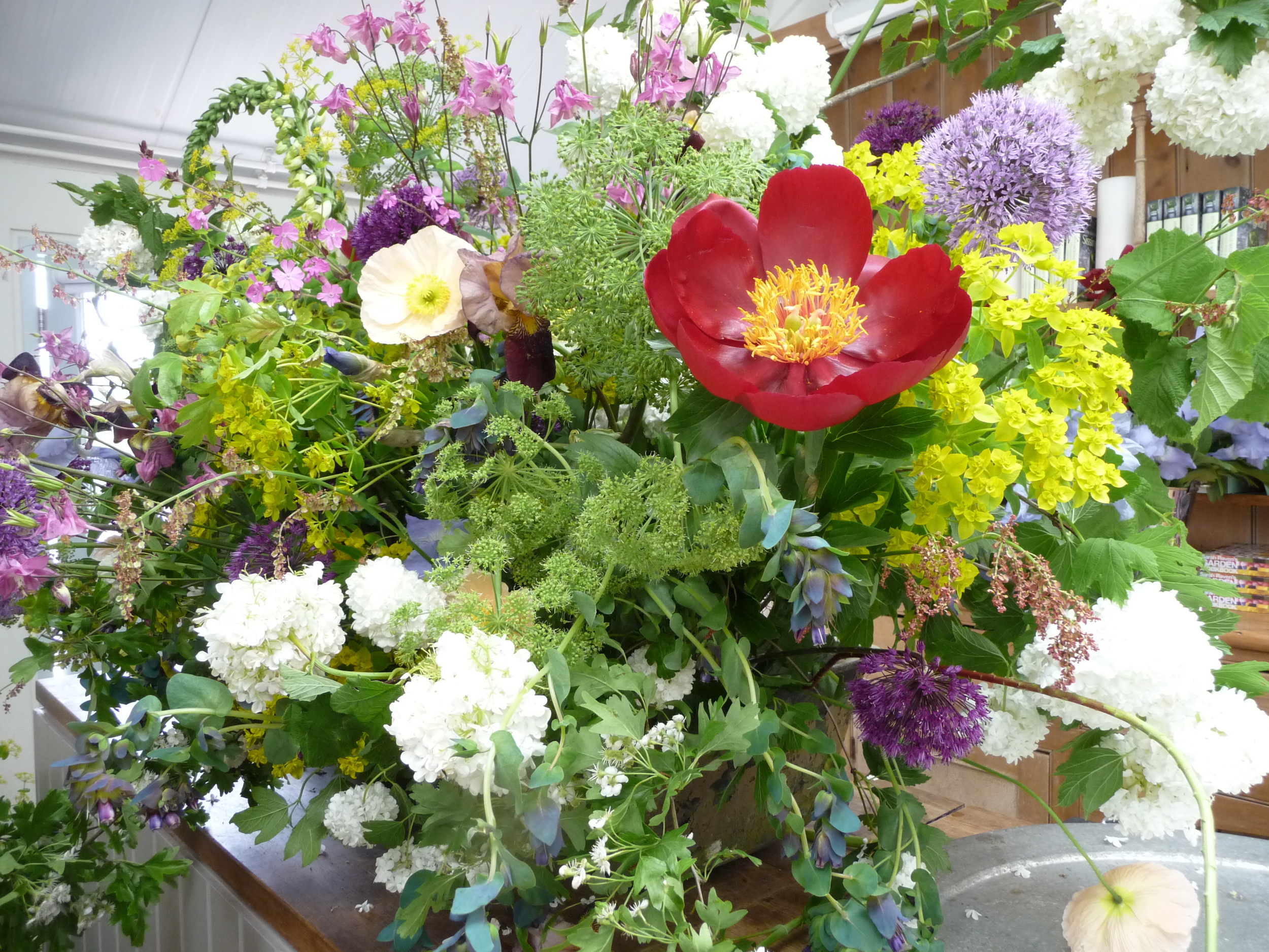
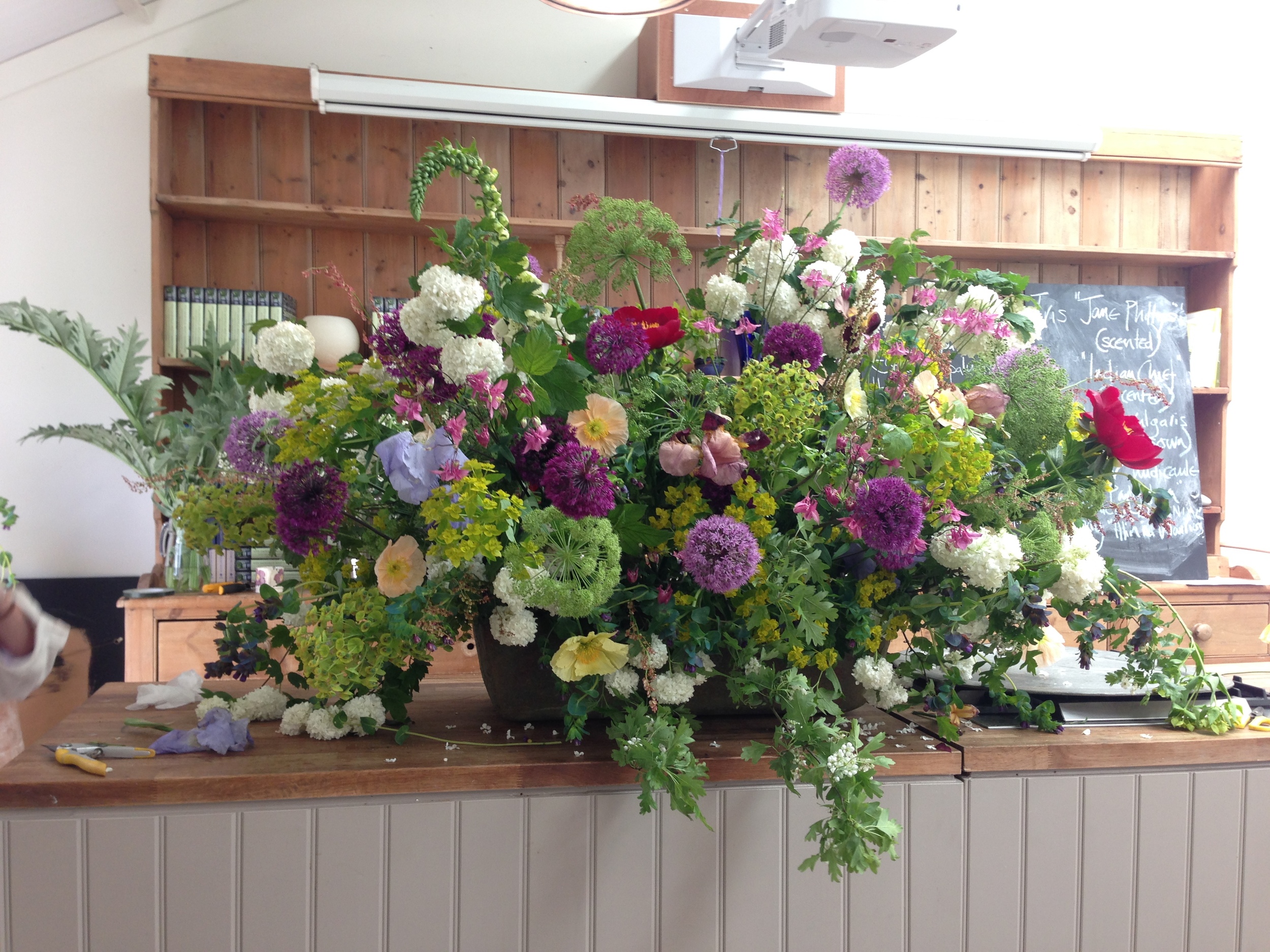
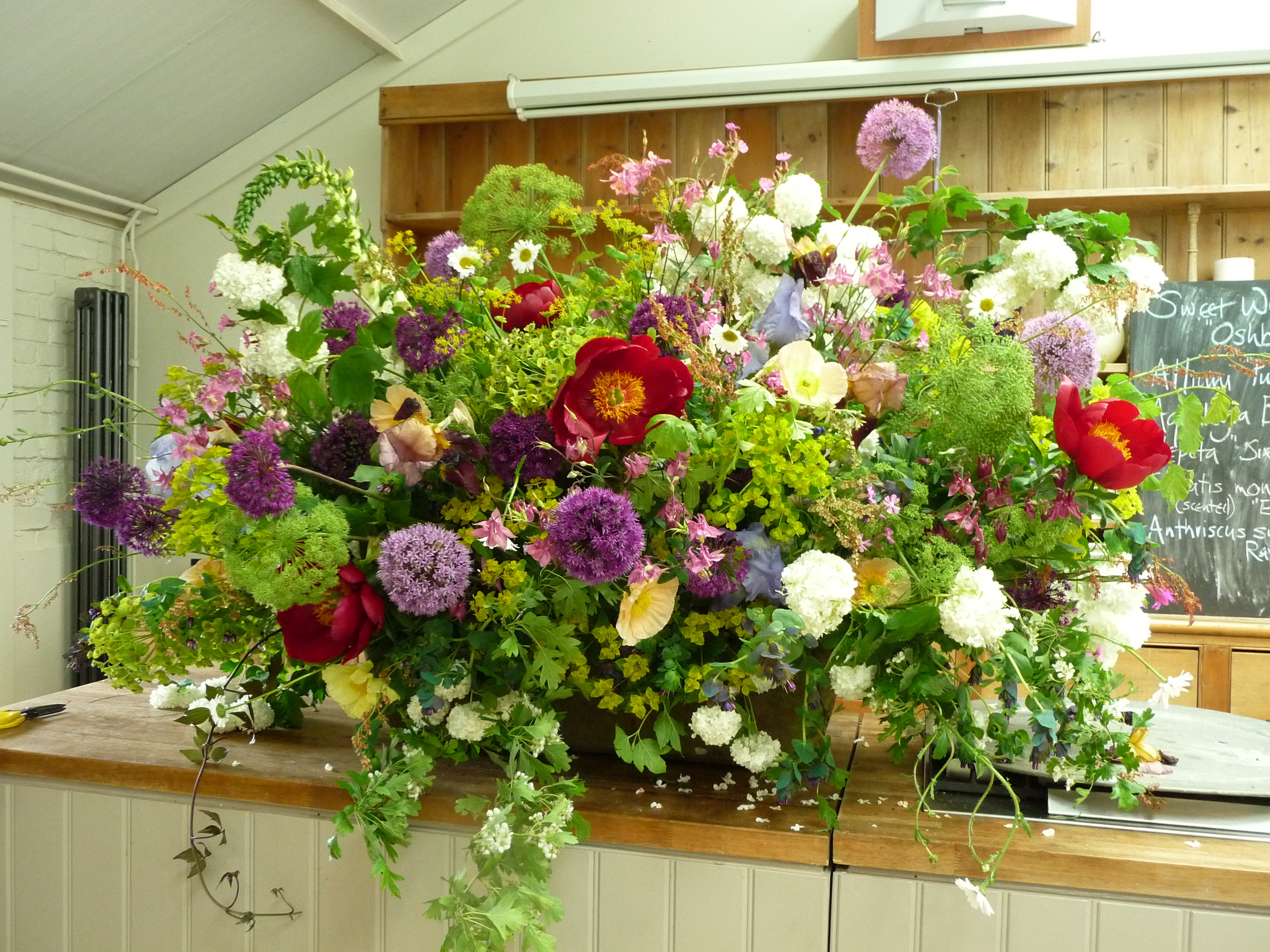
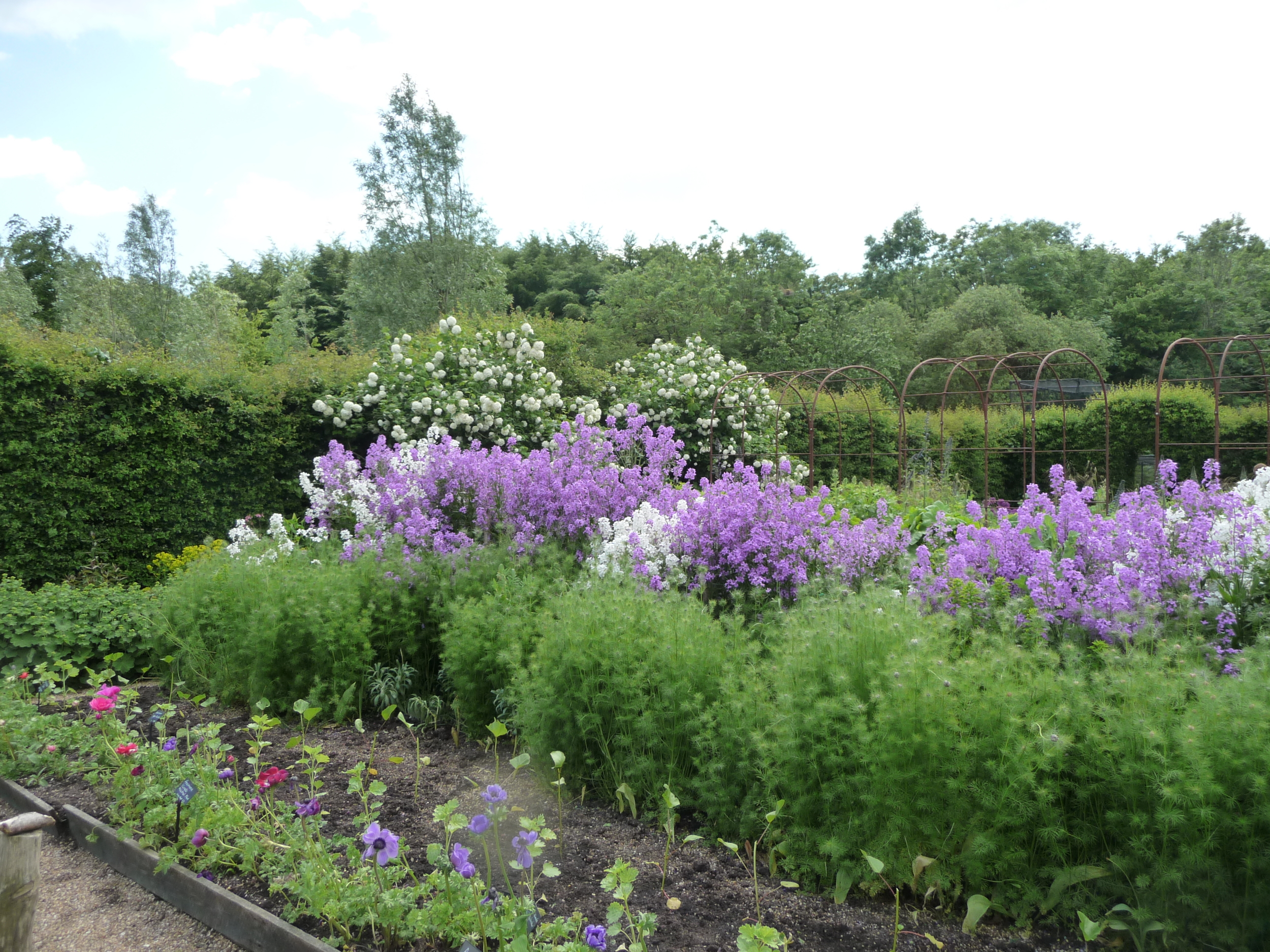
Juliet began her first masterpiece in a large metal horse's trough. She uses chicken wire rather than oasis which she attaches with tape. Chicken wire is a lot more effective and versatile in large containers especially if using tall and/or heavy stems. Juliet chatted to us as she created her masterpiece and answered all of our questions. We all took copious notes! I've shown below the progress as she added more and more gorgeous flowers that she had grown. It was amazing to watch the way the arrangement transformed. Right at the end she decided to add a few red peonies and there were gasps from the floor as these pops of red suddenly transformed the whole arrangement and it took on another dimension.
Sarah supported Juliet's presentation by providing the botanical names of each flower and how they are best cultivated. They were a great double act!!
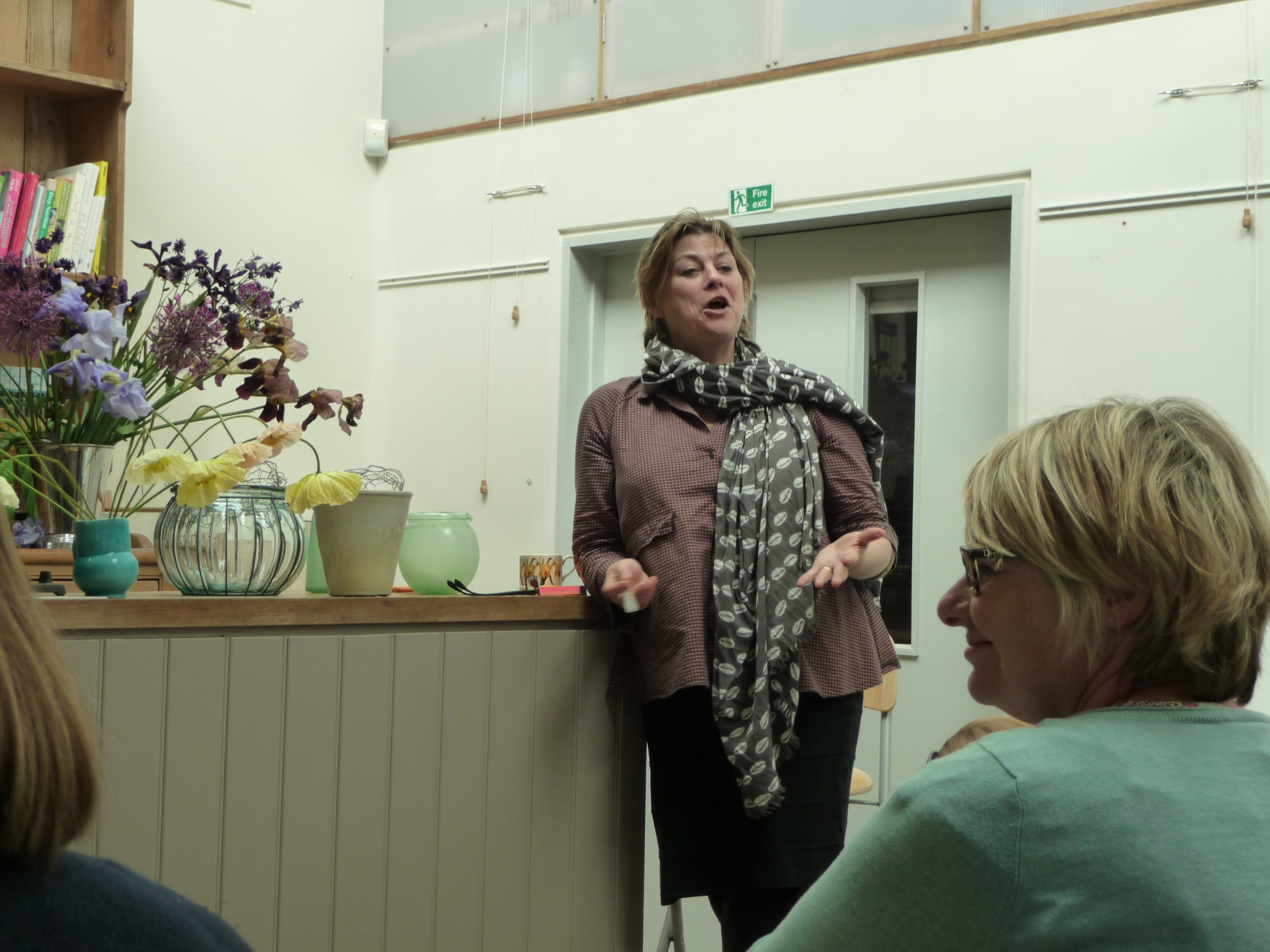
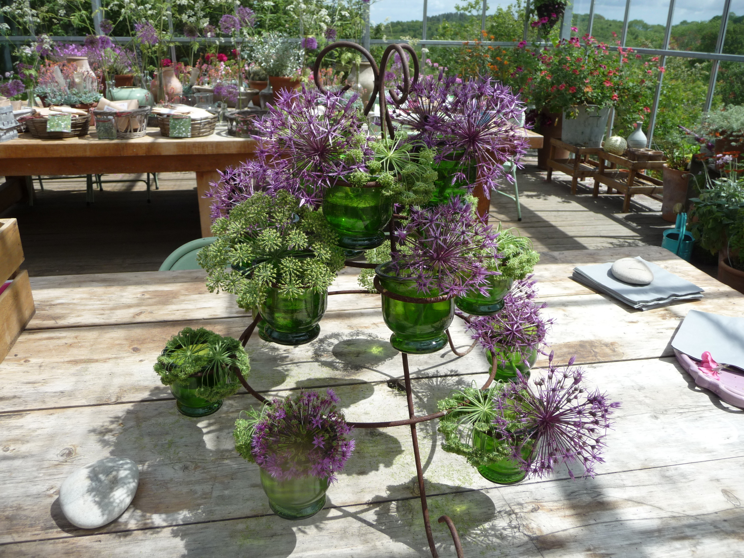
The second arrangement that Juliet created was much smaller but equally as stunning. She used a smallish glass vase and it's incredible the size of the arrangement that she put in it.
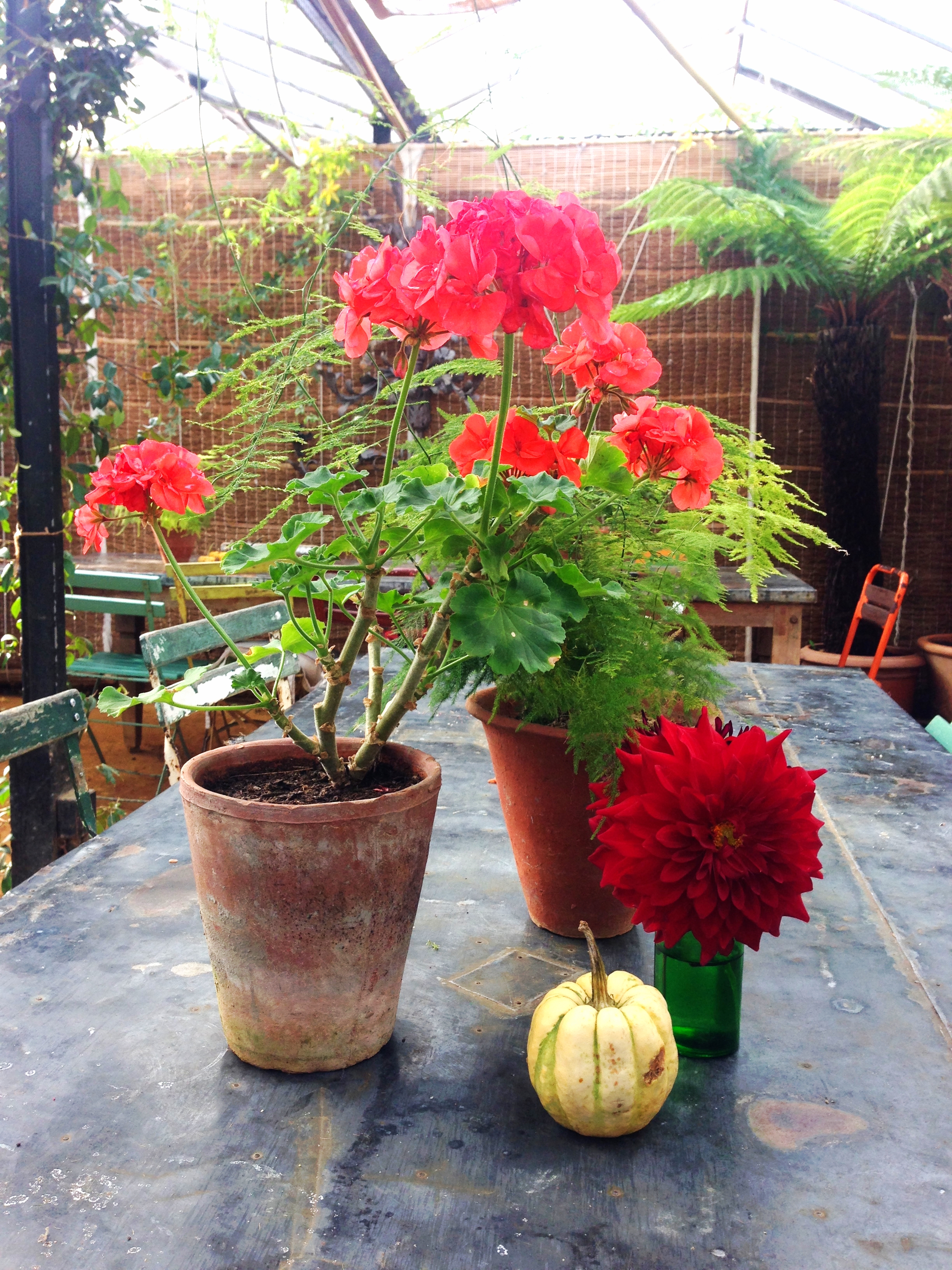
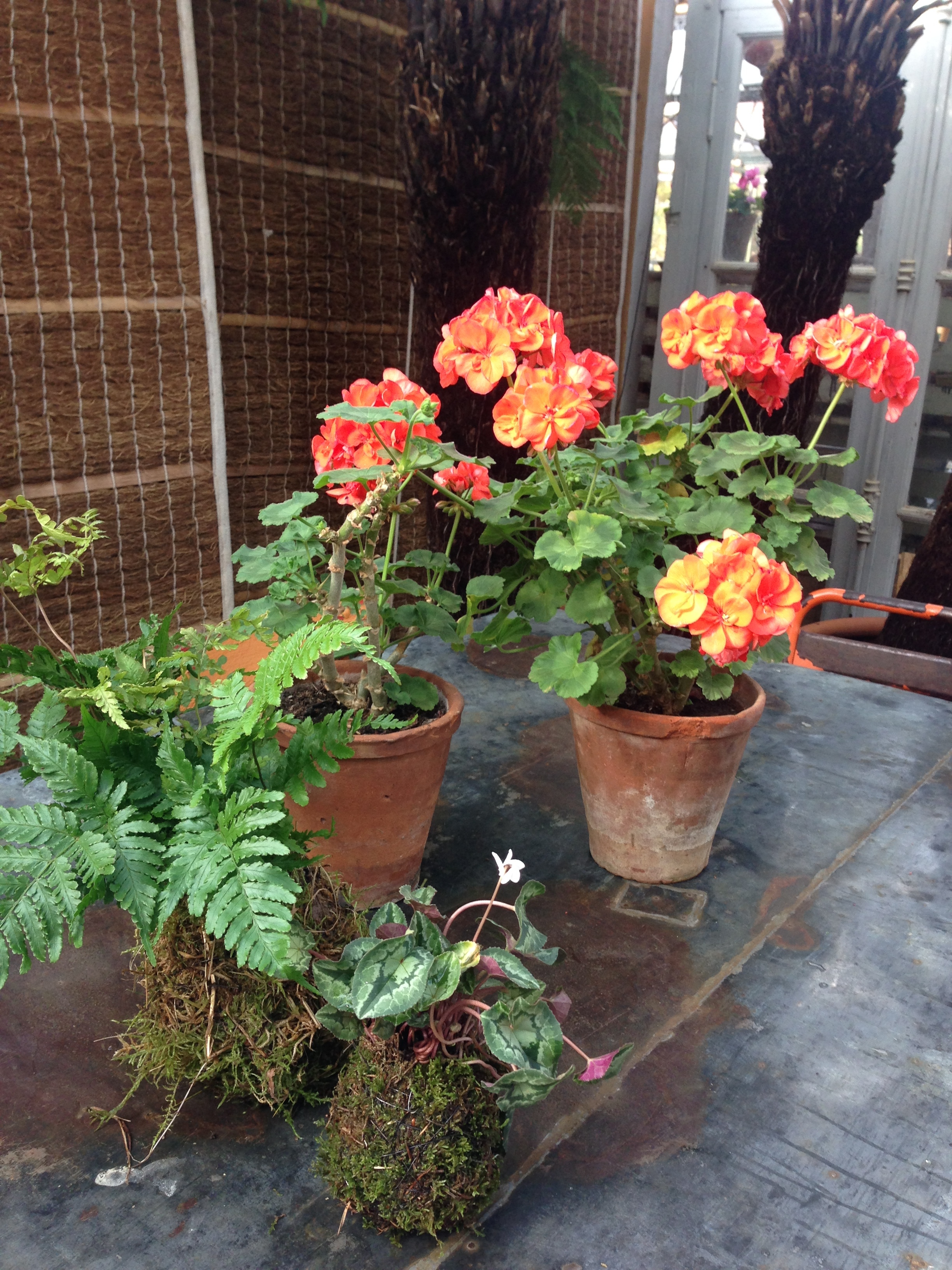
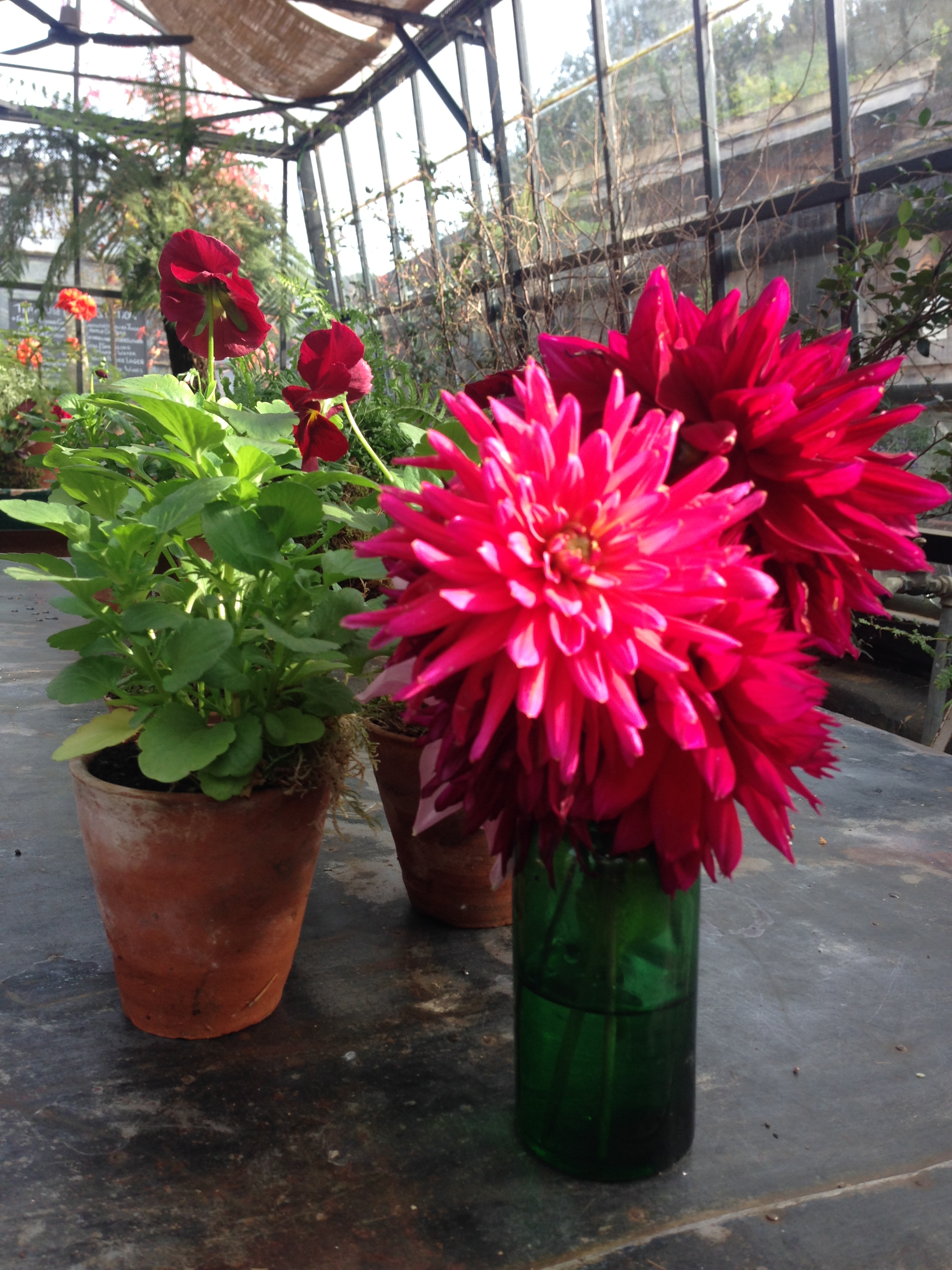
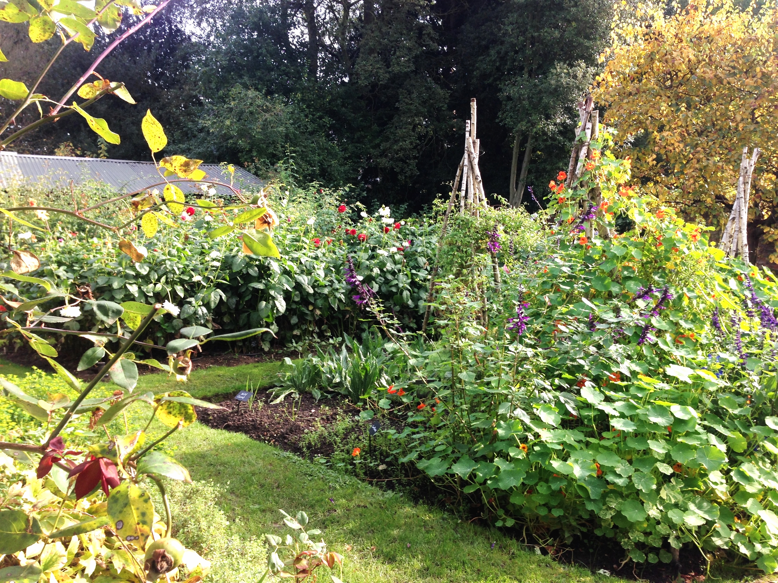
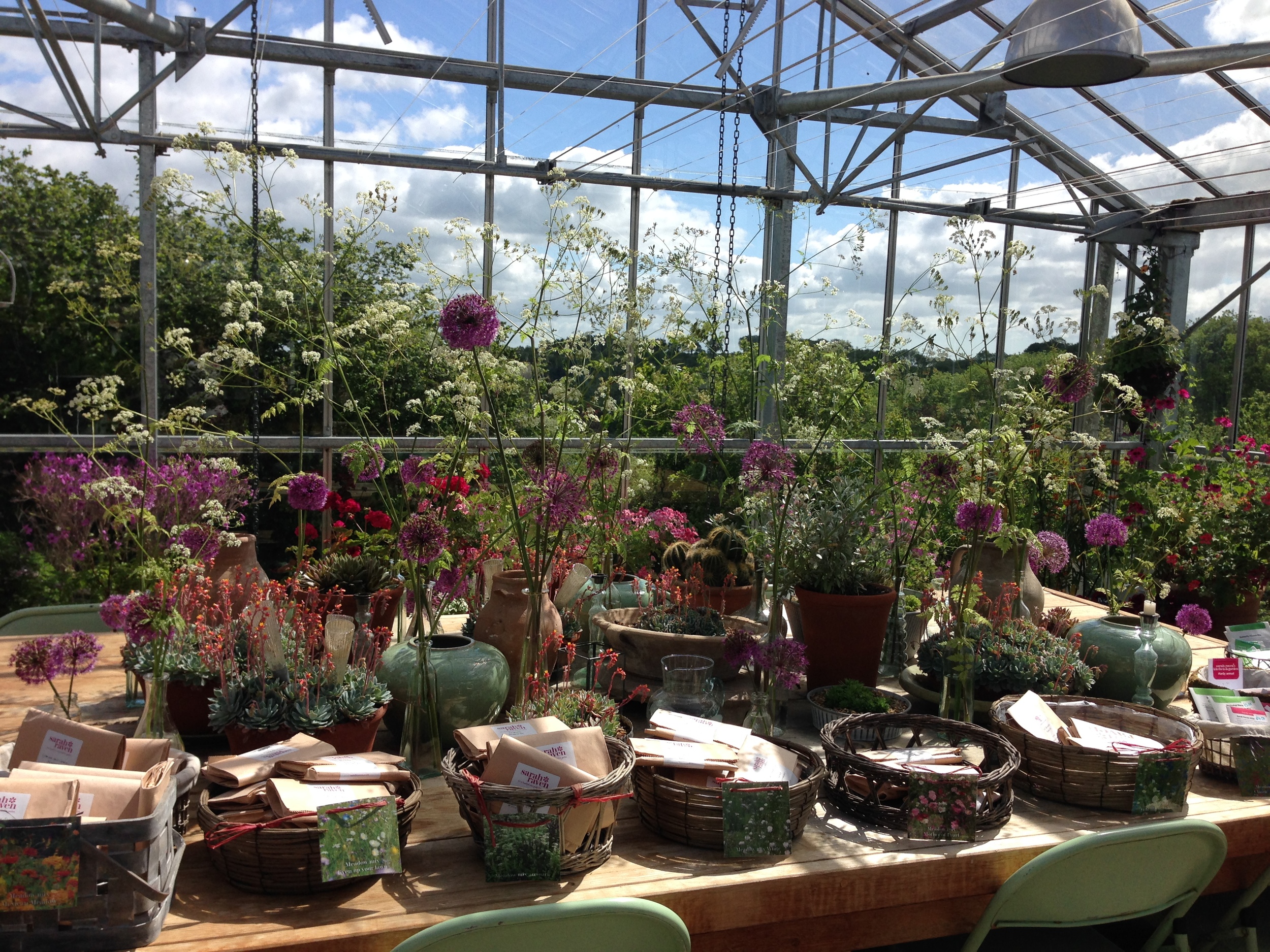
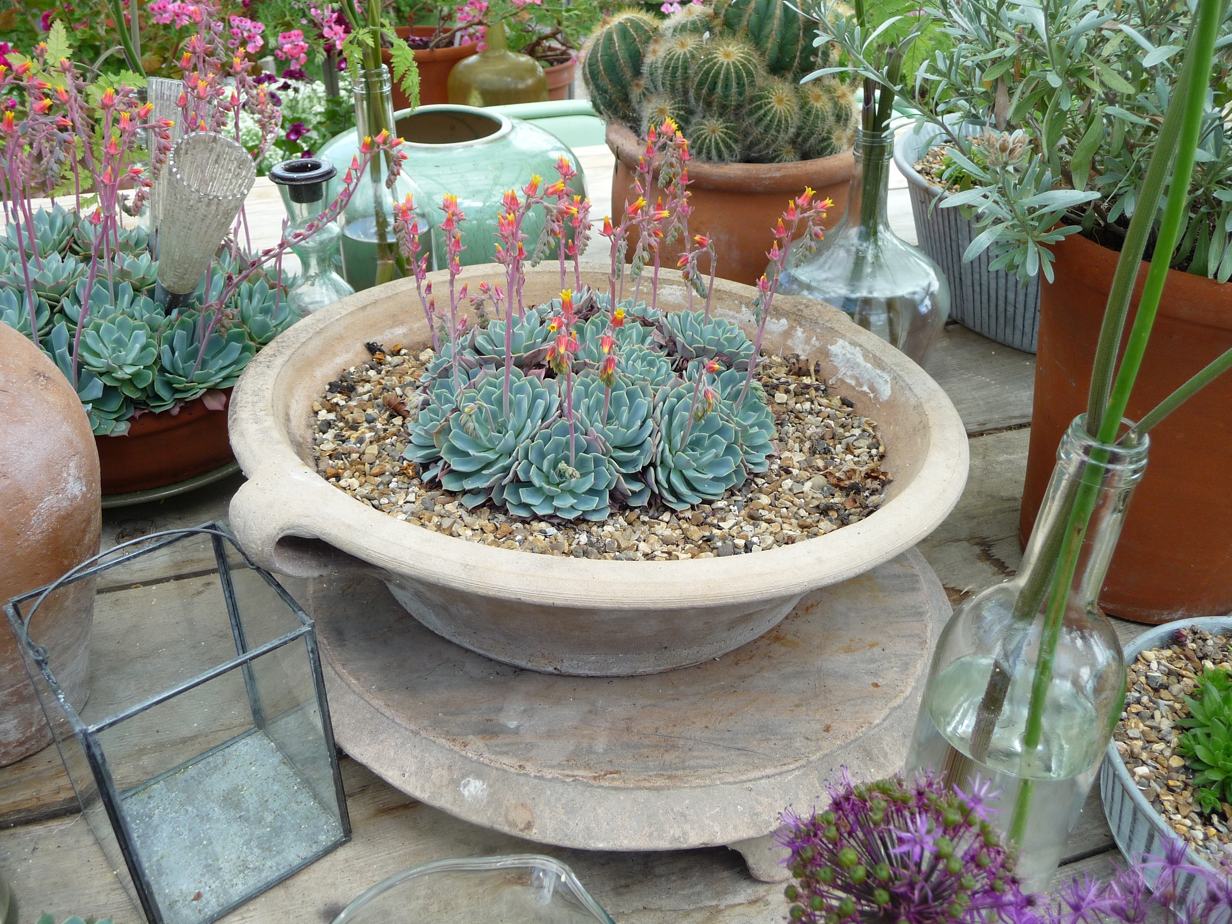
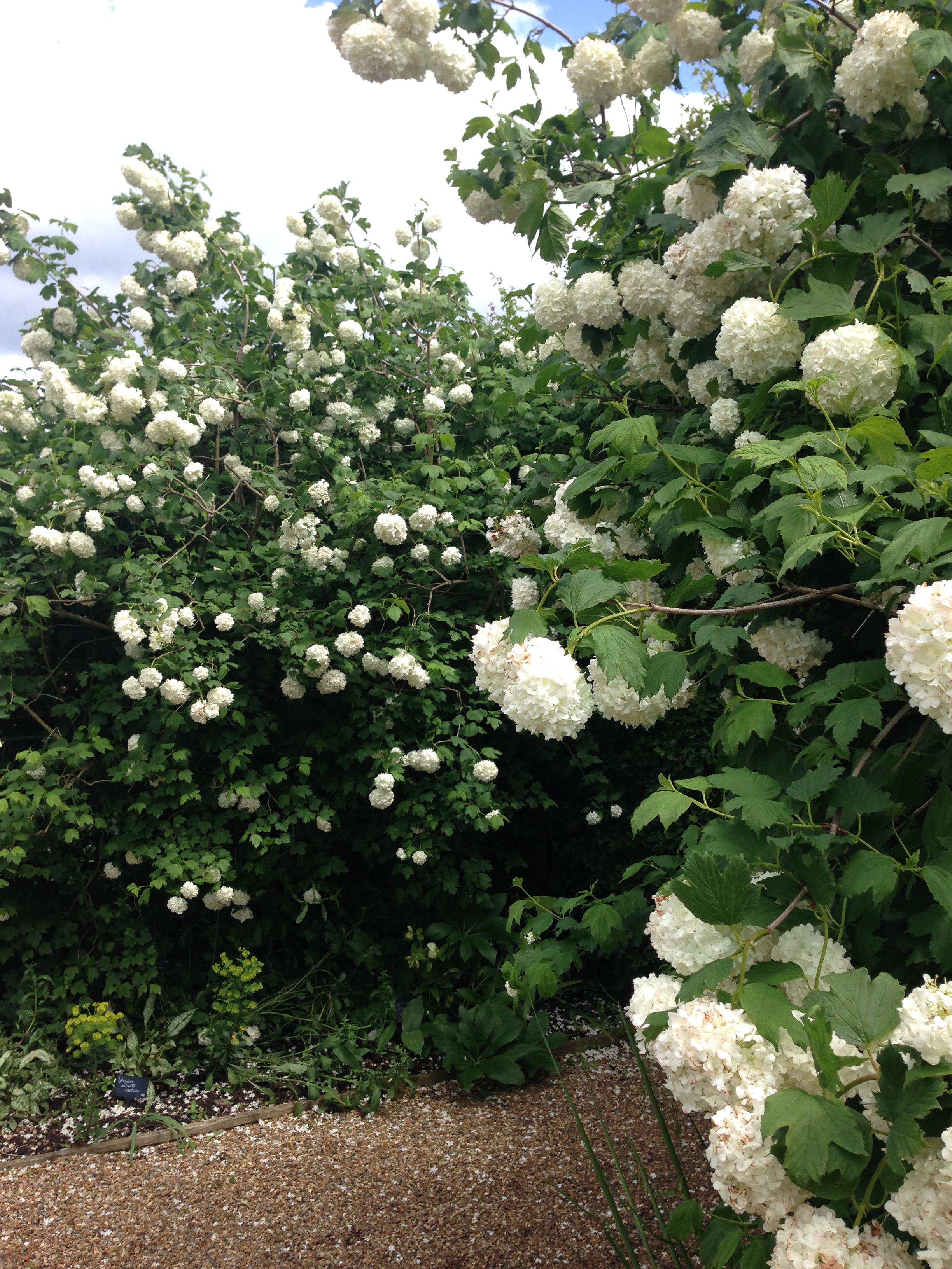
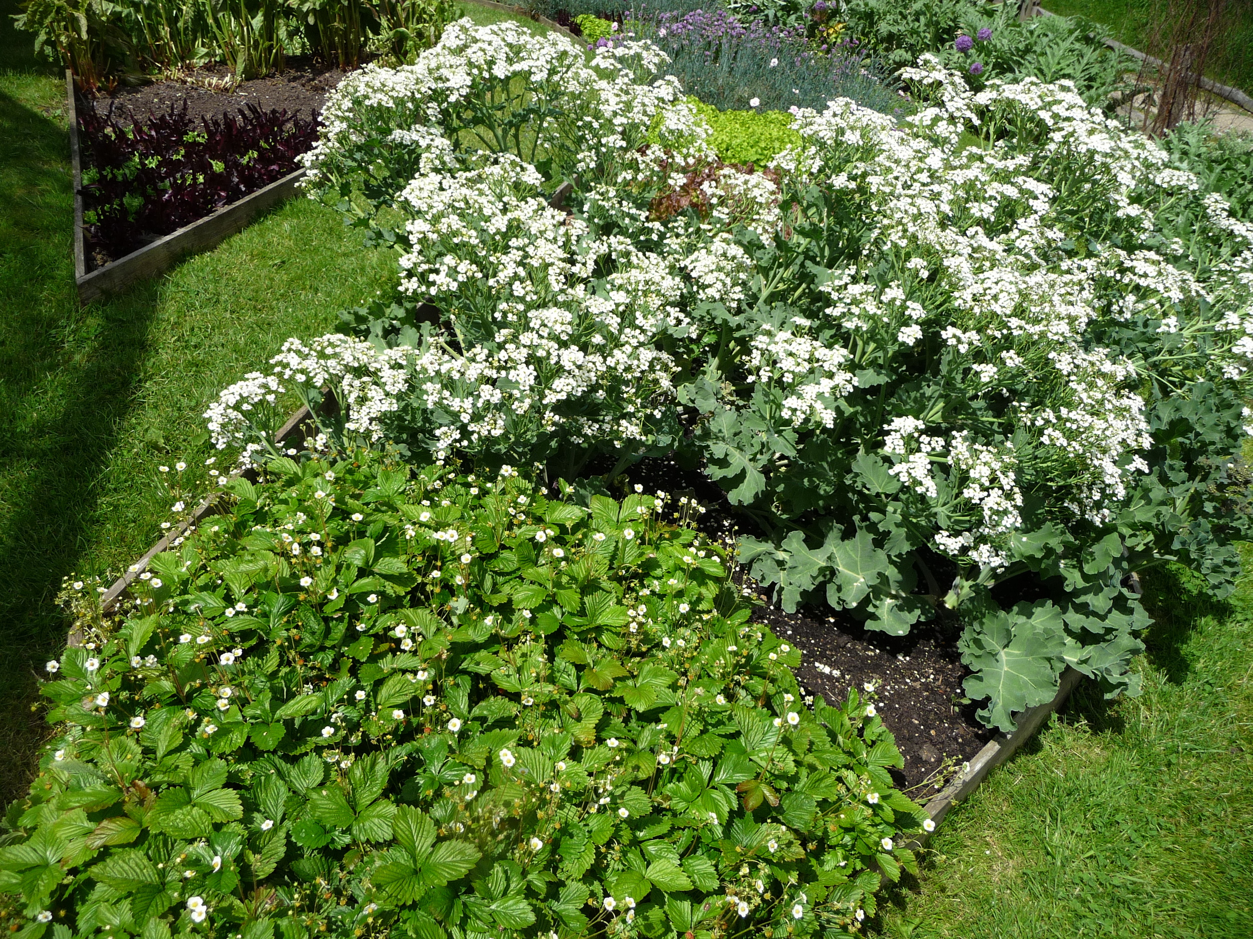
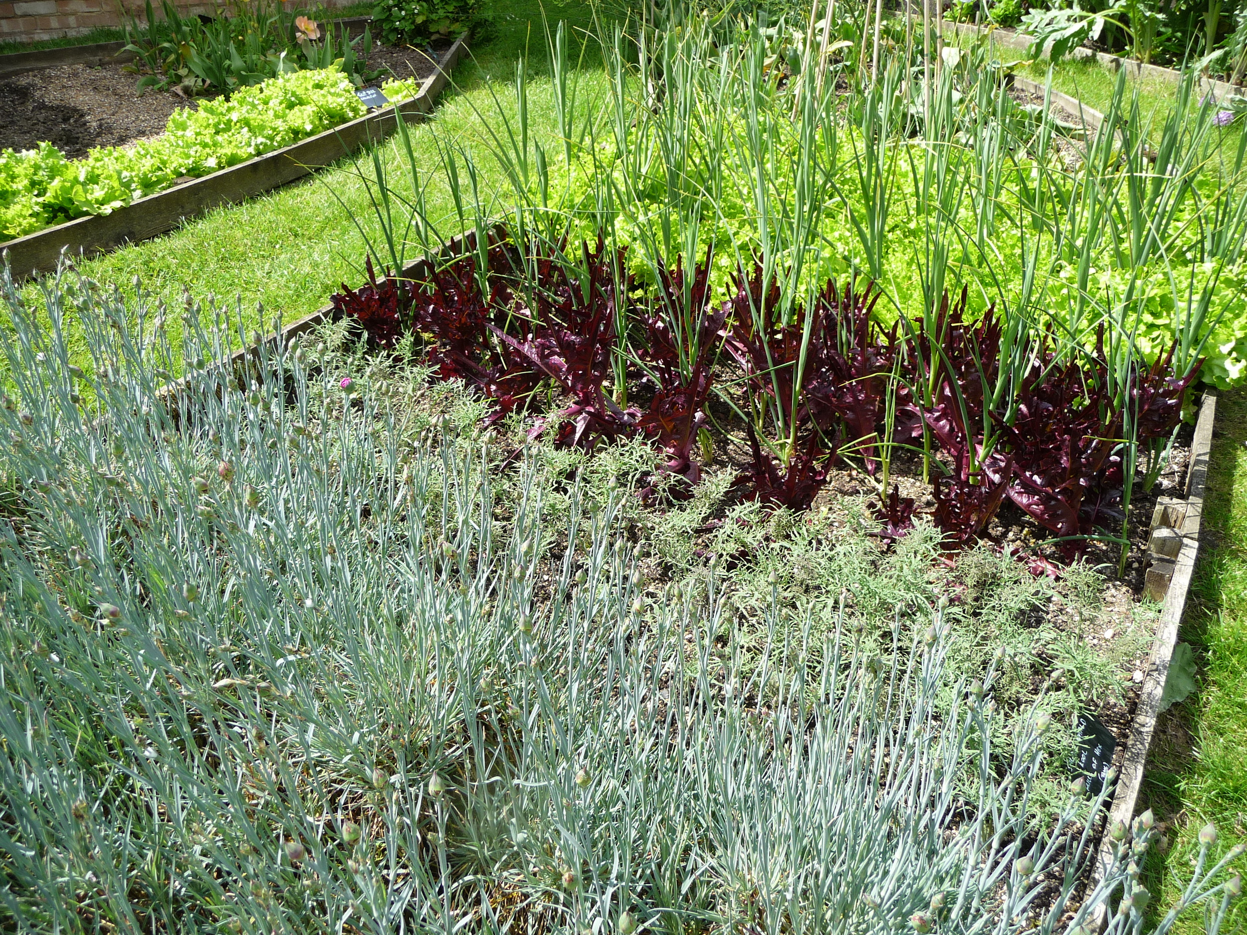
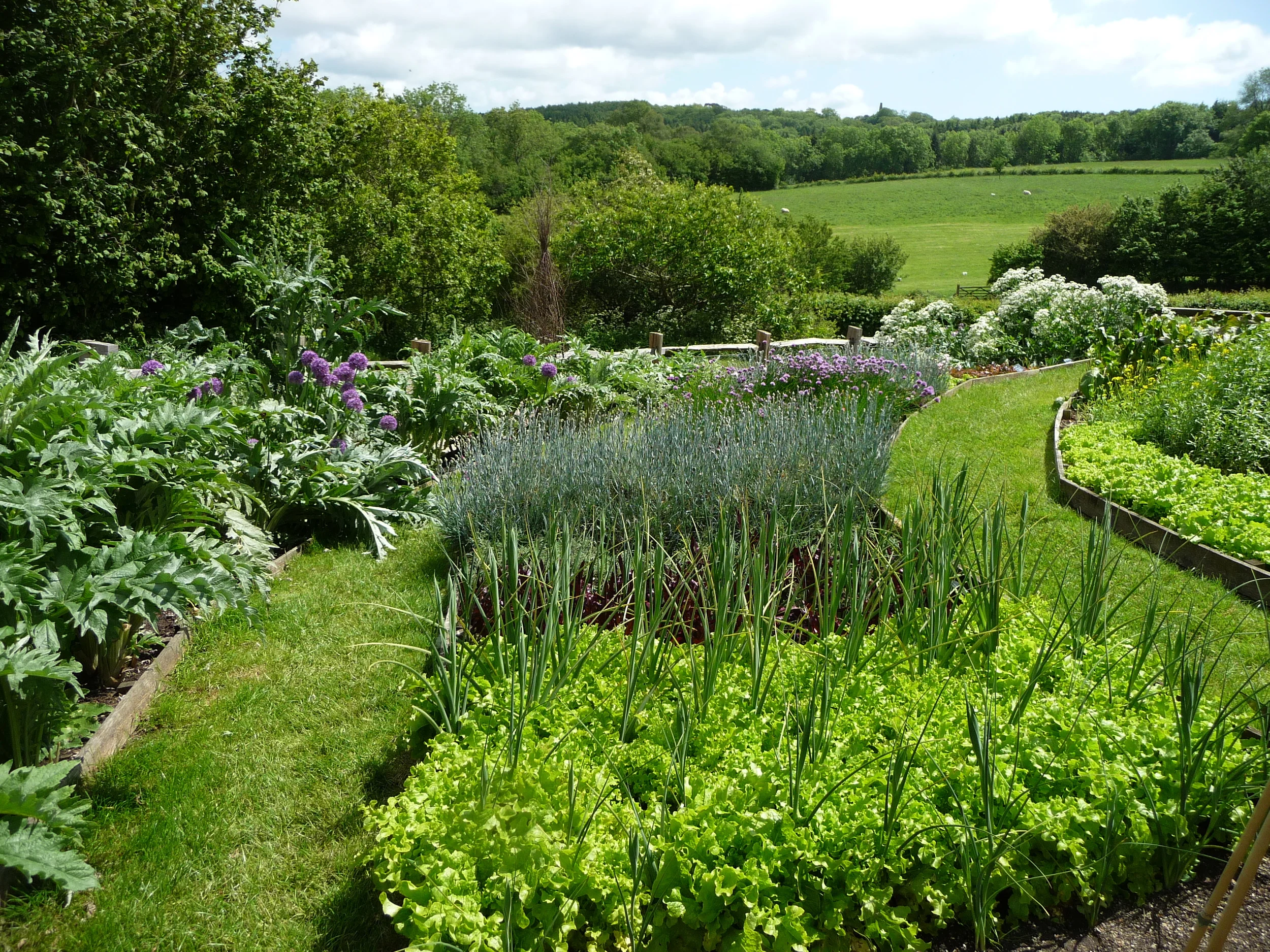
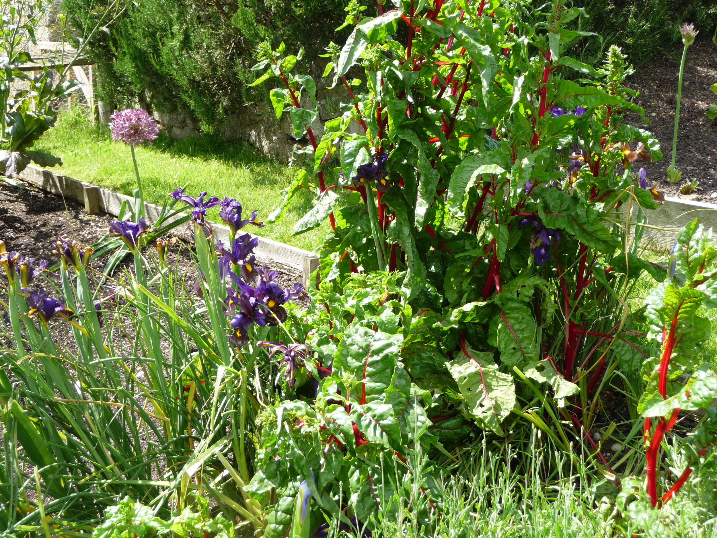
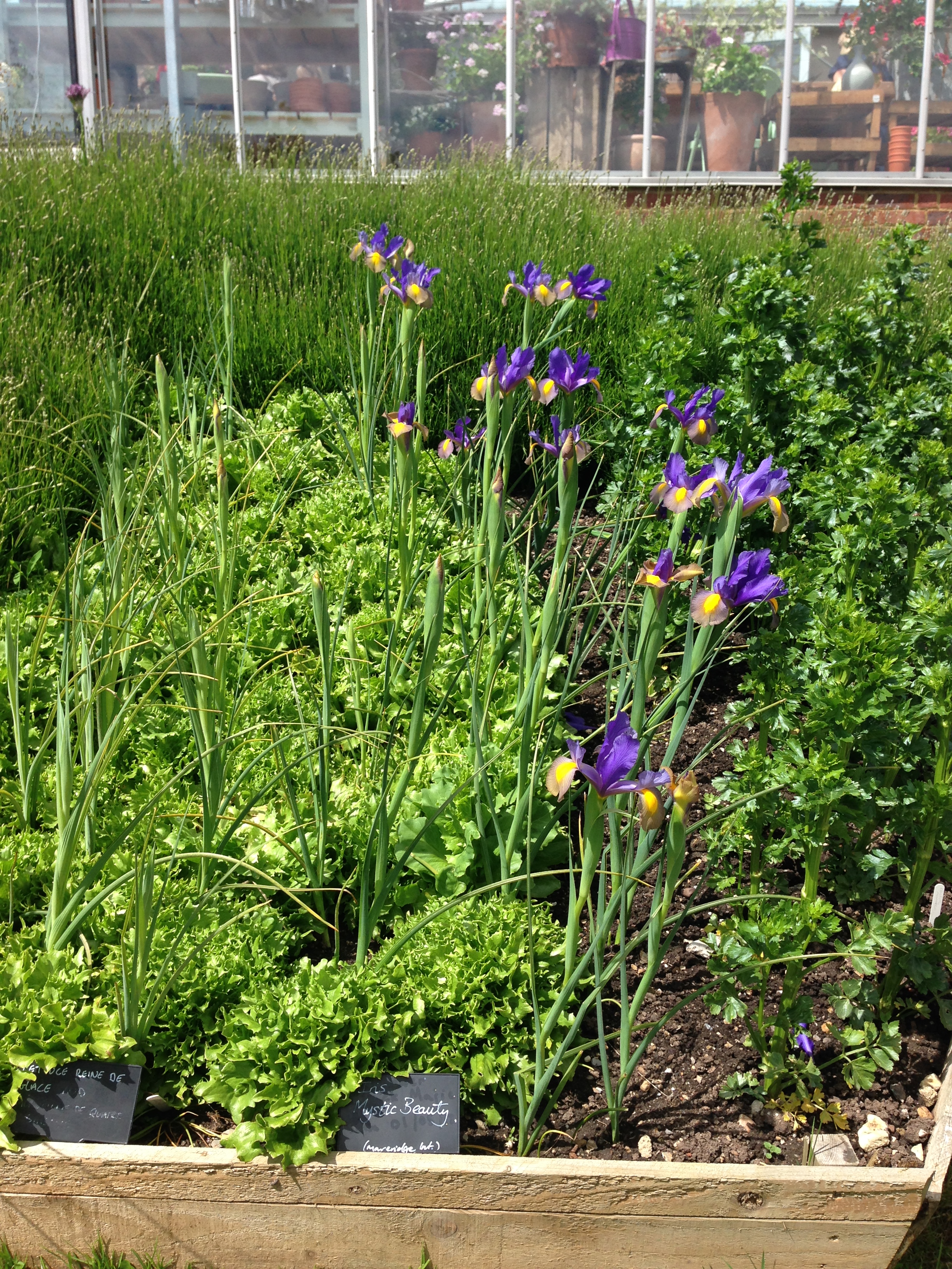
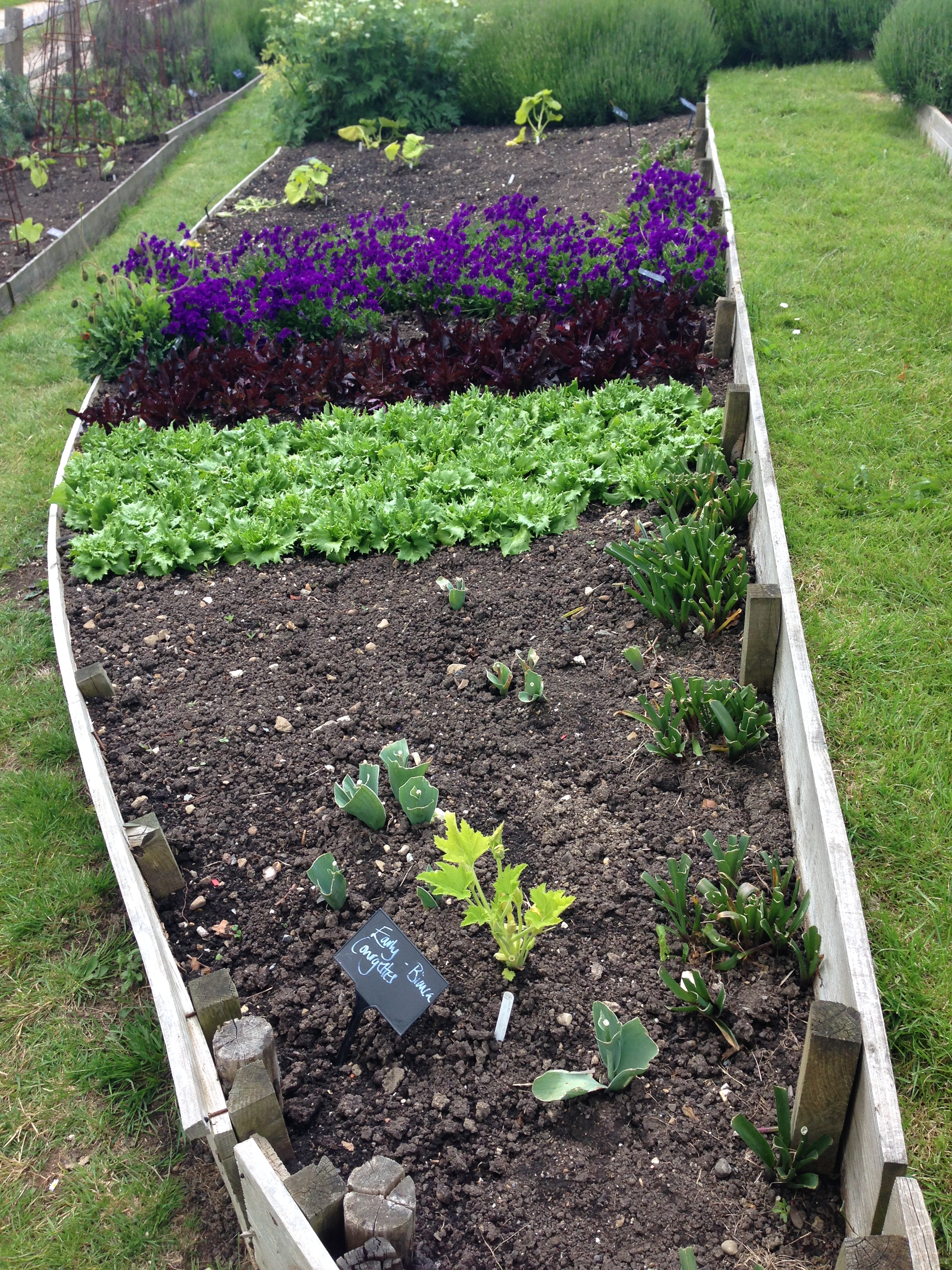
After a delicious lunch made from vegetables produced on the farm we had the chance to wander around Sarah's magnificent vegetable gardens and cutting gardens. They really are absolutely stunning. The vegetables and flowers are mainly used for the courses that Sarah runs. For some of the flower workshops you get to go and pick your own flowers from her gardens. Now that really would be a treat!! I've split the photos into the flower gardens followed by the vegetable gardens.


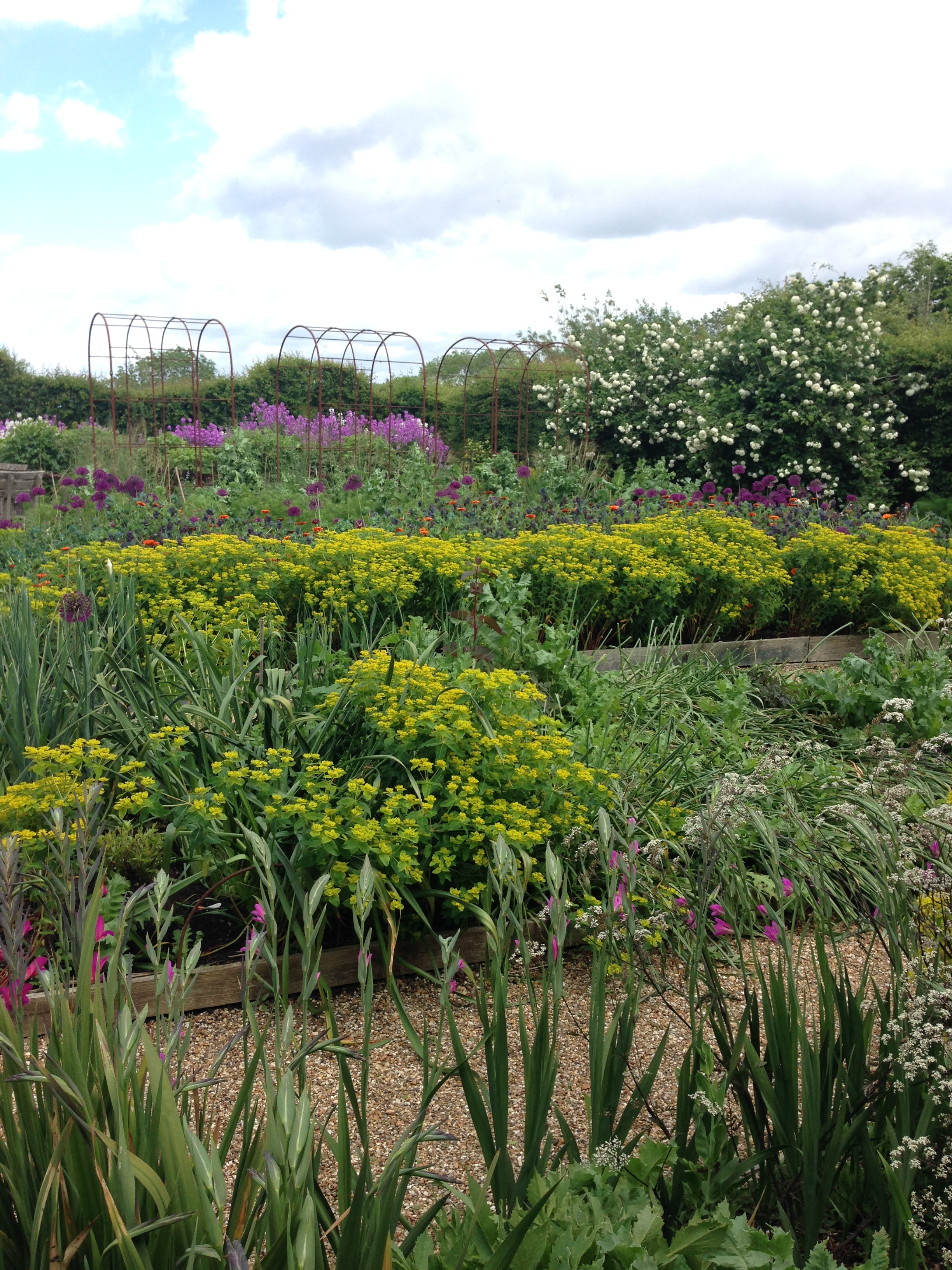
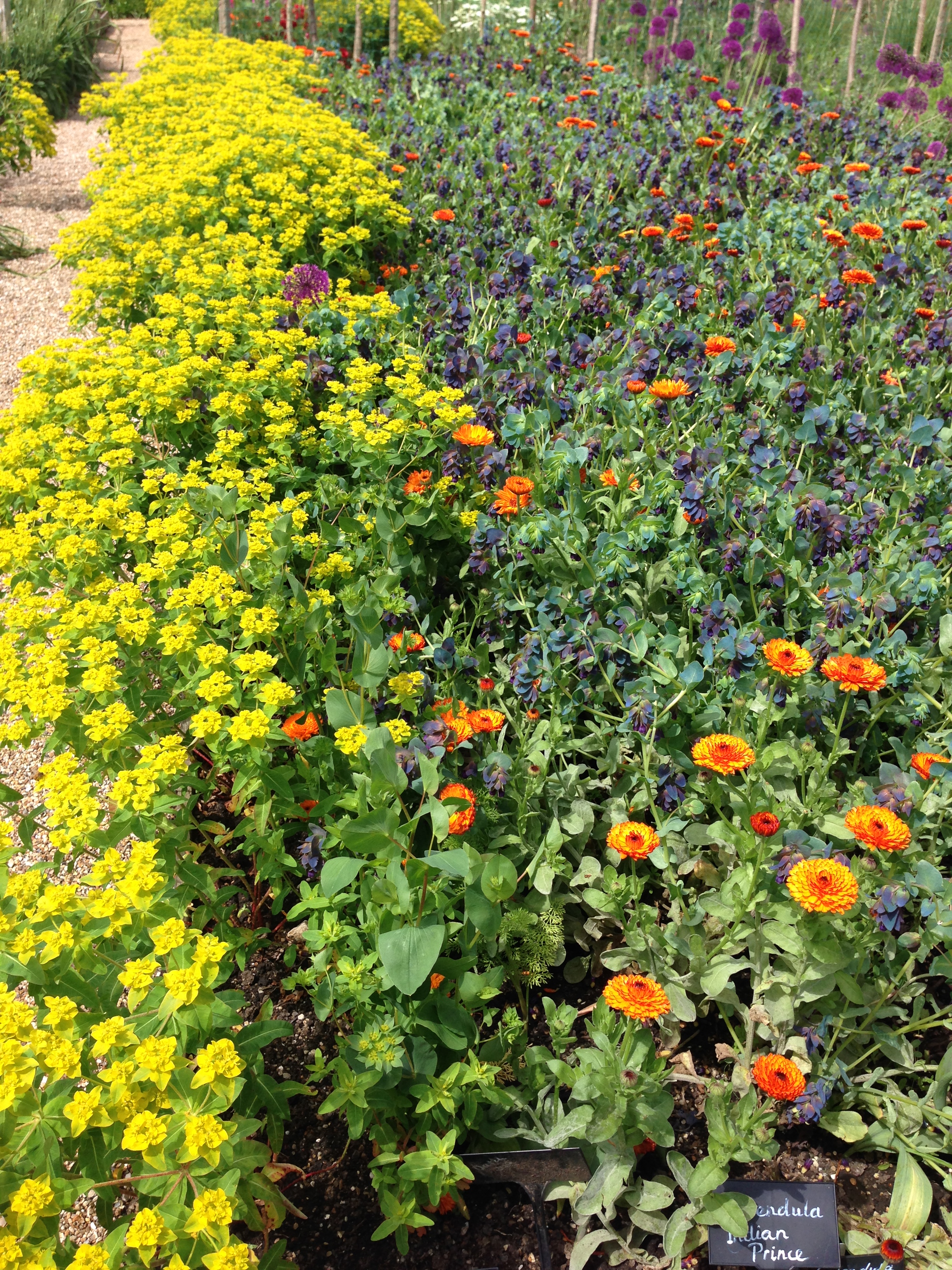
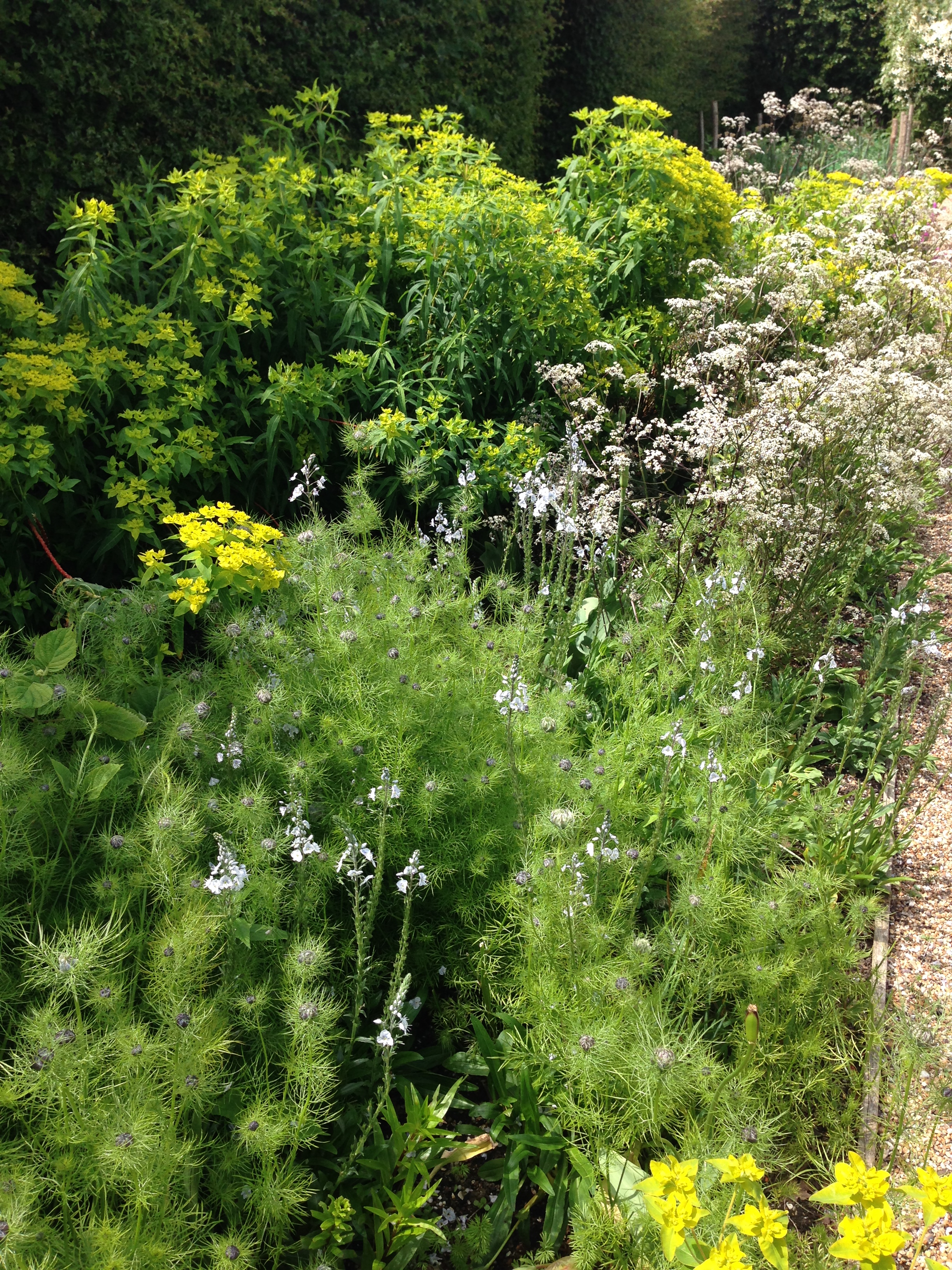
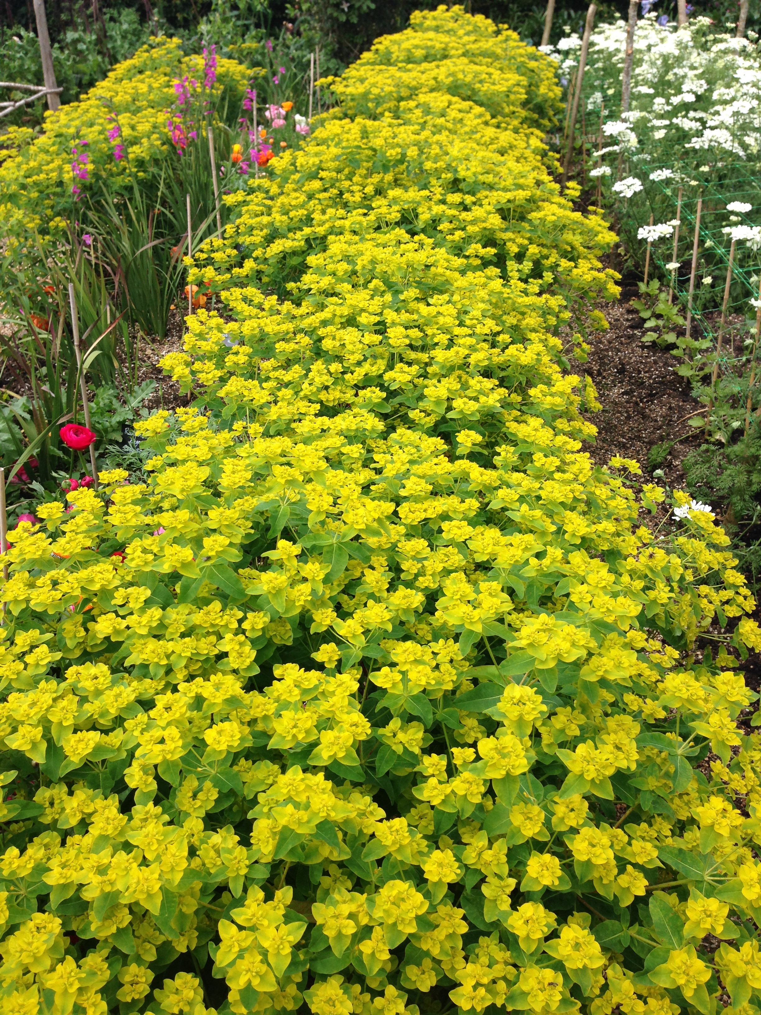
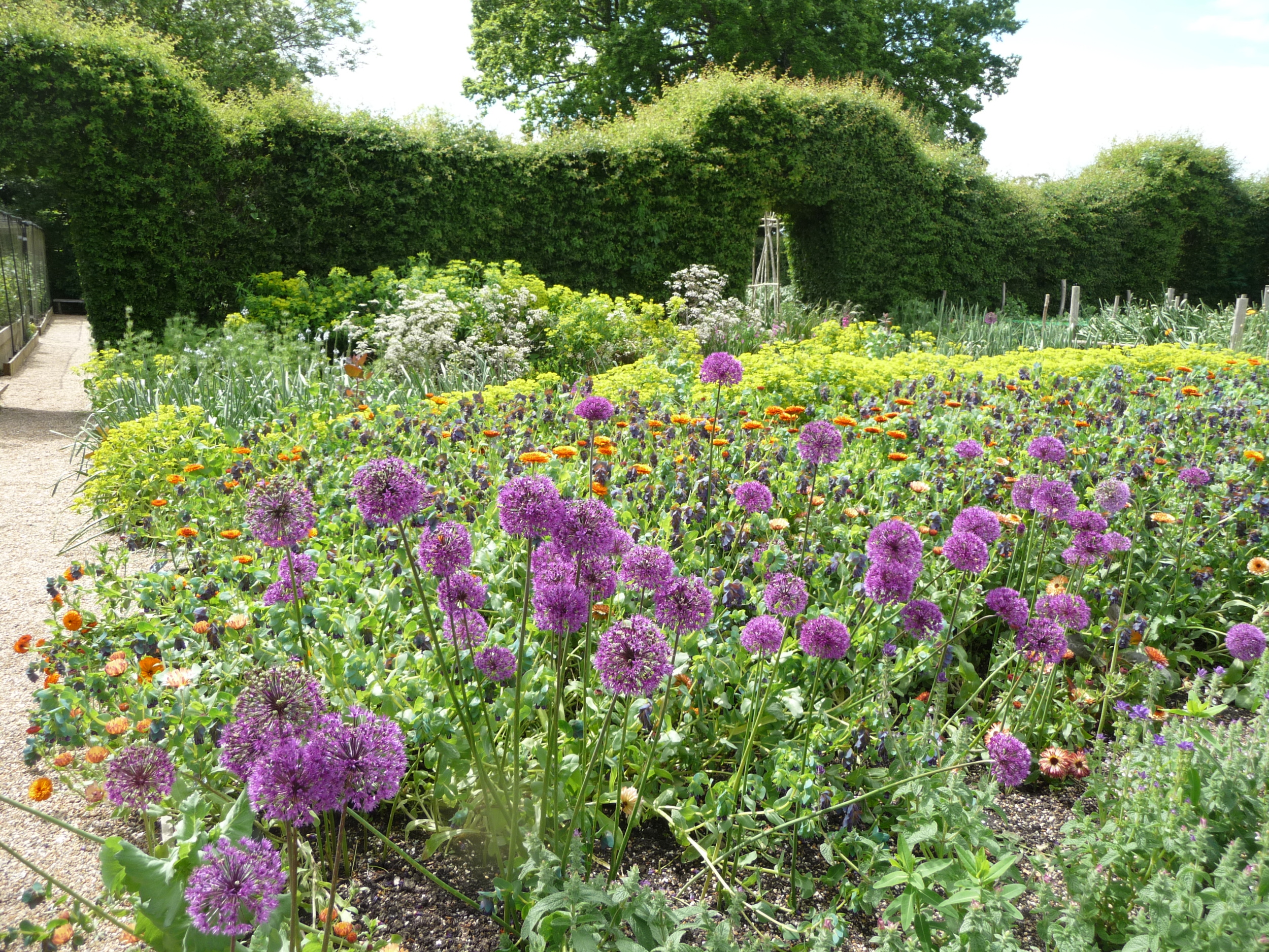
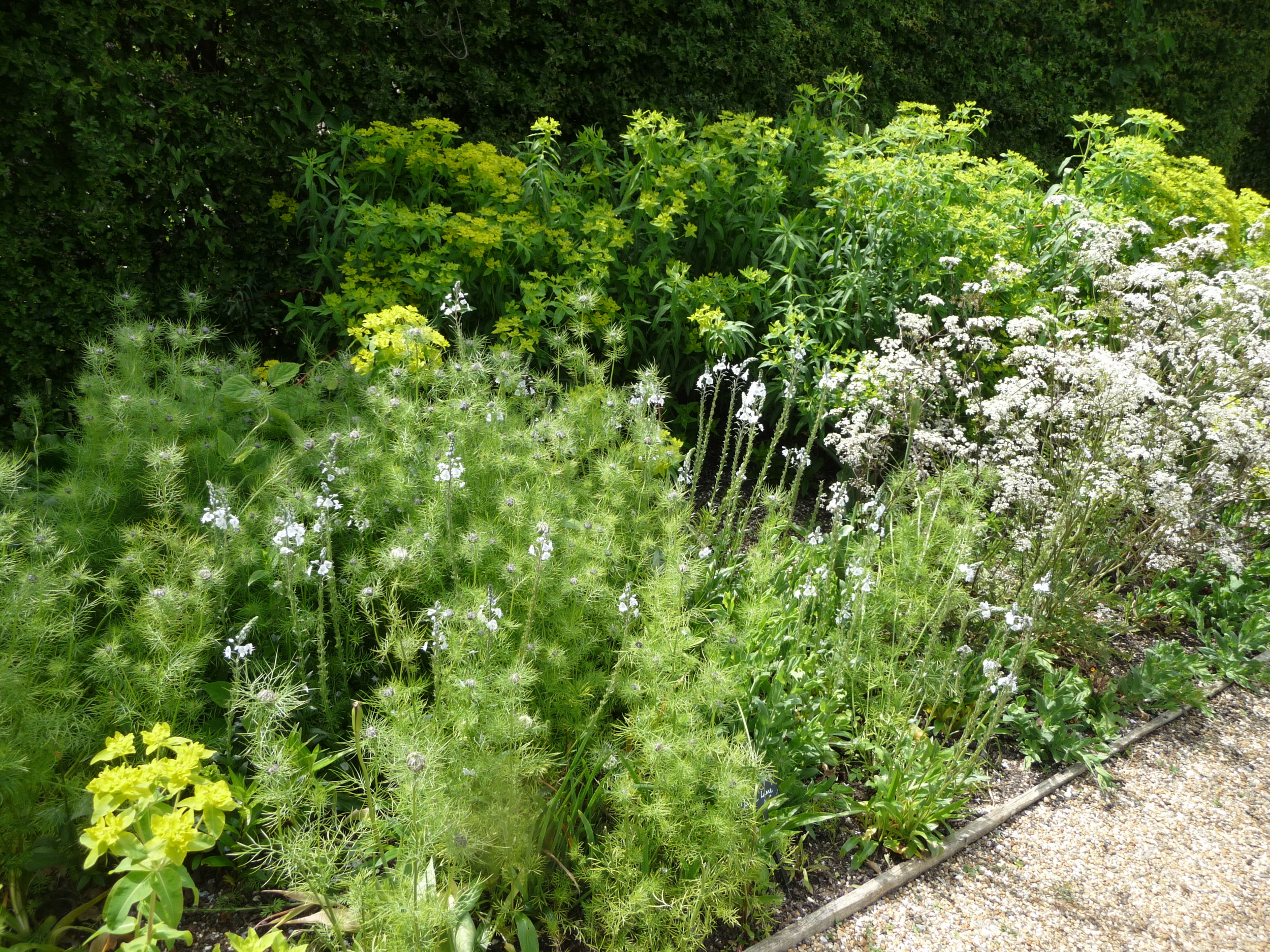
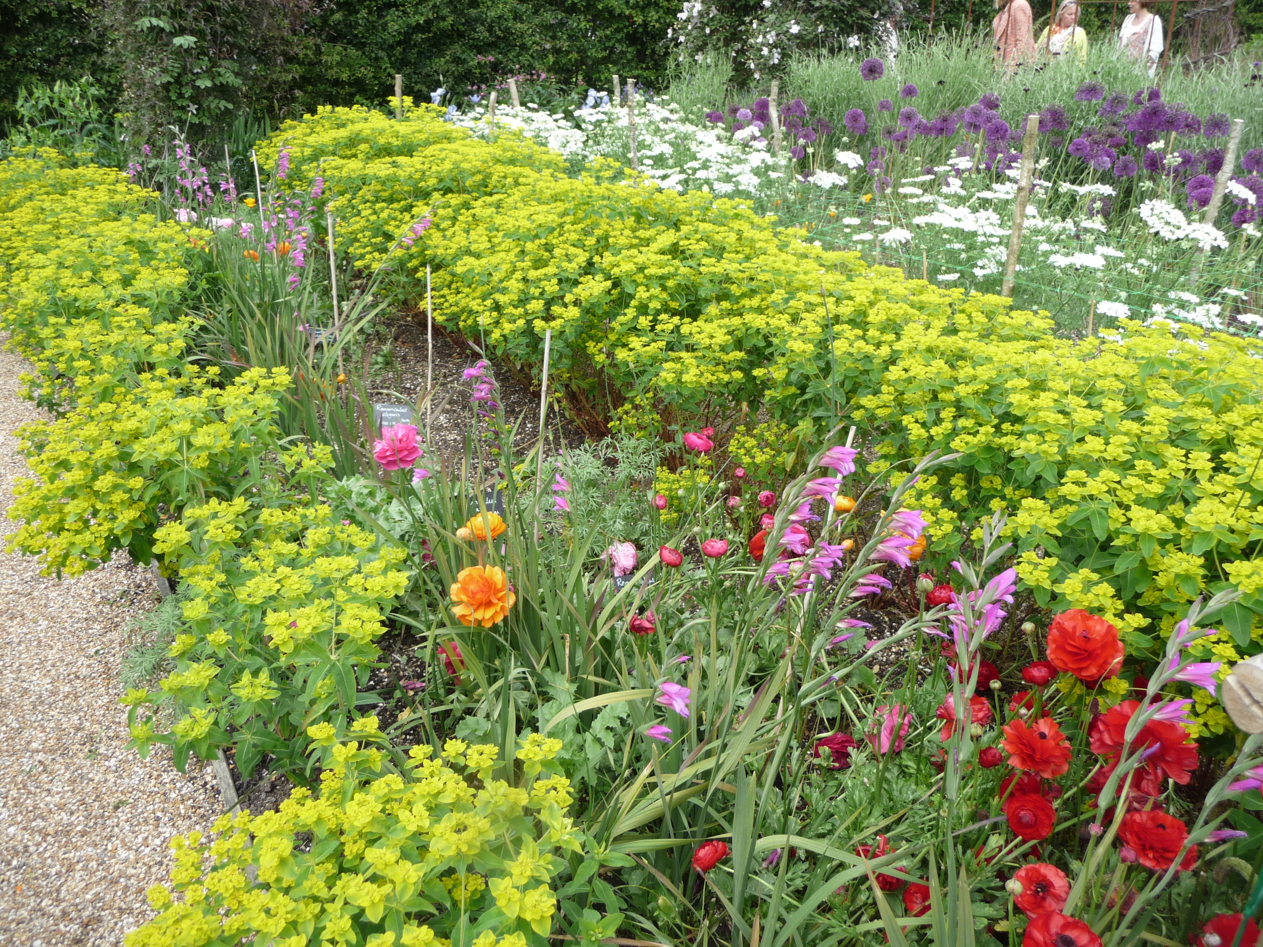
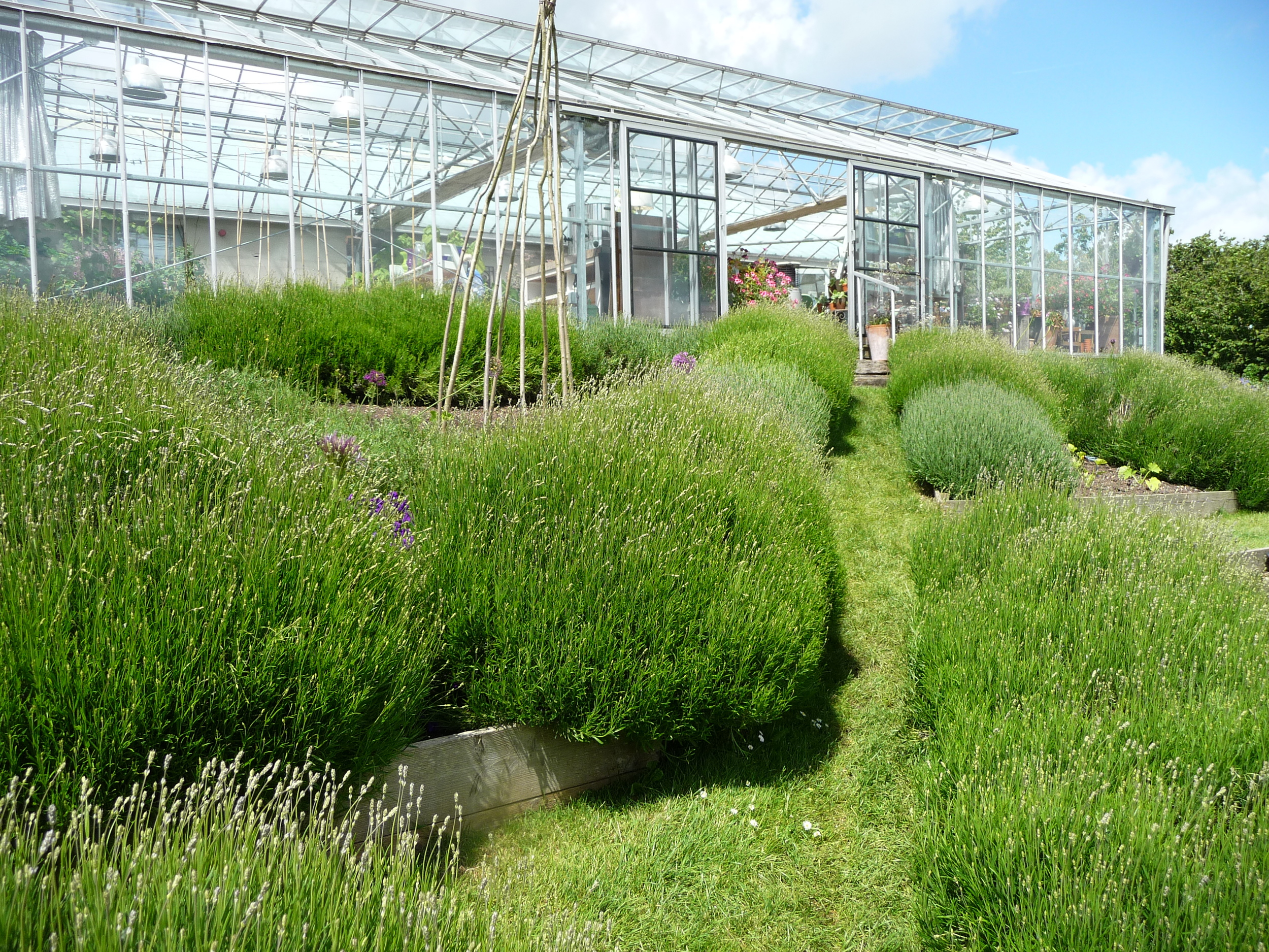
And here are some photos of the vegetable gardens. I love the way some of the vegetables have been interspersed with rows of flowers or beds of lavender.


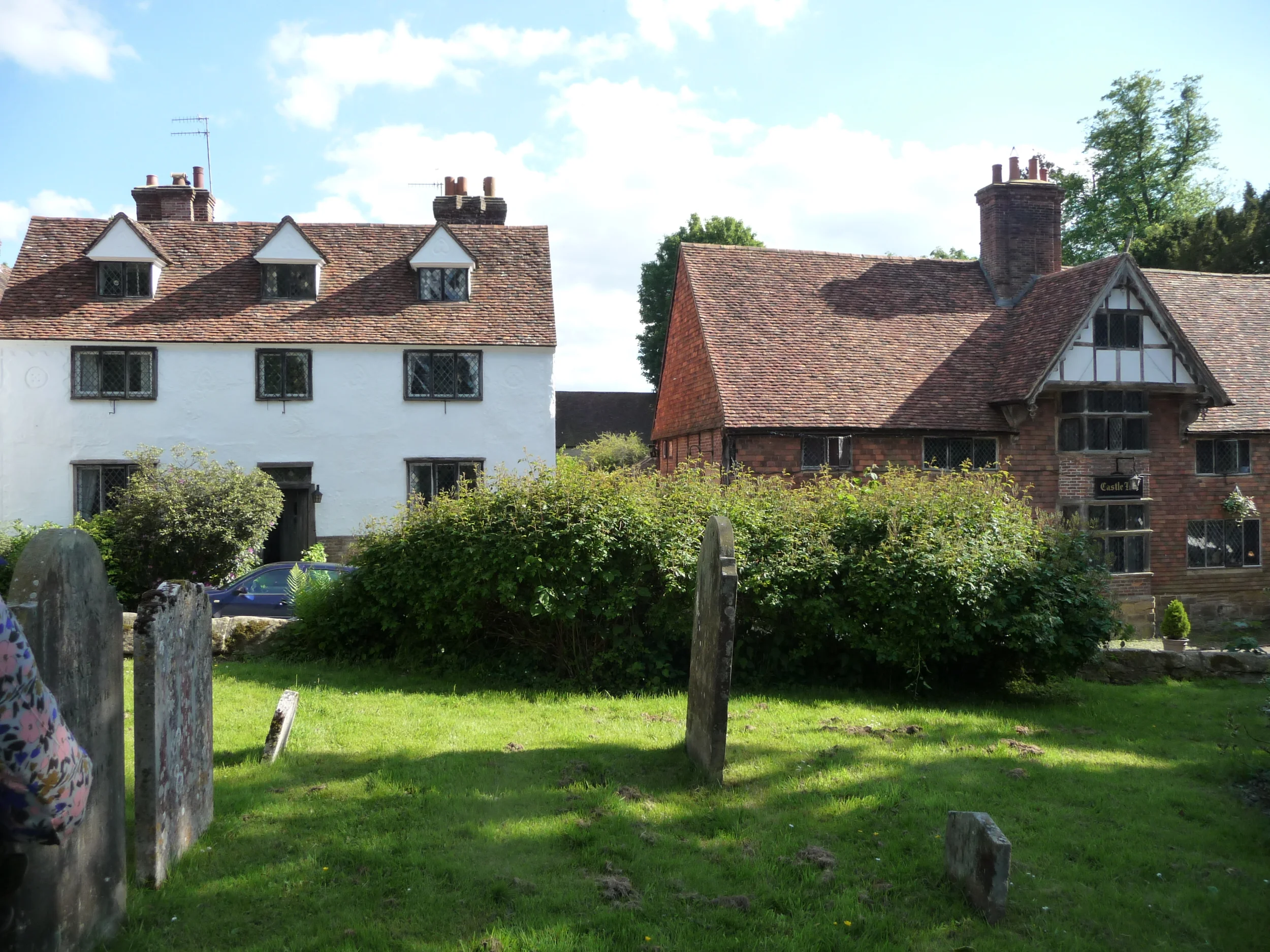
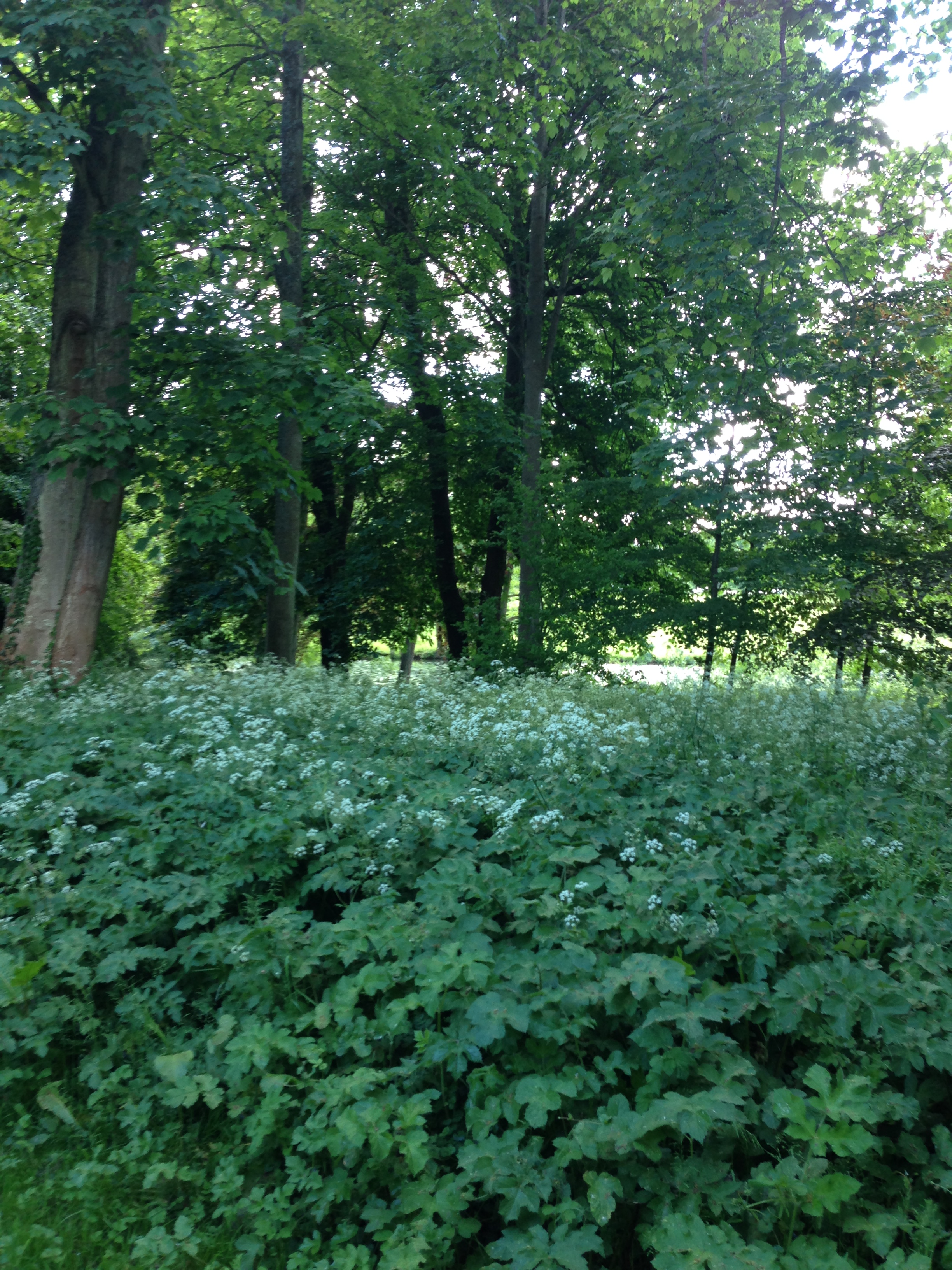
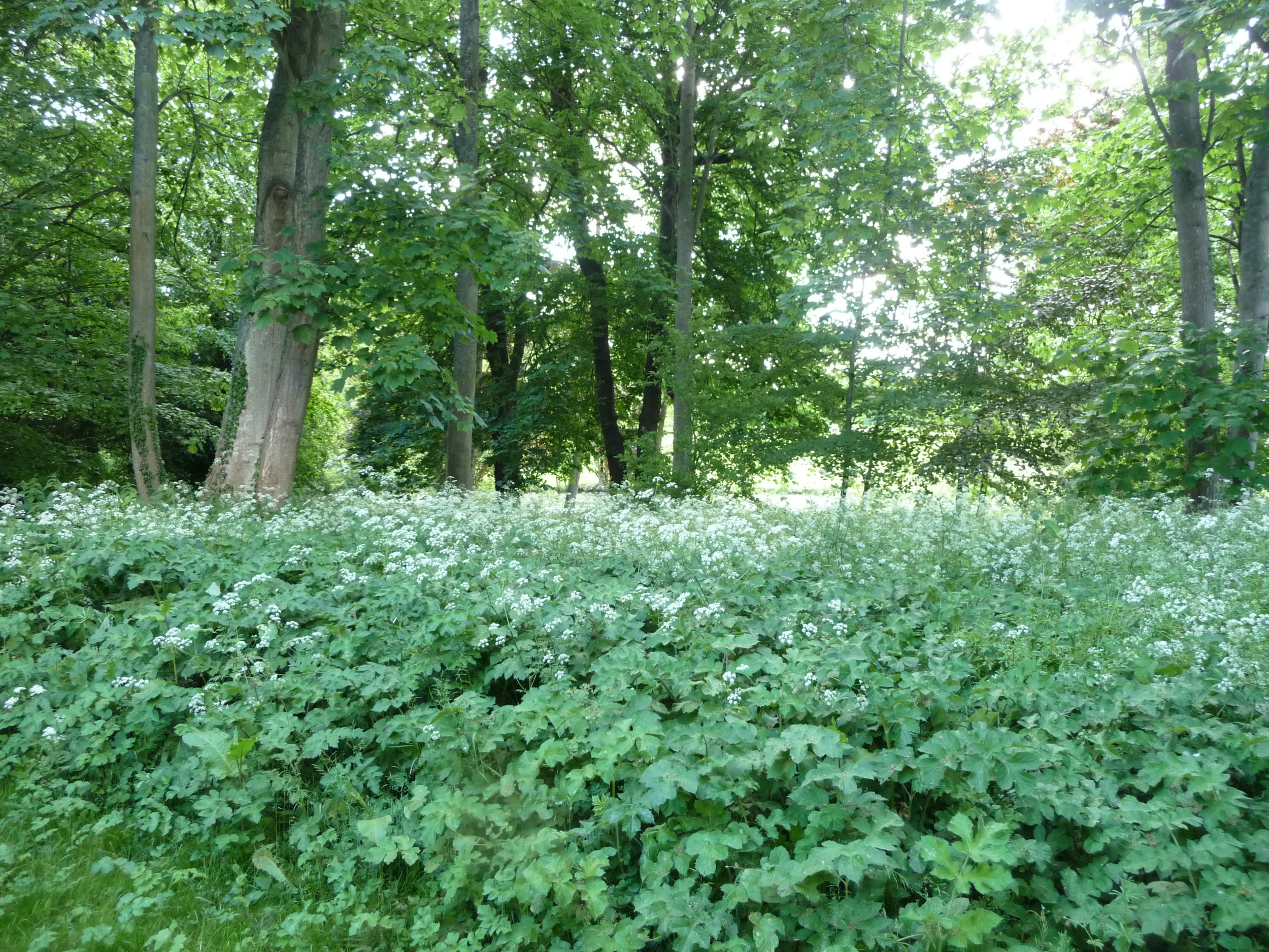
After we left Perch Hill we decided to return to London via the village of Chiddingstone in Kent. This is where the movie, Room with a View, was filmed and it's one of my favourite villages in the South East. It was one of those limpid afternoons and the village was sleepy with hardly any cars passing. We parked up next to the church and sat on the wall of the church yard listening to the birds. I wandered through the gate that leads to Chiddingstone Castle into a wooded area thick with cow parsley. It was truly magical. What would have made it even better would have been a pint in the village pub but given I was driving that wasn't an option!
I hope you have enjoyed the feast of colour and texture from the photos above. Always remember that what works in nature also works in the home. Don't be afraid to use colour(s) in your rooms, be they pops of colour or painting/wallpapering whole rooms or walls in strong colours. Take another look at Juliet Glaves' arrangement above with those pops of red peony colour in that huge masterpiece of hers. I would never have thought to introduce red but then I always say "be brave, follow mother nature in your interiors and you can't go wrong".
SEEKING STYLE INSPIRATION?
If you’re working on your own home decorating project, need help with your outside space, home staging if you are about to put your home on the market or just some de-cluttering/organising techniques, please get in touch and see how I can help. I always offer an initial free consultation with no obligation so contact me to book this.


Design Week 2015 at Chelsea Harbour is the perfect environment for meeting and greeting the great and good of the interior design world. Find out all the juicy design details of my first day at the Design Centre.